Art Product Brand Reeves Gets New Look by Pearlfisher

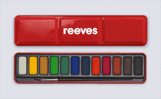
Pearlfisher has rebranded famous art materials supplier, Reeves. Said to be the world’s oldest paint manufacturer dating back to 1766, the brand forms part of the extensive Colart portfolio, and is currently relaunching in an effort to win over more customers.
With an identity that has effectively remained untouched for more than 250 years, company bosses felt the brand had become dated and disconnected from the contemporary so-called ‘creative’ consumer.
Recognising a need to update its desirability and re-establish an emotional connection with customer, Reeves therefore turned to branding and design agency Pearlfisher to transform its brand vision, visual identity, packaging design and digital expression.
Pearlfisher’s strategy team says it wanted to reinvent Reeves as a lifestyle brand.
"Embodying a shift from ‘artistic creation’ to ‘self-expression’, the new strategic vision revises the brand’s focus from the discipline of art to the democratisation of creativity," explains Pearlfisher’s Sophie Maxwell. "The new positioning – creativity as an instinctual state of mind as opposed to a qualification – comes to life in a brand-wide call to ‘Ignite creative spirit,’ which manifests itself across four key touchpoints: Design, Communication, Innovation and Experience".
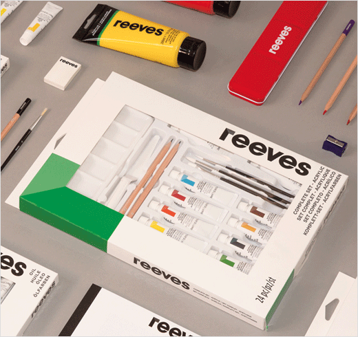
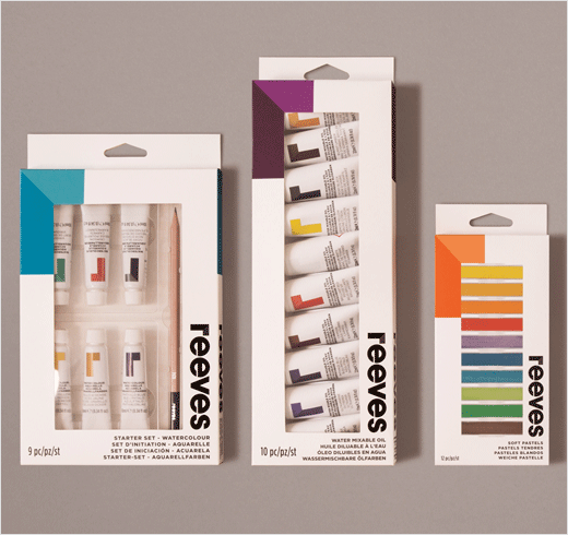
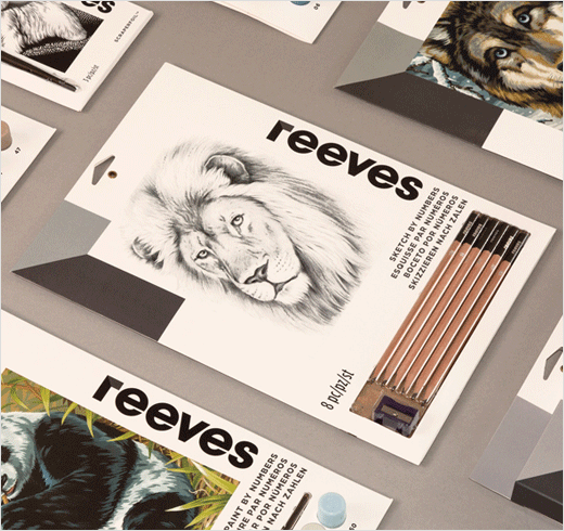
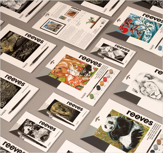
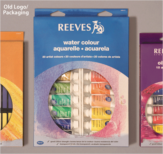
"To take Reeves from a heritage brand to a lifestyle brand," adds Pearlfisher associate creative director, Jon Vallance, "we had to, figuratively, ‘kill the dog’, the visual equity most closely associated with Reeves, and give the brand scope to reflect the individual. Where the old packaging is prescriptive, showing finished artworks and step-by-step guides, the new packaging is about sparking creativity and celebrating spontaneous creation."
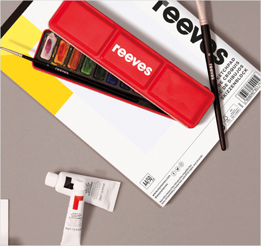
The new look re-organises the vast portfolio of Reeves products into one that is now claimed to be more simple, easier to navigate and also "inspiring" to the consumer.
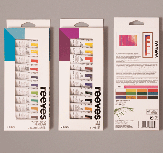
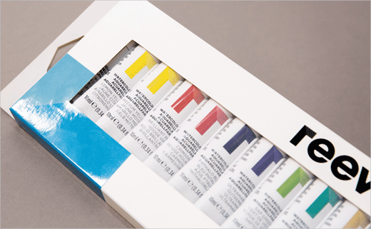
Details include a new logo, tagline, as well as a refreshed website. The revised wordmark also incorporates an ‘R’ that evokes a framed corner, reflecting the brand’s evolution from "dusty and dated to being all about framing creativity", according to the designers.

Pearlfisher
www.pearlfisher.com


