Ritz Relaunches with New Logo and Packaging by Bulletproof
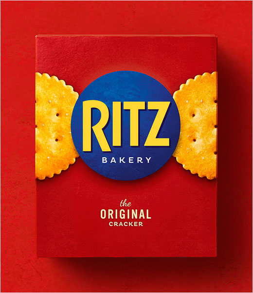
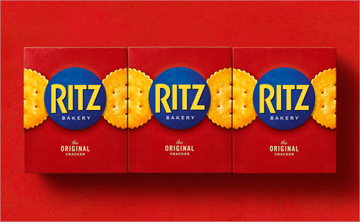
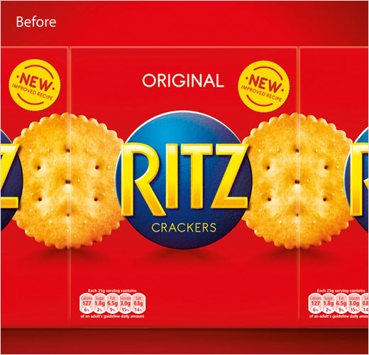
Mondelēz International has worked with the London office of global branding agency Bulletproof to refresh the logo and packaging design for its Ritz snacking portfolio, as part of an overall relaunch of the famous cracker brand.
Despite Bulletproof having already created the pack design for Ritz back in 2013, marketing bosses at Mondelēz felt the product was getting overlooked in the ever growing snacking aisle, with more and more consumers seeking healthier alternatives.
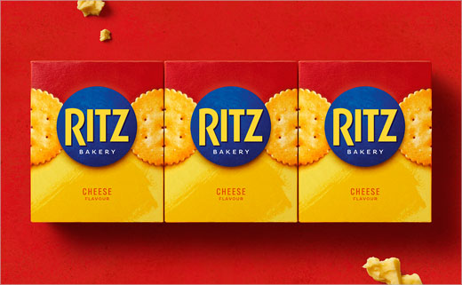
Bulletproof says it was therefore tasked with creating an “evolutionary” design that would help communicate an ‘improved’ recipe as well as usher in a new flavour variant.
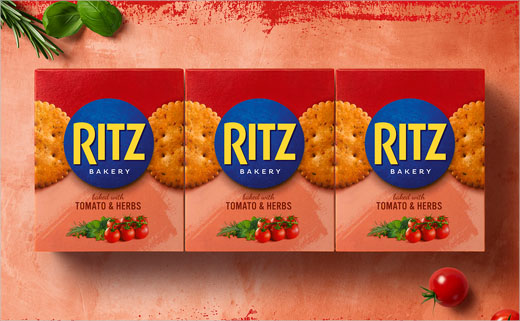
“They say never mess with a classic. But even icons need sprucing up every once in a while and Ritz was no exception. We set about creating a contemporary new design, updating the key brand assets to reflect the new healthier positioning by simplifying and creating a new brand world of natural substrates, textures and styling,” explain the designers at Bulletproof.
“We defined the role of red across the Ritz portfolio and built a clear system that heroed Ritz red for the core cracker product and gradually gave way to sub-range colours. The result is a unified, more appealing range that still packs in the deliciously snackable flavour consumers know and love,” they further add.
“Having created a best-in-class design for the portfolio five years ago, Bulletproof has again delivered a bold design bursting with appetite appeal and real punch that will entice both existing and new consumers to try our delicious – and healthier – new recipes,” claims Ritz brand manager, Melissa Stuart.
Bulletproof
www.wearebulletproof.com


