OnPath Testing Debuts New Logo Inspired by Golden Ratio and Mondrian

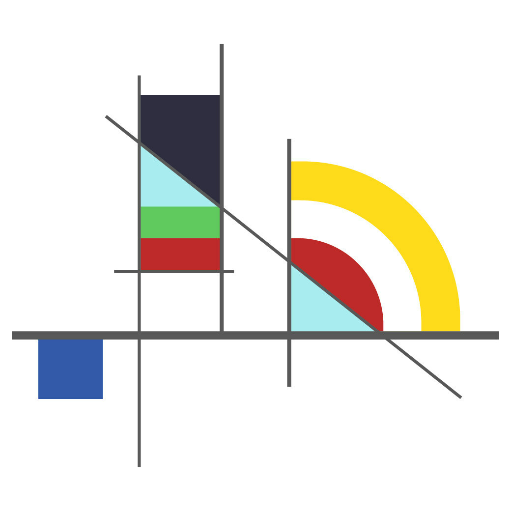
American software testing company, OnPath Testing (OP), has unveiled a rebrand inspired by the Fibonacci sequence, the golden ratio, and Euclidean geometry.
The Colorado-based firm's new look serves as a nod to classic mid-20th century art, complete with a Mondrian-style primary colour palette and Swiss grid formatting.
"The new colours represent clarity (yellow), dedicated, sustained energy (red), honesty and pragmatism (blue), growth (green), and transparency (aqua blue)," says the company about its new brand colours.
"The company was ready for a fresh visual identity that accurately reflects our innovative approach to testing and QA in software development life cycles [SDLCs]," explains OP CEO and founder, Brian Borg.
"Our prior branding was somewhat forgettable, and didn't convey our unique approach," he adds.
"We wanted a sophisticated design that evokes the journey of a software development project in abstract ways. But we also wanted the imagery to suggest collaboration and cooperation – key elements of OnPath's brand DNA," further comments OP chief operating officer, Lon Botta.
Source: OnPath Testing (OP)


