Pfizer Debuts New Logo and Identity

Pfizer has this month unveiled a new logo and identity, which represents the first brand refresh for the pharmaceutical giant in well over half a century.
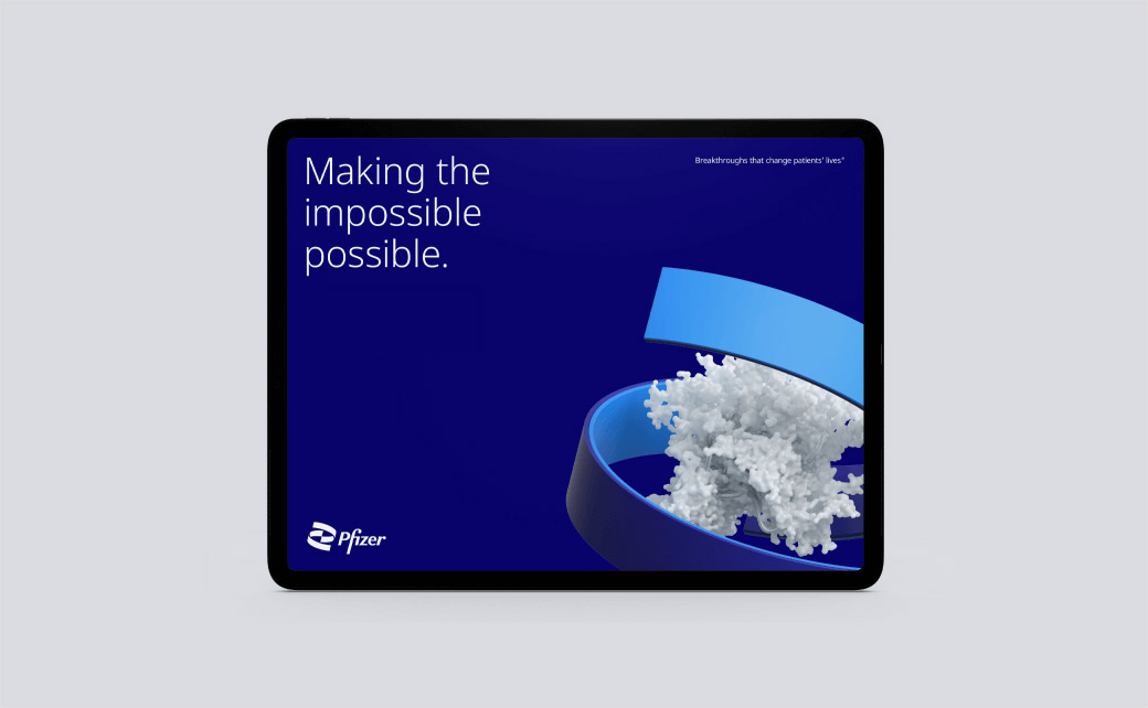
The refreshed logo is constructed of two interlocking forms that are claimed to reflect unity as well as the company's two central ideals, namely, 'passion for science' and the 'wellbeing of patients'.
"Pfizer has become much more than a pharmaceutical company. Our new logo signals this shift from commerce to science. We’ve unlocked the pill form to reveal the core of what we do: a double helix, spiralling upward," says the company.
Additional design details include an evolution of the brand's blue colour to a two-tone palette that is once again claimed to signify "commitment to both science and patients".
"In an industry awash in blue, we're doubling down. A choice that champions our history as a leader for the pioneers who have followed," reckons Pfizer.
Another key element of the updated identity is new photography that reportedly shows real people being helped out by medical professionals.
Also making an introduction is the font Noto Sans; created by Google, it is described as being "philosophically and aesthetically aligned" with Pfizer.
"Our new identity reflects the dignity of Pfizer’s history and captures the innovative spirit and science focus alive in the company today," comments the company's executive vice president and chief corporate affairs officer, Sally Susman.


Source: Pfizer


