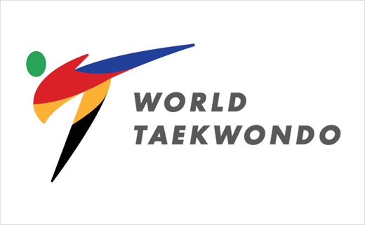
World Taekwondo Reveals New Brand and Logo Design
The World Taekwondo Federation (WTF) has rebranded as World Taekwondo, with the organisation’s new brand and logo having being revealed this week at the 23rd World Taekwondo Championships in Muju, Korea.
The name change comes as the organisation wants to avoid confusion of its acronym with the offensive slang abbreviation ‘WTF’, which is commonly used across the internet.
“In the digital age, the acronym of our federation has developed negative connotations unrelated to our organisation and so it was important that we rebranded to better engage with our fans,” said World Taekwondo president, Chungwon Choue.
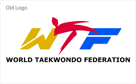
In terms of design, the new logo retains the “kicking athlete” symbol that was the “T” in the “WTF” as a link to the federation’s heritage. The “kicking athlete” is coloured in the five colours of the Olympic rings against a white background to signify the federation’s position as the leader of Olympic taekwondo and to symbolise the globality of the sport.
World Taekwondo was originally established in 1973 and currently has 208 member national federations worldwide. It became part of the Olympic sports program in 2000.
Following its official rollout this week in Muju, the new brand will be incorporated in all official communications, marketing materials and branded merchandise.
Source: World Taekwondo


