Studio Constantine Creates New Identity for Reiko Kaneko
Australian consultancy Studio Constantine has designed a new identity for Stoke-on-Trent-based ceramics brand, Reiko Kaneko.
A graduate of Central Saint Martins, Reiko is British-Japanese, and draws on both influences in her work. Earlier in 2015, she approached Studio Constantine to work with the business on the development of a new visual identity.
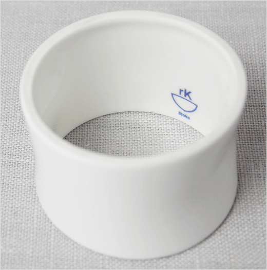
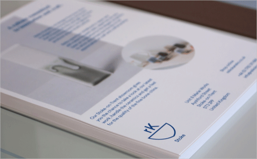
“Studio Constantine first looked to the notion of a maker’s mark and its history within British and Japanese ceramics, understanding the rich language of gestures, symbols and colours. The final maker’s mark was composed of three classic elements of the genre; the maker’s initials, a heraldic device (in this case, doubling as a vessel), and the product’s place of origin. Historical in composition, but deliberately modern and stark in execution,” explain the designers.
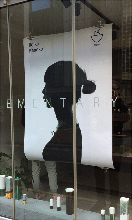
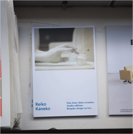
The maker’s mark is paired with a more formal, purely typographic set of ‘Reiko Kaneko’ in a sans typeface. The designers say they can be used separately or in tandem.
The blue colour, meanwhile, makes a historical reference to backstamps in both Britain and Japan, and has further associations with blue and white Japanese ceramics exported to Europe during the 19th century. The main colour is supported with a palette of neutral tones taken from different clays.

Studio Constantine
www.manualelectric.com


