Georgetown College Reveals New Logo Design
American academic institution Georgetown College has this week revealed an all-new logo design.
The private, Christian liberal arts college was originally founded in 1829, and is claimed to be the oldest Baptist-heritage institution in the state of Kentucky.
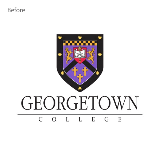
Georgetown’s new logo design, which is set to replace all previous iterations and will be used both internally and externally in all printed publications as well as media, is comprised of four distinct visual elements: the shield, the diagonal, the GC, and the wordmark.
Regarding the first element, namely the shield, the institute says it communicates “the strong academic foundation on which the college was built and has maintained through its history”, while the diagonal is claimed to express “a commitment to positive, upward growth as an organisation and for students.”
The GC, meanwhile, which is described as “breaking out” of the inner shield, symbolises “the unlimited reach of the College’s graduates, faculty, and staff within our community and throughout the world”, and the melding of the two letters further serves to communicate that Georgetown College “pushes beyond barriers and strives to be inclusive, innovative, and to push toward the common good”.
The final element, the refreshed wordmark, is characterised as being “clear, modern, and approachable” when compared to the old typography.
In terms of colour, the new logo adopts a prominent black and orange scheme that serves as a nod to Georgetown’s undergraduates who are commonly known as the “Tigers”.


Source: Georgetown College


