Yahoo! Reveals New Logo Design
Internet and email pioneer Yahoo! has revealed a new logo design as part of a major brand overhaul.
"Our new look is just a sign of bigger, more important changes in the works," said the Verizon Media-owned American company in a statement posted on its website. "We’re rolling out a series of new products and features to help you get more of what you love."
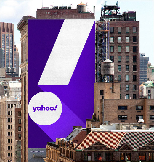
Designed by Pentagram, the latest logo is the sixth since the company launched in the mid-1990s. A more vibrant shade of purple when compared to previous versions, it also switches to all lower case letters.
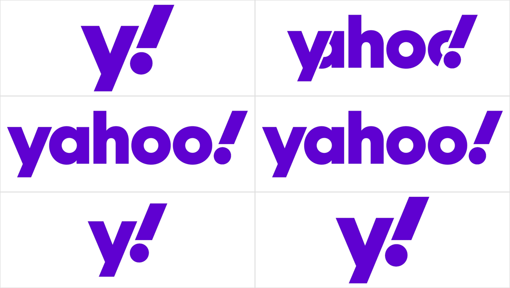
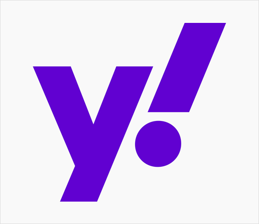
An animated variant further sees the wordmark retract to just "y" and "!", which then combine to form a monogram that serves as a secondary logo.
"The new wordmark is set in Centra No. 2 Extrabold, and the letters of the logotype have been modified to be more geometric and compact," explain the designers. "The exclamation mark has been italicised for emphasis, as it has been in every iteration of the logo since the company’s founding."
The "y" and "!" of the logo are also both set at an angle of 22.5 degrees, "a forward tilt that suggests a sense of momentum and excitement", according to the design team.




Pentagram
www.pentagram.com


