Aesop Creates Logo and Packaging for ‘Oh Fudge!’
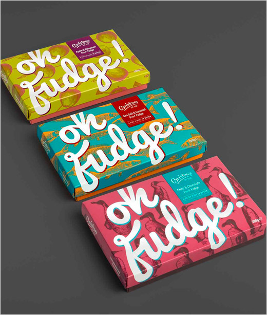
Branding agency Aesop has created new packaging for Bristows Oh Fudge! that it says helps brings to life the flavour variants.
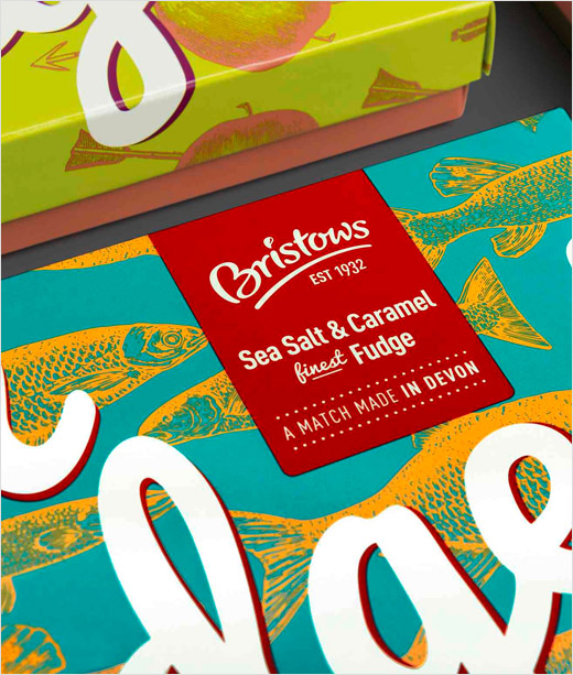
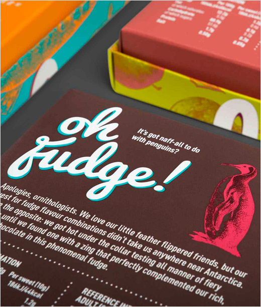
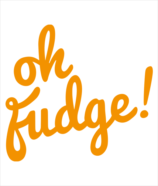
The agency also came up with the brand name – ‘Oh Fudge!’; the strapline – ‘A match made in Devon’ plus back-of-pack stories for each flavour.
“Caramel & Sea Salt; Chilli & Chocolate and Apple & Cinnamon are daring flavour combinations that demanded a bold and unexpected design approach. Orange fish swim against a turquoise backdrop; penguins appear incongruous against a pink landscape and apples shot-through with arrows adorn a sweet and spicy orangescape,” explain the designers.
Further commenting on the design approach, Dan Calderwood, design director, Aesop Agency says: “The illustrations are a tongue-in-cheek representation of each flavour – unexpected and surprising, creating an ‘Oh Fudge!’ moment.”
The new fudge brand is said to have already generated interest from niche and mainstream retailers including Hugh Fearnley-Whittingstall’s River Cottage deli.
Aesop have previously worked with Creditons – the Devon based confectioners – creating packaging for Bristows Bonbons and Bristows fudge and toffee.
Aesop
www.aesopagency.com


