POLO Mints Get Refreshed Logo and Packaging
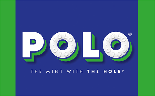
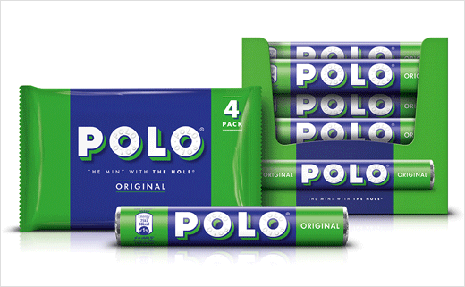
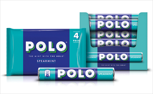
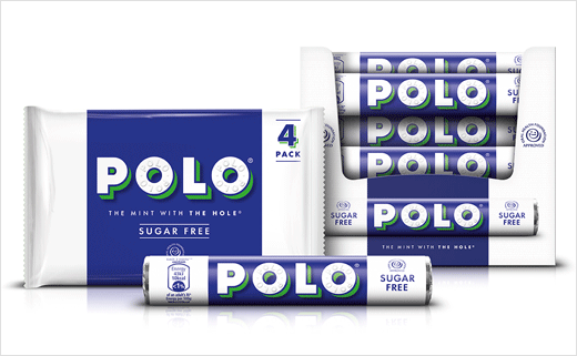
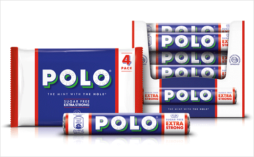
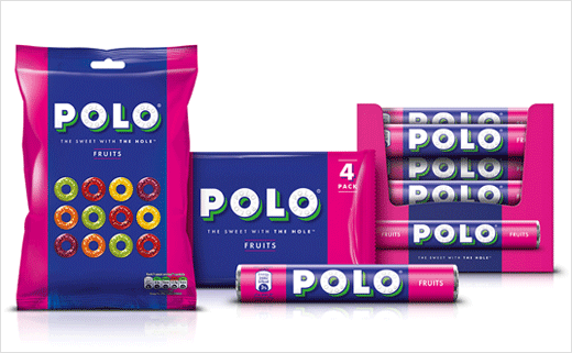
Taxi Studio has created a new look for Nestlé's POLO mints. The agency was appointed following a three way pitch last summer.
"POLO brand’s packaging was in need of some TLC to keep up with the times. Our team at Taxi was brought in to help refresh the POLO brand identity and enhance stand out on shelf in a way that drove relevance with a younger audience and retained existing, loyal customers," say the designers.
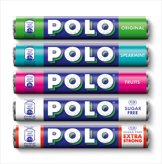
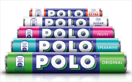
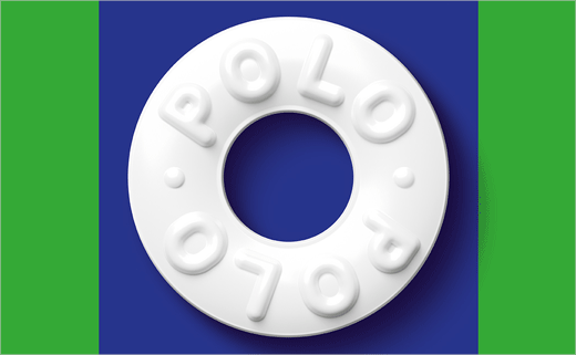
The new branding and packaging design adopts an all-white logotype, which was hand-drawn by typographer Rob Clarke; it is said to be based on a typeface used by the POLO brand back in the 1940s.
"Creating an all white brandmark visually simplified the design to give greater stand out while keeping the iconic mint at the heart of the brand," explains Jonathan Turner-Rogers, associate creative director at Taxi Studio.
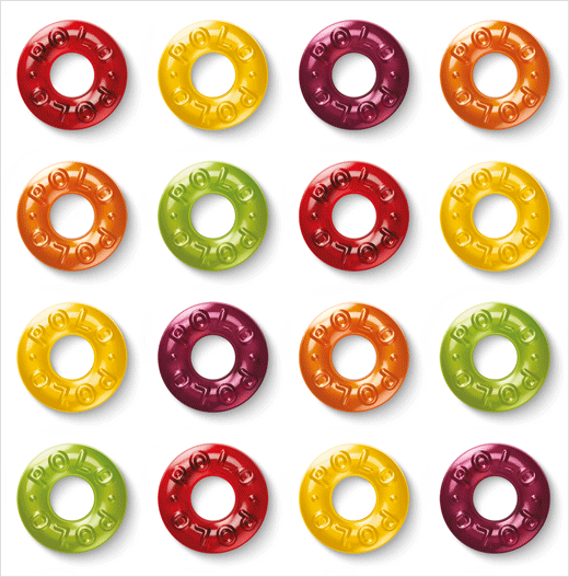
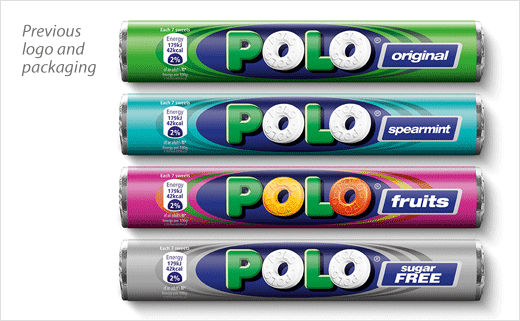
The shadows on the previous logo "made the sweet icons look grey" according to Turner-Rogers, so the consultancy also enlisted illustration studio Bomper to design new sweet illustrations that have a "3D feel to them while maintaining the white on the pack".
Taxi Studio
www.taxistudio.co.uk


