B&B Studio Refreshes Logo and Packaging for Peppersmith
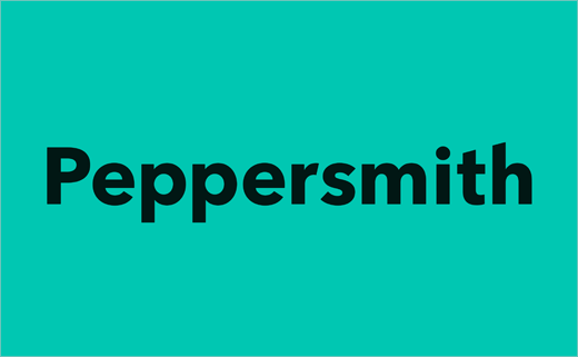
B&B studio has refreshed the logo and packaging design for British confectionery brand, Peppersmith.
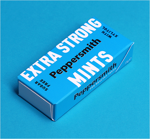
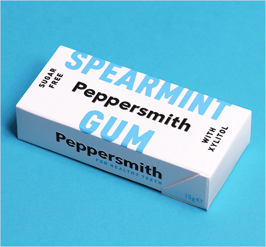
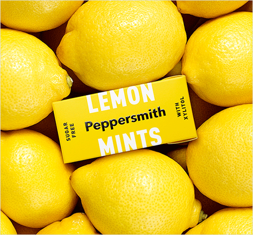
The revised look, it is claimed, "celebrates the natural ingredients and strong flavours" of the brand’s range of sugar-free chewing gum and mints.
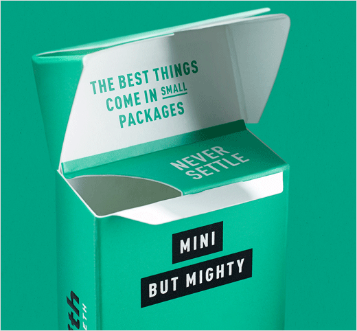
Designers at B&B, who were responsible for creating the original Peppersmith brand back in 2010, say the refresh has been inspired by the confectioner's corporate philosophy of "Never Settle" in an effort to create "a more emotionally engaging platform".
"When we first partnered with Peppersmith, we positioned them as a premium gum with a handcrafted feel. But this is a brand that never settles," explains Shaun Bowen, creative partner at B&B studio. "In this rebrand, we’ve defined the brand’s functionality and repositioned them with a desirable lifestyle aesthetic, enabling them to confidently communicate the product benefits through the appropriate channels, from high quality ingredients to health credentials."
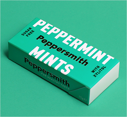
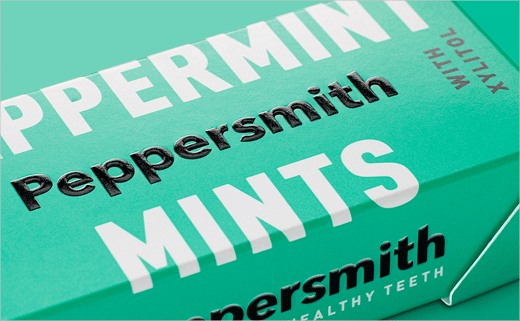
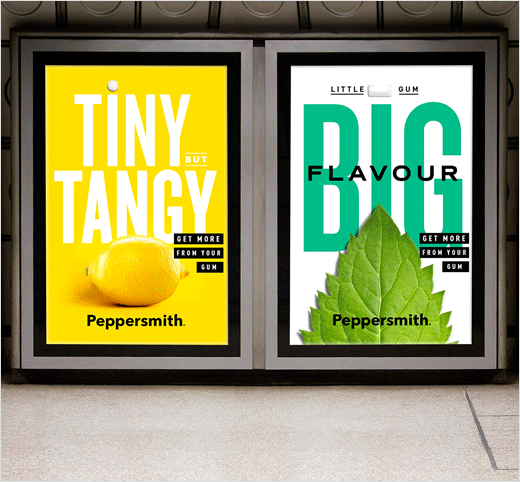
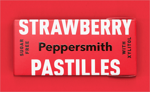
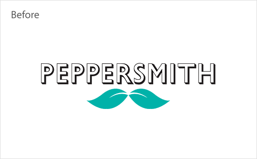
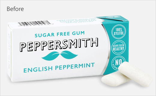
The new logotype is described as being cleaner, fresher and friendlier than the "retro-premium" old design, while the copy on each pack has been stripped back with wrap-around lettering and "playful" phrasing such as ‘mini but mighty’ and ‘tiny but tangy’.
In addition, Peppersmith has introduced plastic-free packaging which no longer incorporates a plastic wrapper.
"The new designs give us a much more contemporary look, make our messaging clearer and give us better stand out in an increasingly competitive category. With a more streamlined aesthetic and bolder tone of voice, B&B has reinforced our position as a leading challenger brand with a strong personality that sets us on a path for future growth," says Mike Stevens, founder of Peppersmith.
B&B studio
www.bandb-studio.co.uk


