Entrepreneurs’ Organization Given New Look by Brandpie
Global consultancy, Brandpie, has created the new logo and identity design for Entrepreneurs’ Organization (EO).
The agency worked with EO to develop a new purpose, positioning and differentiating identity for the non-profit organisation that claims to “engage leading entrepreneurs to learn and grow”.
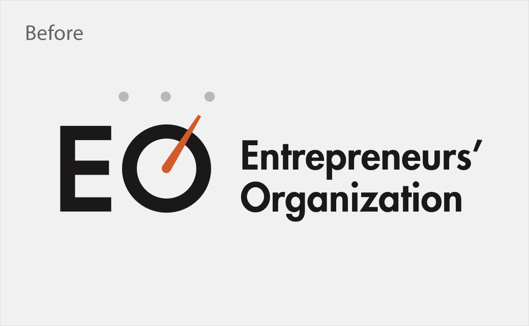
Last year, having outgrown the identity and positioning it adopted in a 2005 refresh dubbed “Fueling the Entrepreneurial Engine”, EO brought in Brandpie to help reevaluate the organisation.
To facilitate this, Brandpie says it focused first on understanding who EO is as an organisation and discovering more about their mission, vision, positioning, and strategic plans for the future.
“Engaging the team and wider stakeholders throughout the organization is a key part of any design project, so we begin that engagement right from the start with kick off meetings, focus groups with our collaborative software VYTALS, and a competitive audit,” says Rik Haslam, executive creative partner at Brandpie.
This process included speaking to and hosting focus groups with EO members and employees around the world, including teams in South Africa, Australia, Japan, the UK, and US.
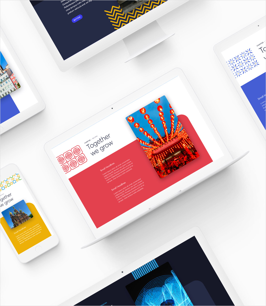
Based on the insight gathered through this first phase, Brandpie developed EO’s new brand narrative centred around a creative premise of “Together we grow.”
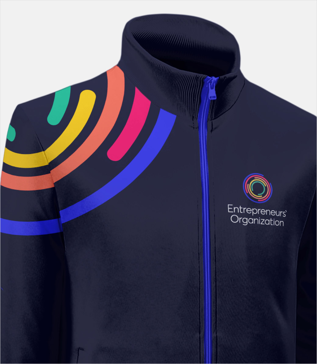
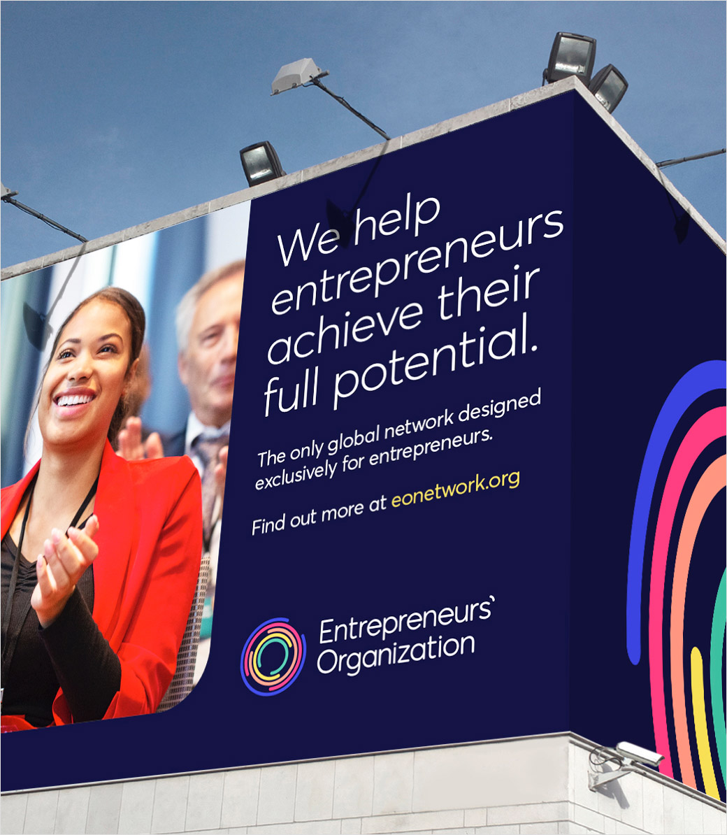
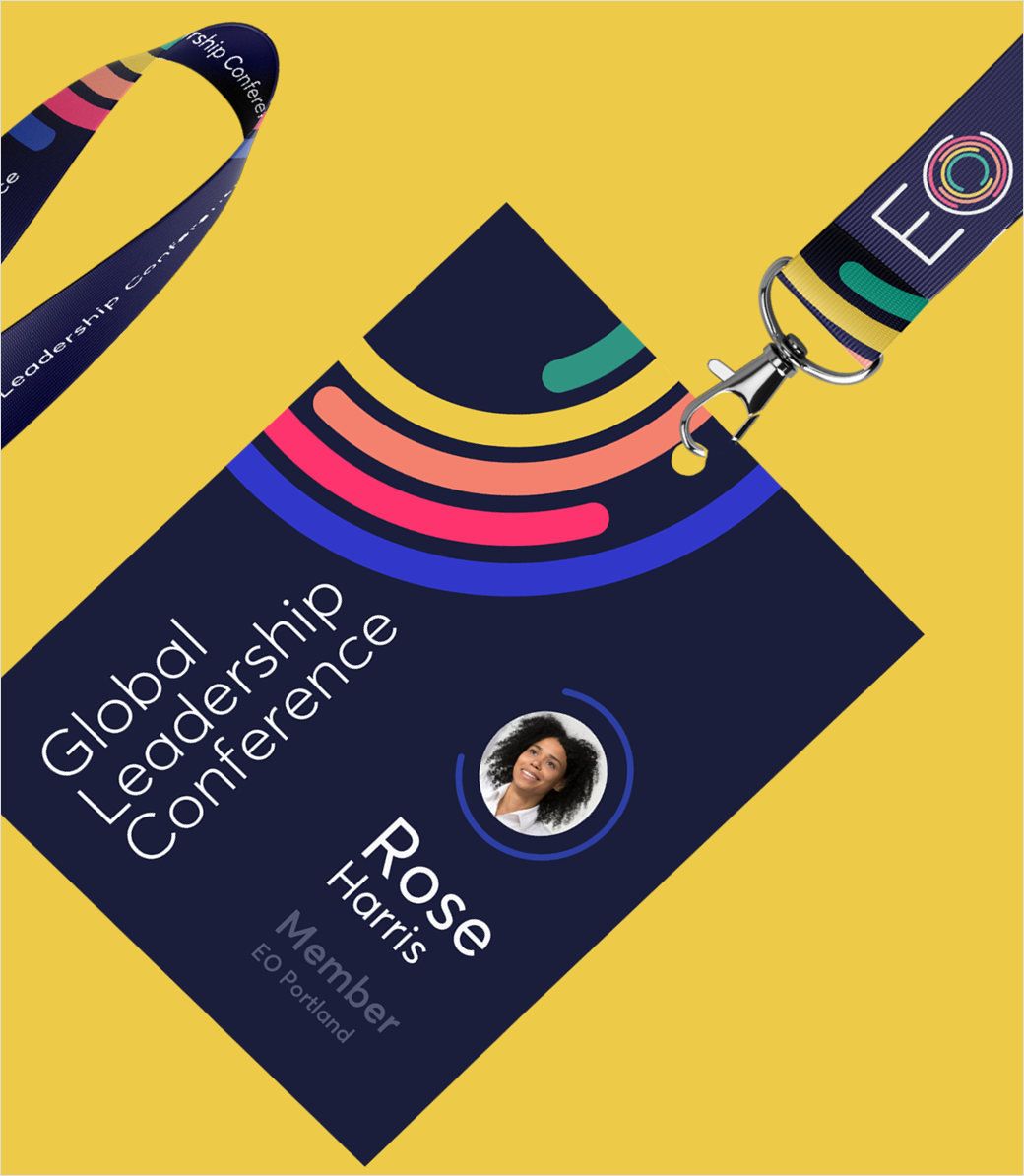
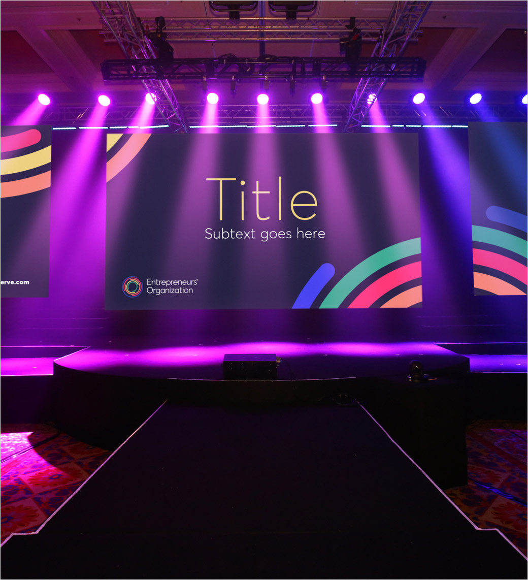
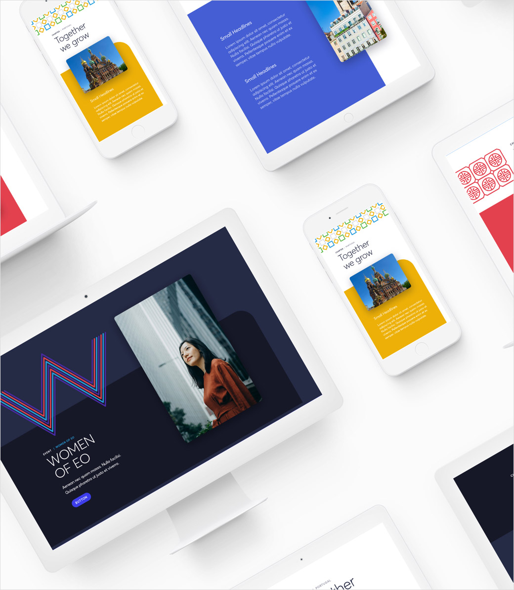
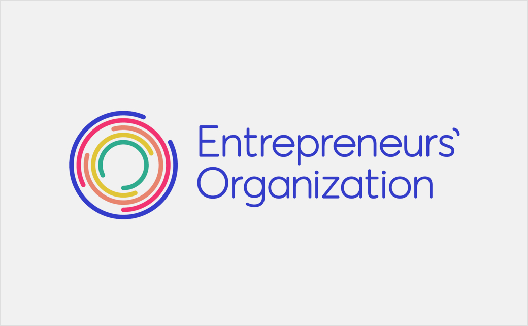
To subsequently bring this new positioning to life, the agency worked with EO’s in-house creative team to deliver a new visual identity system, including an abstract logo design that is claimed to graphically represent “the life-enhancing connections that members form within EO”.
“A dual notion of dynamism and amplification lies at the heart of the new visual system. The multiple lines within the logo also hint at the nature of the relationships that form – the lines appear to be interacting and influencing one another, connecting together, springing out of one another and taking each other on a journey,” explains the design team at Brandpie.
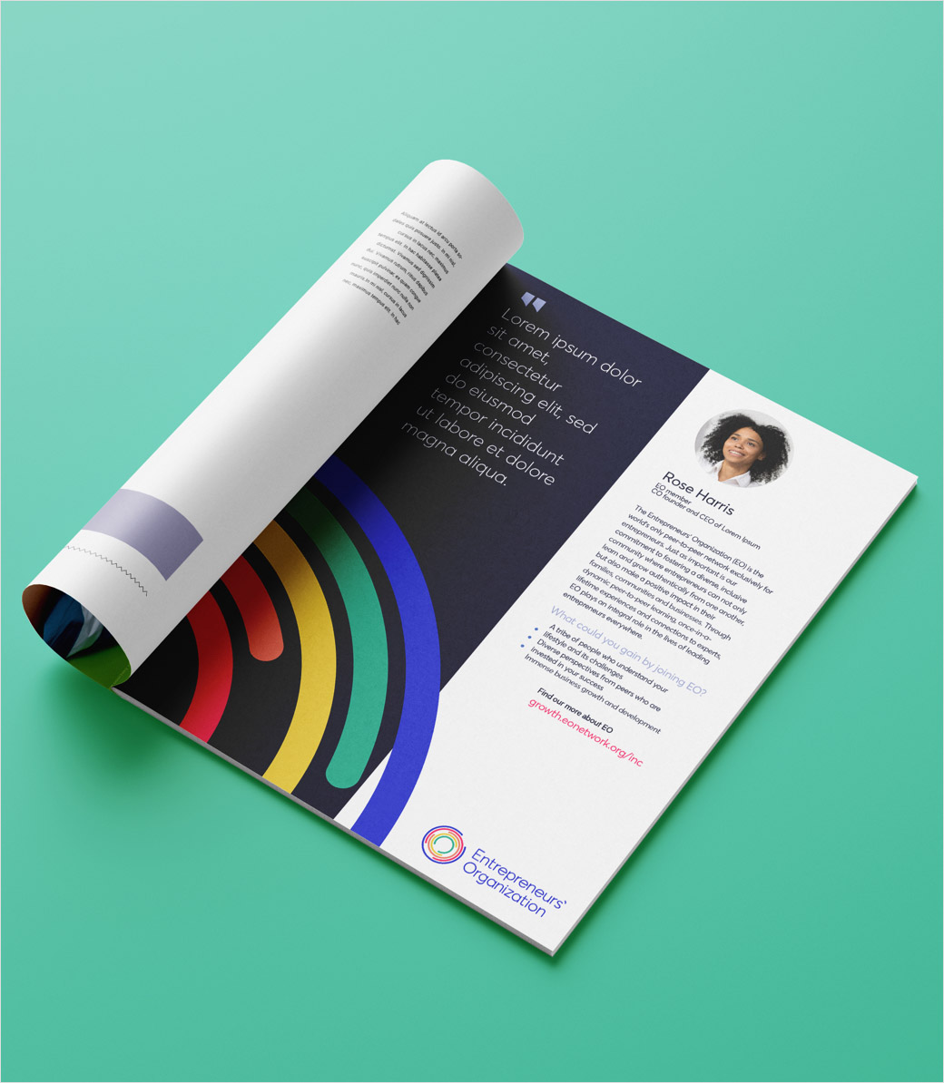
The new look also includes an updated sans serif font, and a “friendly” colour palette that represents “the organisation’s dedication to inclusion, growth, and connection.”
“This transformation reveals the core of human connection that lies at the heart of EO, and will help them achieve new heights through a purpose-led strategy,” concludes Haslam.
The new EO brand is now live.
Brandpie
www.brandpie.com


