AmeriCorps Reveals New Name, New Logo
Global brand consultancy Brandpie has created a new visual identity and brand strategy for the Corporation for National and Community Service, the first major update for the government agency since it was created 25 years ago.
Operating in the USA since 1993, the organisation will from now on be called "AmeriCorps", although from a legal perspective it will retain its former name.
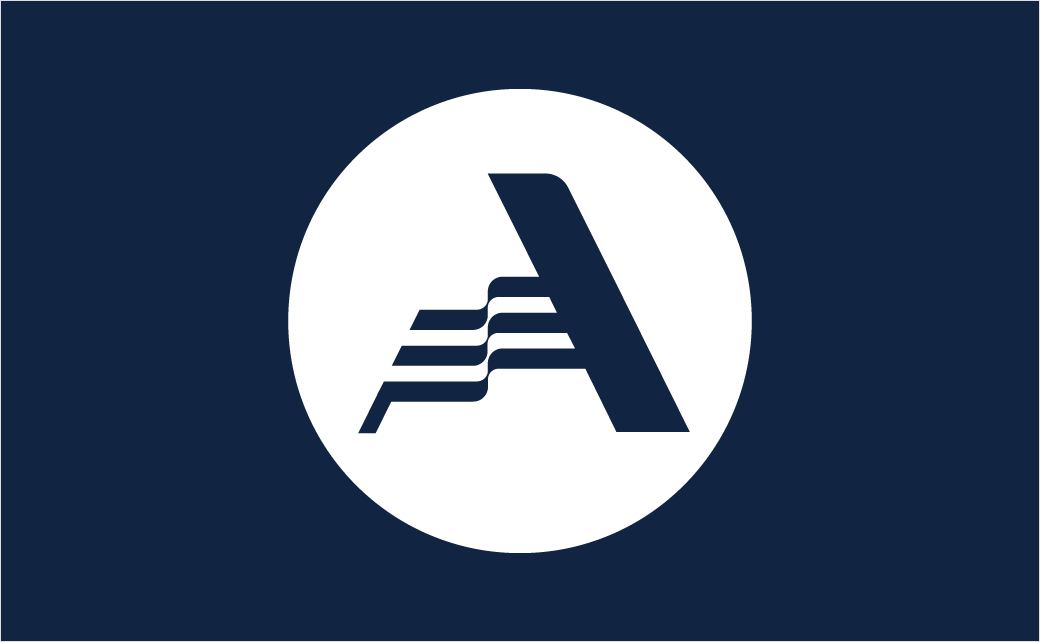
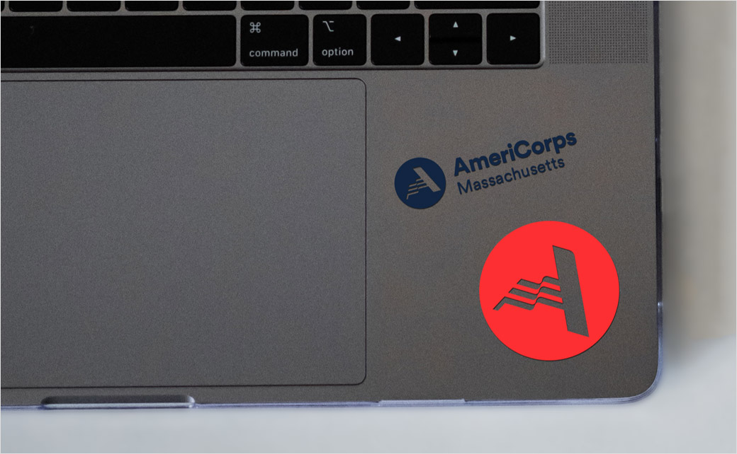
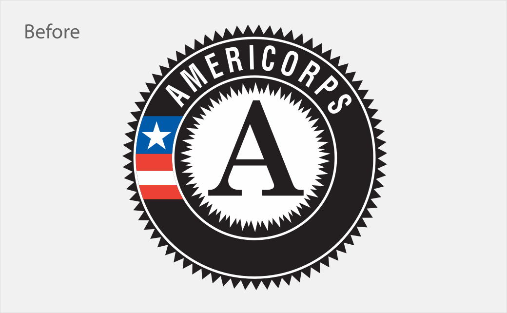
Along with a new name and brand strategy, the agency also unveiled a refreshed logo, which blends the letter 'A' with an American flag.
"We wanted to utilise the equity built around the heritage of the ‘A’ in the existing logo, but display it in a way that was surprising and unique," explains Rik Haslam, executive creative partner at Brandpie.
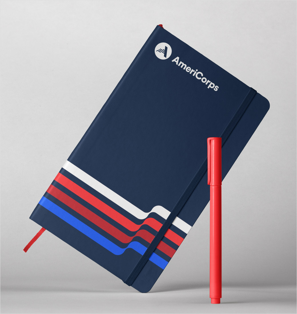
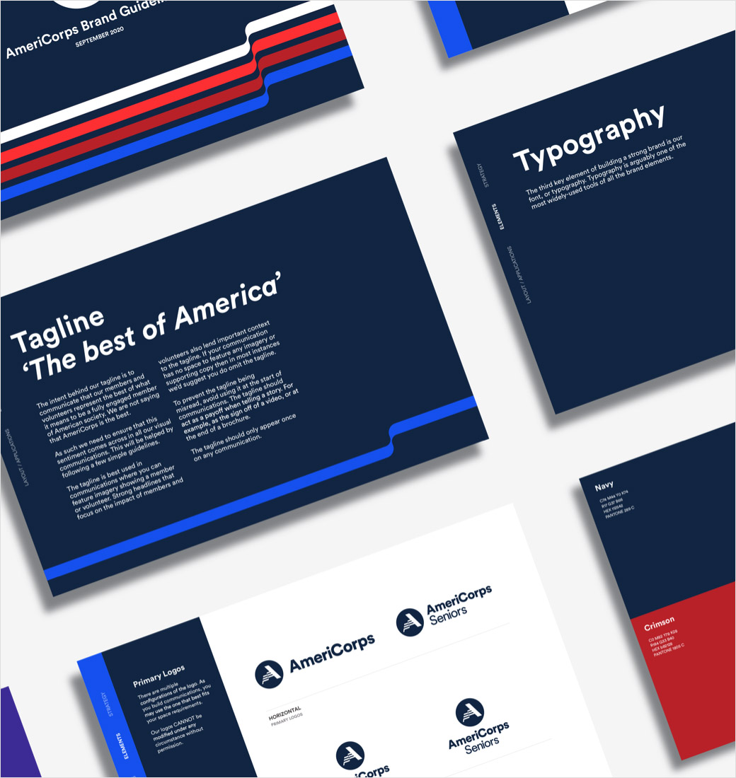
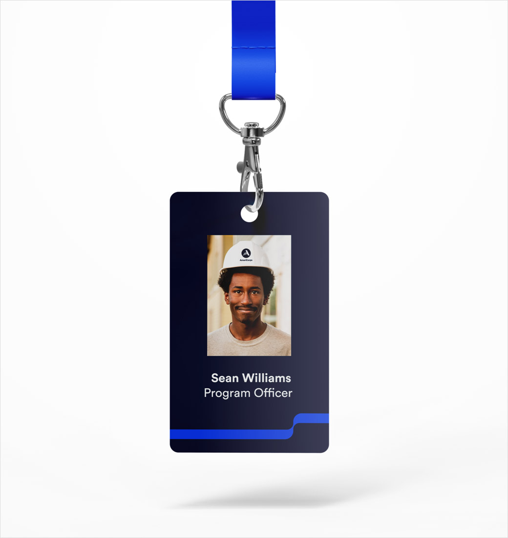
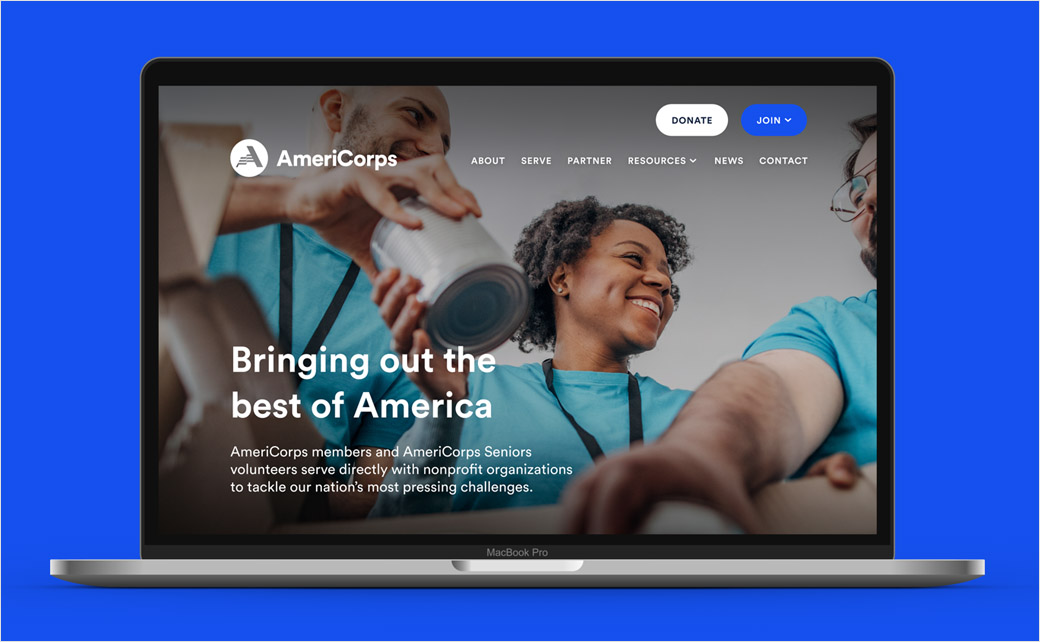
Other key elements of the new identity include an updated colour palette and a new contemporary typeface, while a redesigned americorps.gov website is also said to be in the works.
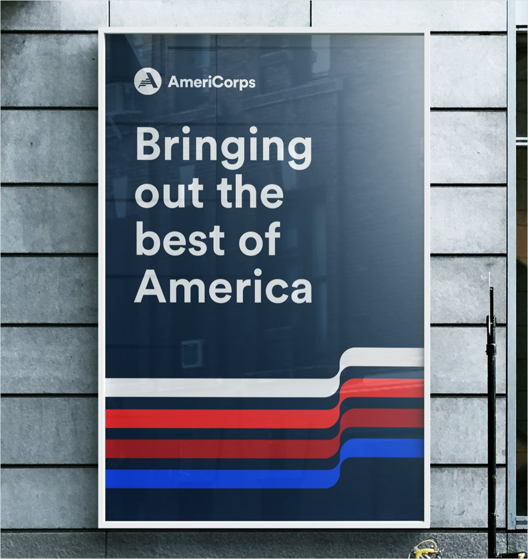
Additionally, a refreshed tone of voice and messaging framework introduces a new tagline, namely, "The best of America".
"We couldn’t be prouder to unveil this work for AmeriCorps. We’re confident that by empowering the organisation with a clarified purpose, strategy, and identity, we’ve helped AmeriCorps to showcase its dedication to bringing out the best of America," says Brandpie's US CEO, Marylee Sachs.




Brandpie
www.brandpie.com


