Cornetto Gets New Logo and Packaging by Design Bridge
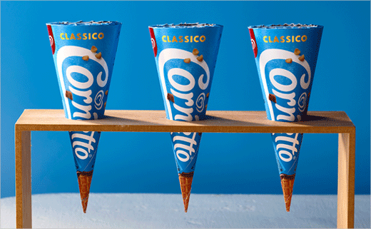
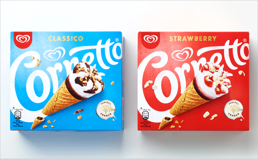
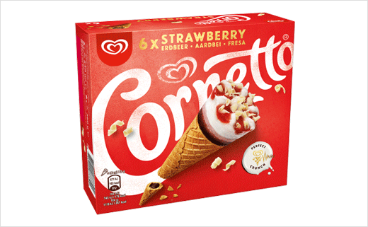
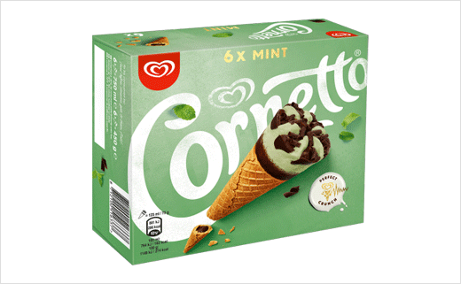
Design Bridge has created the new logo, visual identity and packaging designs for Cornetto.
And representing a first for the famous Unilever ice cream brand, the new look will also be applied across all global markets.
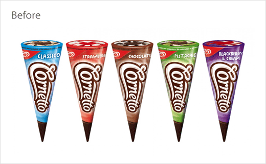
“The current Cornetto brand was being executed by local teams in individual markets, which resulted in inconsistencies in how the brand looked and felt around the world,” explains Claire Robertshaw, executive creative director at Design Bridge. “It also felt outmoded with its young target audience and the way the world of food has moved on. Our challenge was to create the first global visual identity for Cornetto to express the brand’s unique personality in a coherent and distinctive way that also felt relevant and engaging to consumers.”
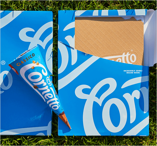
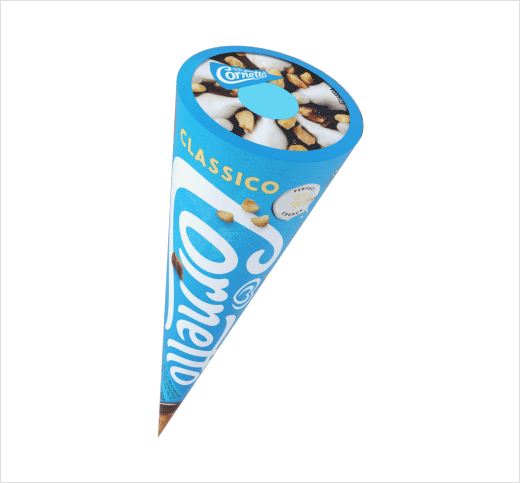
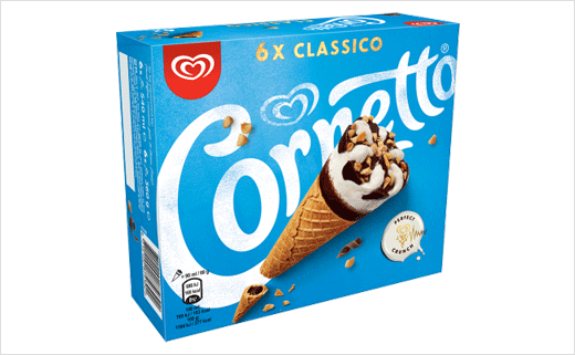
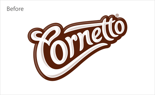
“We kept the ‘creaminess’ and fluidity of the logo but made it simpler to give it a younger, fresher feel. We stripped it of its synthetic and artificial effects so that it reflects the genuine quality and real ingredients of the ice cream,” adds Mike Stride, creative director at Design Bridge.
By overlapping the logo and product photography, the refreshed design is also claimed to bring out the “playfulness and spontaneity” of eating Cornetto ice creams.
This approach is further carried through to the copywriting on pack, with lines like “keep in the freezer (and close to your heart)” and “Best before… (anyone else gets them)”.
Additional details include a new texture on pack as well as a new colour palette comprising “optimistic” sky blue and “real food” colours; previously, the colours were said to vary “widely” from market to market.
Cornetto’s new look is currently rolling out across both physical and digital touch-points, replacing the previous designs created by Carter Wong.
Design Bridge
www.designbridge.com


