eSports Giant ESL Reveals New Logo and Identity
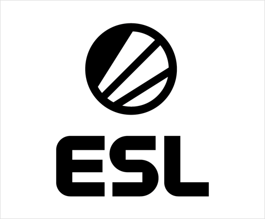
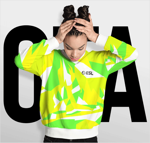
eSports event organiser ESL has revealed a refreshed brand identity, which includes a redesigned logo, bespoke typeface, and the use of a brighter colour palette.
Originally founded in 2000, and formerly known as Electronic Sports League, ESL claims to be the world’s largest eSports company and currently operates high profile, branded international video gaming leagues and tournaments such as ESL One, Intel Extreme Masters, ESL Pro League as well as the ESL National Championships.
The German-headquartered business says its new brand positioning – dubbed “where everybody can be somebody” – reflects that founding story of the company. Having been developed in collaboration with global branding agency Superunion, it is described as “a metaphor for the journey to become somebody and stand out, creating a place for partners, players and fans to stand out too”.
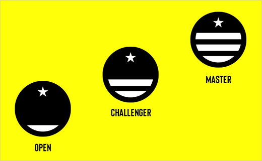
The new look also introduces changes to the way ESL badges its various leagues and tournaments. Adopting a three-tiered structure, it now features “Open” for new entrants, “Challenger” for more advanced players, and “Masters” for the crème de la crème of gaming talent.
“The updated ESL identity is more than a look and feel. It’s a strategic tool that helps ESL to meet its most important objectives,” says Rodrigo Samwell, marketing boss at ESL.


Source: ESL


