Pentagram Updates Rolls-Royce Logo for the Digital Era
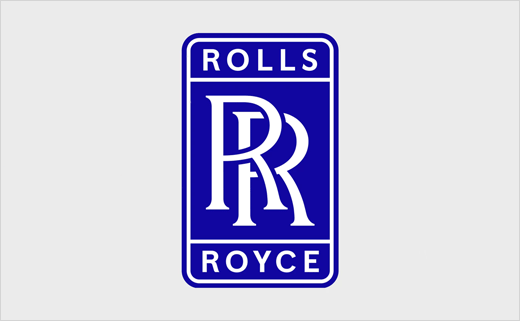
Design agency Pentagram has refreshed the logo and brand identity for Rolls-Royce in an effort to bring “visual continuity across geographies and business channels”.
The famous British car marque was originally founded in 1906 by Charles Rolls and Henry Royce. During World War I the company also entered into aero engine manufacturing.
Although the car division became a separate entity in 1973, eventually being bought by Germany’s BMW in 1998, the aviation-focused division, with its business headquarters in London, ended up becoming the world’s second-largest maker of aircraft engines. Today it is also stands as a major player in the power systems and nuclear technology fields.
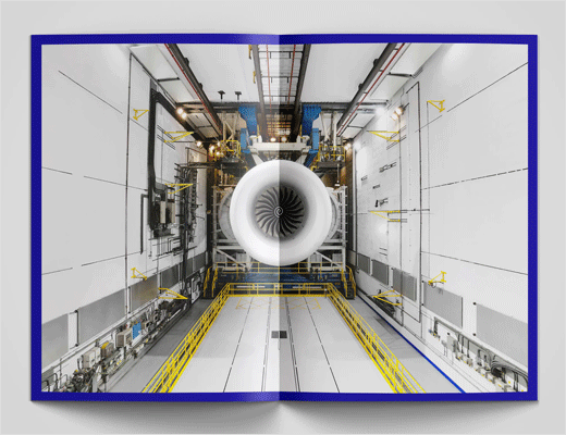
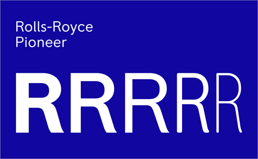
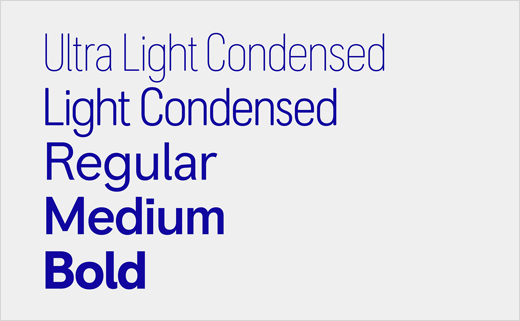
Pentagram says the principal impetus behind the company’s visual revamp, which encompasses a refreshed badge and tagline, newly defined colour palettes, a specially commissioned typeface from the Colophon Foundry dubbed “Rolls-Royce Pioneer”, and a new approach to icons, infographics and motion graphics, was to ready the brand for the digital era.
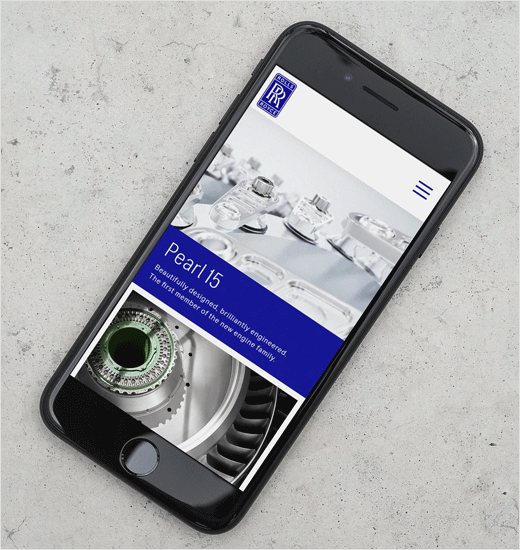
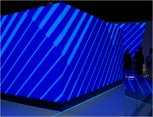
“The challenge for the designers was fine-tuning the brand for the small-space digital world, where it can be difficult to make a visual impact with detailed marks,” explains the agency. “At the same time, the branding had to be effective in the physical world, where identities come to life in large-scale, environmental applications.”
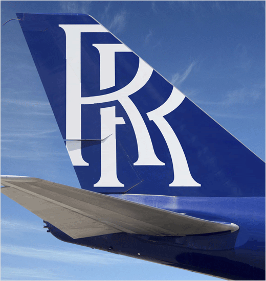
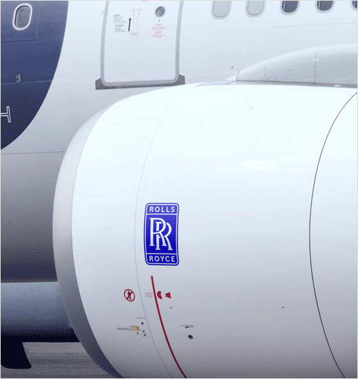
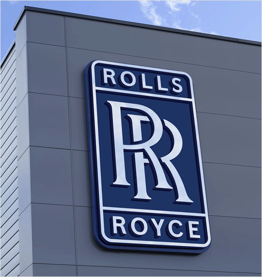
Retaining the famous double ‘R’ that is synonymous with Rolls-Royce, Pentagram’s designers therefore simplified the company’s badge by removing the external wordmark as well as tweaking the geometry of the double ‘R’.
“The refresh brings simplicity and clarity, with an increased emphasis on digital applications and an increasingly international audience,” claim the designers.
Rolls-Royce launched the refreshed brand identity at the 2018 Farnborough Airshow.
Pentagram
www.pentagram.com


