Virgin V Festival Gets New Logo and Branding by Form
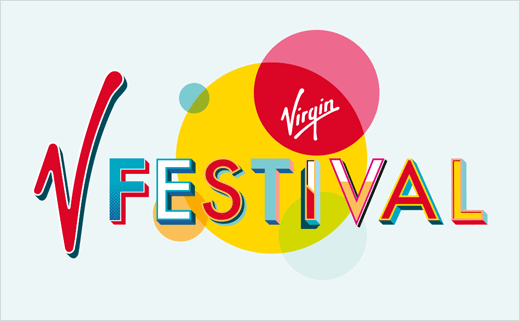
Form creative partners Paul West and Paula Benson have designed a new logo and visual identity for the Virgin V Festival, which celebrated its 21st Birthday last year with headliners Rihanna and Justin Bieber.
Commissioned by Festival Republic’s Melvin Benn and Paul Glossop on behalf of Virgin V Festival, the new identity has been launched to coincide with first stages of marketing for the event’s 22nd year and will roll out across marketing communications and onsite at the festival parks which are claimed to host 175,000 visitors and 120 acts each year in August.
The logo incorporates a set of bespoke letterforms alongside the Virgin V which has been integrated to work with the new direction and features a new colour palette developed to complement Virgin’s brand. The Virgin logo is encapsulated within a red balloon ellipse, a holding device that is also capable of showing other brand logos from Virgin’s various business partners.
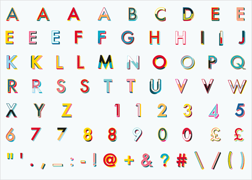
The logo’s letterforms are drawn from an entirely bespoke alphabet and set of numbers and glyphs that Form have created in collaboration with traditional sign-writer and artist Archie Proudfoot.
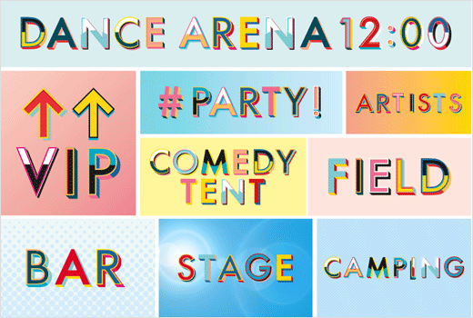
Form says it had previously discovered Archie’s work at an art fair and felt his approach – which hints at fairground and circus semiotics – reflects the celebratory feel of the festival. The bespoke typeface will be used across all touch points from social media messaging to signage and merchandise.
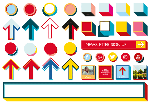
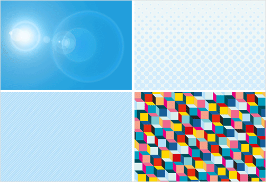
Additionally, Form has created a series of graphic devices consisting of 3D boxes, circles, arrows and background patterns that will house line-ups, news, announcements and social media posts.
“The Festival embraces many styles of music with a big rock headliner one year to a pop act the next, so we felt the new identity should communicate an upbeat, optimistic summer experience of music and good times,” says Benson.
“The opportunity to create an identity for a festival of this magnitude through mainly typographic means is an accomplishment we’re very happy with. Collaborating with artist Archie Proudfoot, whose work we admire greatly was a pivotal moment,” adds West.
Form
www.form.uk.com


