Canadian Airline WestJet Unveils New Logo and Livery Design
WestJet – said to be Canada’s second largest air carrier – has unveiled a new logo and livery design.
In terms of the refreshed logo, the font has been updated to Bliss, to give the WestJet wordmark “a more uniform and current style”. The logo also now uses a single colour to soften the regional emphasis on the word “West”.
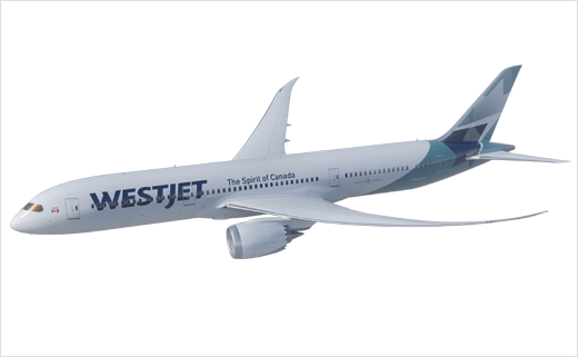
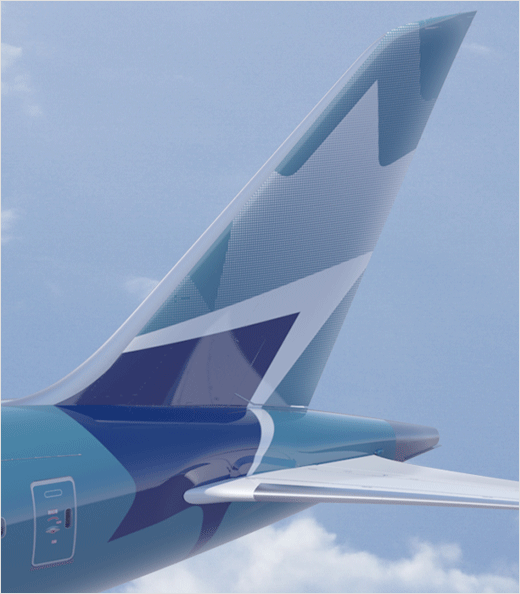
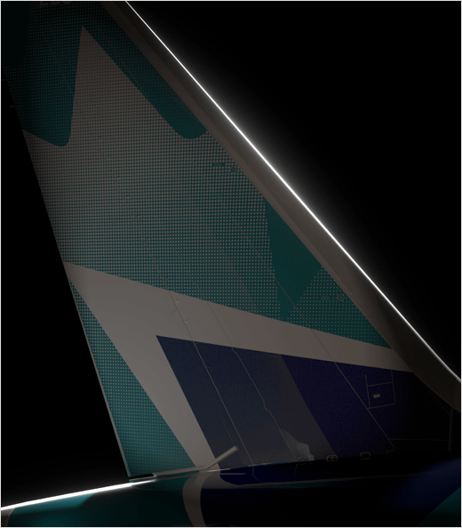
The revised livery, meanwhile, features an updated stylised maple leaf on the aircraft’s tail, as well as the display of the Canadian flag at the front of the plane as a further nod to the company’s North American roots.
The new system also marries both of Canada’s official languages with, “The Spirit of Canada” appearing on one side of the aircraft and the French translation, “L’esprit du Canada” on the other, both extending across the middle of the aircraft fuselage.
“The updated livery is modern and dynamic while the interior is world-class, distinctly Canadian and uniquely WestJet. Both reflect WestJet’s transition from a regional airline in 1996 to a new era of connecting Canada with the world and bringing the world to Canada,” says Ed Sims, WestJet president and CEO.
The creation of the refreshed identity was overseen by Ove Brand Design, while Teague, a Seattle-based design firm, implemented the design on the aircraft.



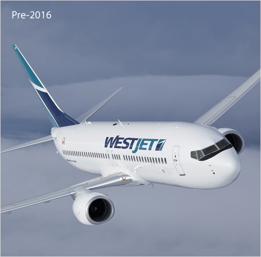
Source: WestJet


