Firehook Launches New Logo and Packaging Design
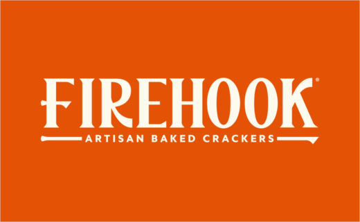
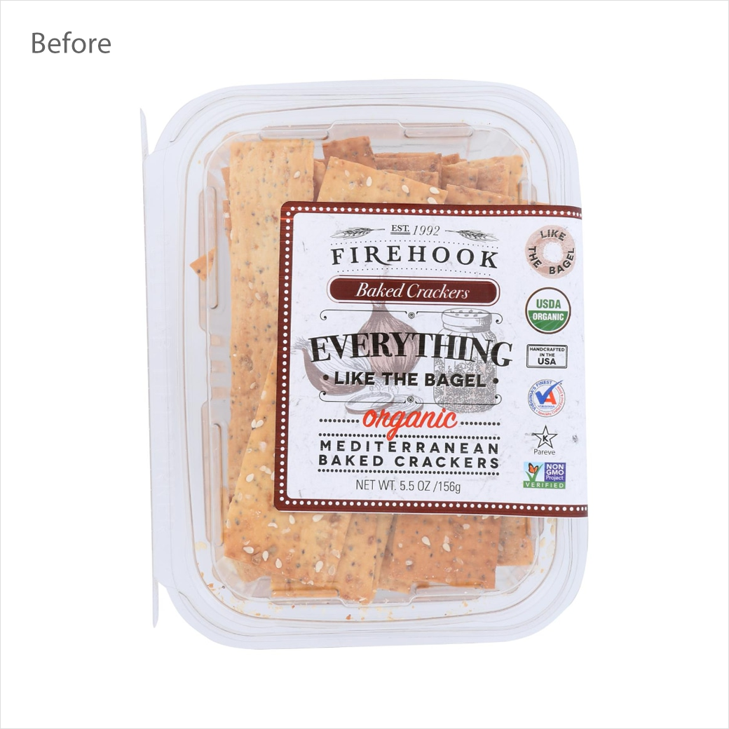
Firehook, the cracker brand, has launched a fresh new appearance for its entire product range.
The rebrand – which has been led by design firm Stranger & Stranger – is claimed to unite the American company's "proud past with its boundless future".
"The redesign boldly places the Firehook name front and centre as a proud celebration of the brand's roots, while hand-illustrated graphics honour the simplicity, flavour, and premium ingredients found in each craveable crunch," says the Virginia-headquartered firm.
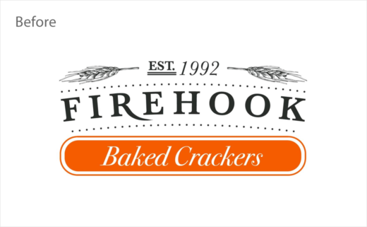
"At the heart of this evolution is a refreshed Firehook orange logo using a crisp, clean, more modern typeface. As an homage to the brand's baking heritage, the logo incorporates a stylised 'fire hook' into the design, inspired by the iron tools used by the earliest bakers to retrieve goods from blazing stone ovens," further explains the design team at Stranger & Stranger.
Adding: "The orange brand colour represents literal fire, but also the passion Firehook pours into every small batch made on premise in Chantilly, Virginia. Additionally, it reflects the undeniable energy and optimism Firehook crackers bring to any and every snacking occasion, fuelling everyday moments and feel-good gatherings."
"Our goal was to reimagine Firehook Crackers' artisanal look – infusing it with boldness, modern energy, and a spark of liveliness, all while honouring the soul of their handcrafted roots," comments Cosimo Surace, group creative director at Stranger & Stranger.
Firehook Crackers is set to launch its updated branding in U.S. stores this spring, along with a redesigned website.
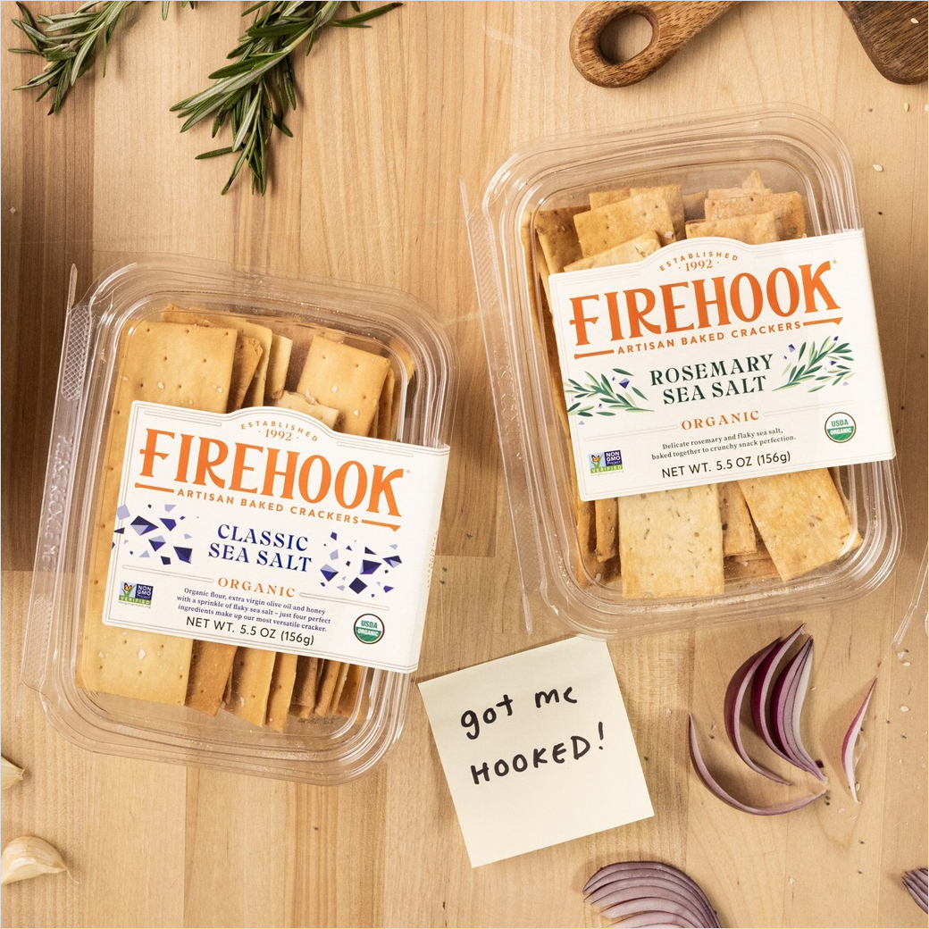
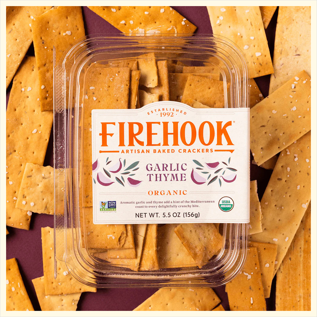
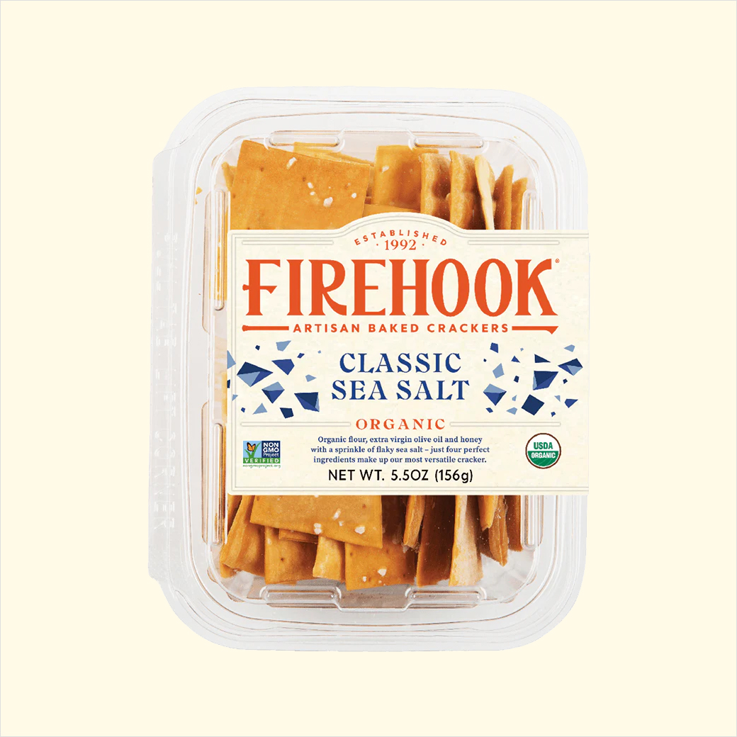
Source: Firehook


