B&B Studio Refreshes Packaging Design for Pip & Nut
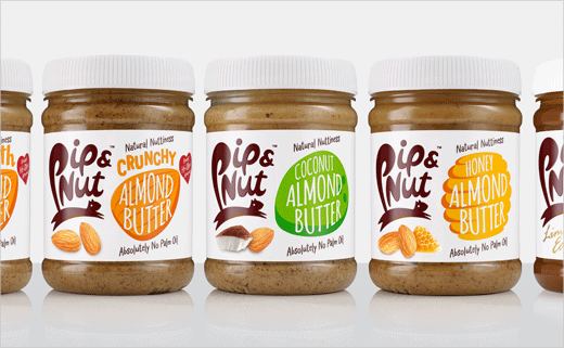
B&B studio has refreshed the packaging for Pip & Nut, which is said to be the UK’s fastest growing all-natural nut butter brand, created by the agency back in 2015.
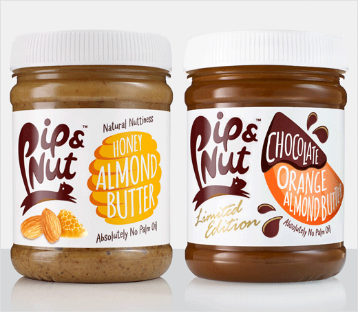
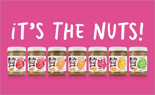
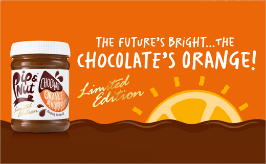
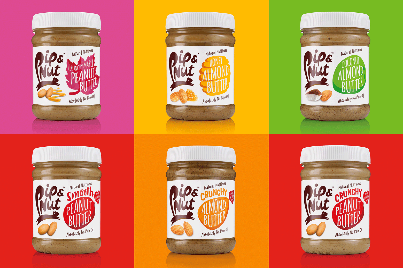
The new look rolls out across the range from this month, and uses revised iconography and pops of colour in an effort to create increased product differentiation across a growing range of flavours.
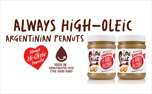
Clear ingredient iconography has been added front and centre to help call out some of the brand’s USPs, such as ‘Always high oleic peanuts’, while back of pack icons for recipe ideas and ‘Pip’s Top Tips’ build on the brand’s focus on "flavour and fun".
The Pip & Nut logo still remains the brand’s strongest asset on pack, but the designers say the injection of colour, as a marker of each flavour, helps the products stand out even more among its more "traditional-looking" competitors.
"It’s a sign of Pip & Nut’s success that the brand has grown quickly and been able to launch new variants. As a result, we’ve needed to help the design work a little harder to guide consumers through the range," explains B&B studio's creative partner, Shaun Bowen.
"As we continue to grow the range and bring new flavours into the fold, we want to make sure it’s as easy as possible for our consumers to differentiate between the products and believe our new look achieves just this," adds Pip & Nut founder, Pip Murray.
B&B studio
www.bandb-studio.co.uk


