Bulletproof Coffee Introduces New Logo and Packaging Design

Coffee brand Bulletproof has unveiled a major visual makeover.
Known as butter coffee or keto coffee, bulletproof coffee is a high-calorie beverage made with added fat, intended to replace traditional carb-heavy breakfasts.
It was created by Dave Asprey, the American entrepreneur and author behind the Bulletproof diet.
After being inspired by yak butter tea he had in Tibet, Asprey introduced his Bulletproof-branded products in 2011.
"This rebrand is about more than just a new look, it's a reflection of where we're headed," comments Andy van Ark, current chief commercial officer of Bulletproof. "We've evolved alongside our consumers, and today's Bulletproof is focused on energising and empowering consumers to own their day."
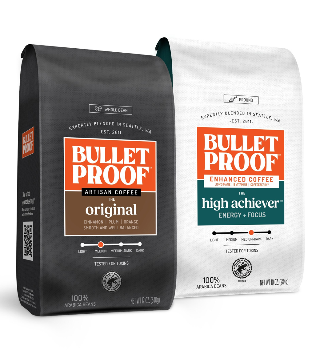
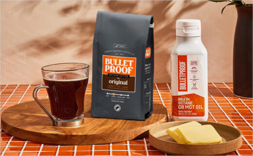
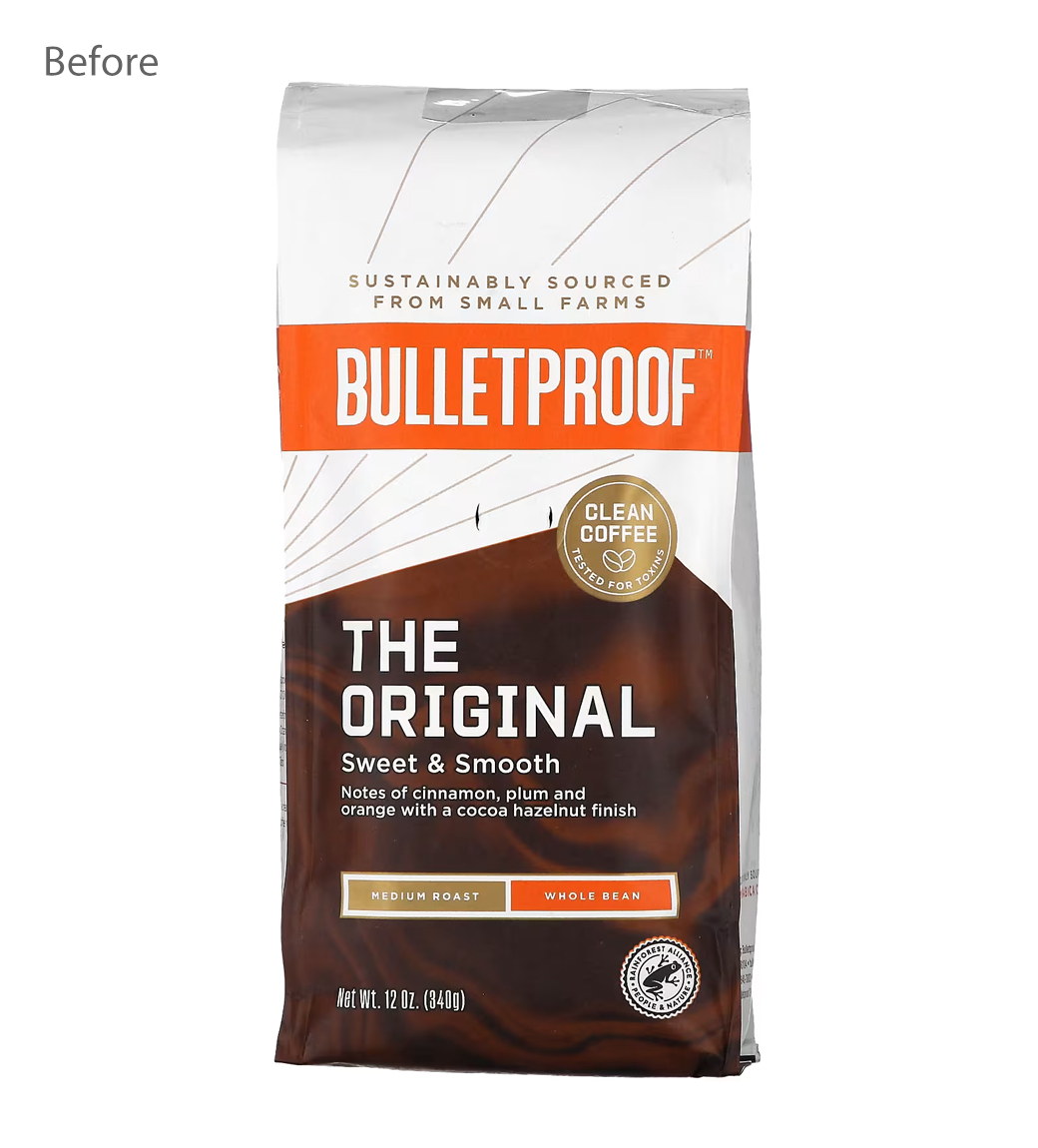
The rebrand features all-new packaging across Bulletproof's entire coffee portfolio, with a design that is claimed to have "a more premium, elevated feel" than previously.
"Bulletproof's refreshed visual identity is led by its signature Resilient Orange, a bold and energising colour chosen to reinforce the warmth and momentum behind every sip," says the company.
Apart from design, the brand has also revised its language and tone "to be more approachable and benefit-driven".

Source: Bulletproof


