Quorn Gets Logo and Packaging Refresh by Bulletproof
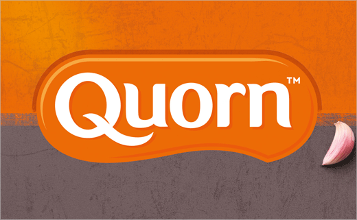
Strategic brand and packaging design agency Bulletproof has created a new global brand identity and packaging design for meat-free brand Quorn as part of a £10m relaunch. Bulletproof was appointed to the project in August 2016 by brand owner Quorn Foods.
Founded in 1985, Quorn is currently said to be the leading meat-free brand in both the UK and Ireland, and has recently expanded into France and Italy as well.
With a goal to accelerate worldwide growth for the brand, Bulletproof was briefed to create a contemporary new brand identity and packaging system for Quorn that would attract an even wider consumer base.
"An opportunity was identified to broaden the appeal of the brand by targeting 'Healthy Discoverers' – consumers actively looking for healthy, nutritious, exciting and flavoursome meat-free dishes, rather than settling for the staid and apologetic category norms," says Bulletproof.
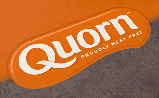
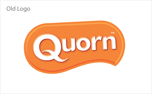
"With regards to the logo update we have completely redesigned the font used in the logotype. We believe there's real equity within the 'Q' and wanted to retain and enhance the flick within the tail; this goes on to cradle the 'u'. We continued this theme by adding little flick serifs into all the letters to build an overall ownable look.
"We then turned our attention to the holding shape, which we reduced the height of and tightened more to the letterforms. We wanted to keep an oven badge-like aesthetic, enhancing it with simple modelling effects."
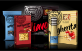
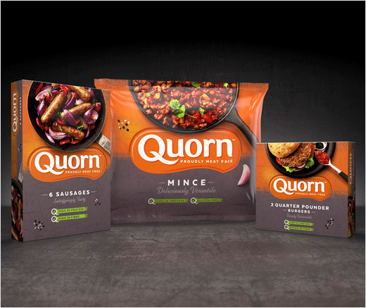
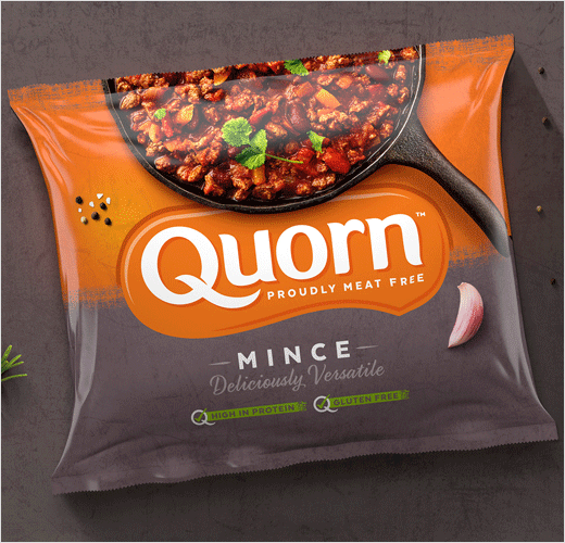
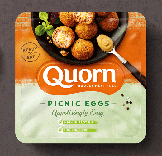
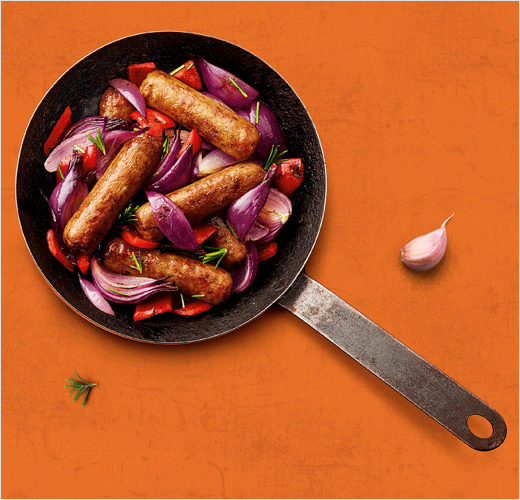
The addition of a new 'Proudly Meat-Free' brand tag line completes the logo redesign, while the packaging gets editorial-style food photography shot top down by Andy Grimshaw. In an effort to reinforce the brand name, a subliminal 'Q' is also formed throughout the photography, either with the handle of a dish or cutlery resting on a plate.
For added shelf impact and to aid navigation within the range, the designers have further introduced a split colour system to the packs which teams a key brand asset – so-called "Quorn orange" – with a complementary pillar colour to identify the occasion, whether dinner, lunch or on the go.
The new packaging will be rolled out this month.
Bulletproof
www.wearebulletproof.com


