Harlem Globetrotters Reveal New Logo to Mark 100th Season

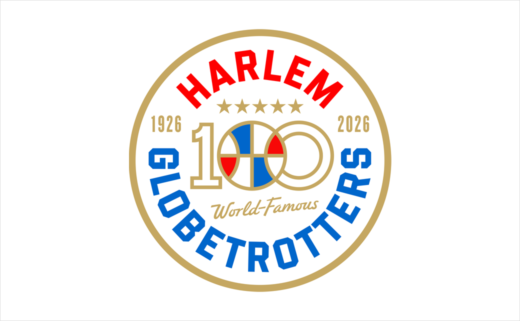
The world-famous Harlem Globetrotters have unveiled their 100th centenary brand logo.
Designed by Matt Lehman Studio of Nashville, Tennessee, the new logo will serve as the key visual emblem for the team as it rolls out its full centenary plans.
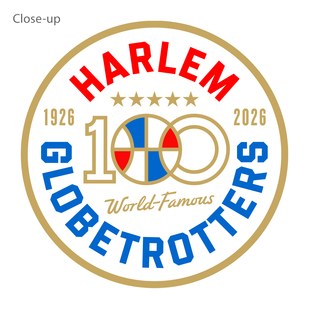
Enclosed within a golden circle, the design showcases the team's famous red, white, and blue color palette, adorned with five stars that represent the original five members of the Globetrotters: Walter ‘Toots’ Wright, Byron ‘Fat’ Long, Willis ‘Kid’ Oliver, Andy Washington, and Al ‘Runt’ Pullins.
The logo also displays the founding dates of the team in Illinois in 1926 and the upcoming official anniversary in 2026. At the centre of the logo, the squad's legendary red, white, and blue ball overlaps the zero, which is claimed to symbolise "the link to past, present, and future".
The nearly 3D-style block letters featured throughout the logo reflect the typography from some of the organisation's early game programs, which remain highly coveted memorabilia among fans.
"We wanted to find the balance of past, present, and future in a fresh new look that was both unique and exciting, whilst paying homage to the many men and women players that have honoured us as Globetrotters. We believe this Centennial logo delivers on all fronts," exclaims Keith Dawkins, president of the Harlem Globetrotters.
Adding: "This mark will connect all of the consumer touchpoints centred around our 100 year anniversary plans. It’s a unifying principle that helps to bring this historic moment to life."

Source: Harlem Globetrotters


