Red Tractor Unveils New Logo Design
Red Tractor, a famous quality mark found on food packaging across British supermarkets, has been given a design overhaul.
The Red Tractor scheme, which at present is the UK’s largest food standards scheme, covering animal welfare, food safety, traceability and environmental protection, was launched in 2000 by the National Farmers Union of England and Wales, with the logo originally known as the ‘Little Red Tractor’, and also the British Farm Standard.
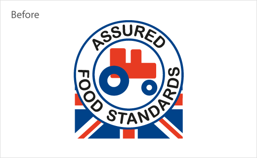
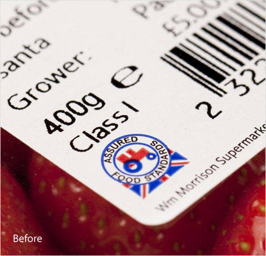
In 2005 the not-for-profit company running the scheme was renamed from “British Farm Standard” to the “Assured Food Standards”.
The latter has been replaced by “Red Tractor” on the new logo, which also features a redesigned tractor – complete with a heart in its rear wheel – sitting on a ‘tick’; the tractor is then placed above a union flag and the words “Certified Standards” that are claimed “to clarify what Red Tractor does”.
“Created 20 years ago to rebuild trust in British agriculture after a spate of food scares, the logo was designed to be very utilitarian. Two decades on, we are facing a new watershed moment, with the market facing huge uncertainty,” says Red Tractor CEO, Jim Moseley. “As we move through this unprecedented time, it is critical that we help shoppers to clearly differentiate which food has been produced and checked to world-leading standards from farm to pack – and the simplest way to do this is to look for the Red Tractor and the tick.”
The new visual identity will be rolled out over the course of the next 18-months, as the UK’s popular food brands update their packaging.
Source: Assured Food Standards


