Scanbot SDK Reveals New Logo Design
Document management firm, Scanbot SDK, has unveiled a new design system, complete with a refreshed company logo and website.
Originally founded in 2011, the German company introduced the consumer document scanning app "Scanbot" in 2014.
That was followed by the Scanbot Software Development Kit (SDK), a B2B scanning solution, later on in 2017.
The updated identity design introduces a number of changes, starting with a new colour palette.
While maintaining the signature Scanbot SDK red, the company has introduced an additional five colours, which are claimed to help communicate important information or actions to users.
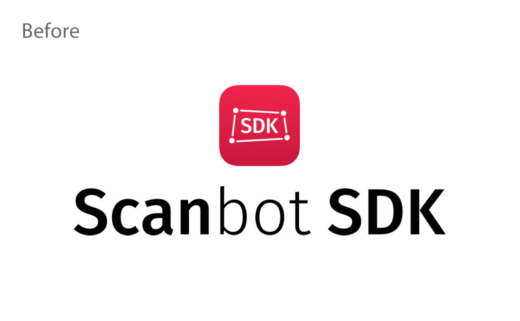
The brand's typography also sees a change, with a move from Fira Sans – described as being too "casual" – to the sans-serif Inter, which is deemed to be "more formal and robust" with better legibility for different screen sizes.
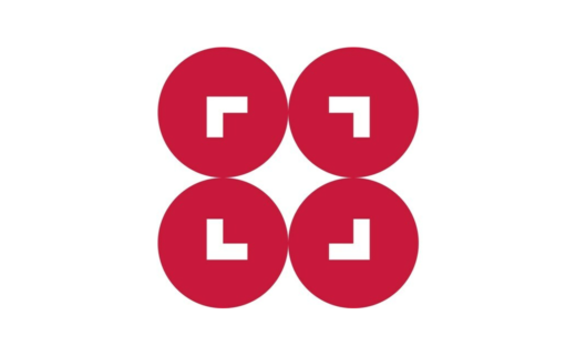
The final piece of the rebranding initiative is an all-new logo, which consists of four red circles along with right angle shapes that mimic a camera viewfinder, while the whitespace between the circles is designed to resemble a camera flash.
"These details encapsulate what Scanbot SDK is all about: enabling fast and accurate data capture and extraction," says the company.
"This rebrand is more than just a visual makeover. It reflects our continual evolution and our commitment to a first-class user experience. We are excited to see this new visual identity bring a fresh perspective to our brand and resonate with our clients," adds company CEO, Christoph Wagner.
Source: Scanbot SDK


