Scorpion Reveals New Logo as Part of Brand Refresh
Scorpion, an internet marketing and technology business ranked at #217 on the Inc. 5000 list of fastest-growing private companies in California, has announced a rebrand to its visual identity.
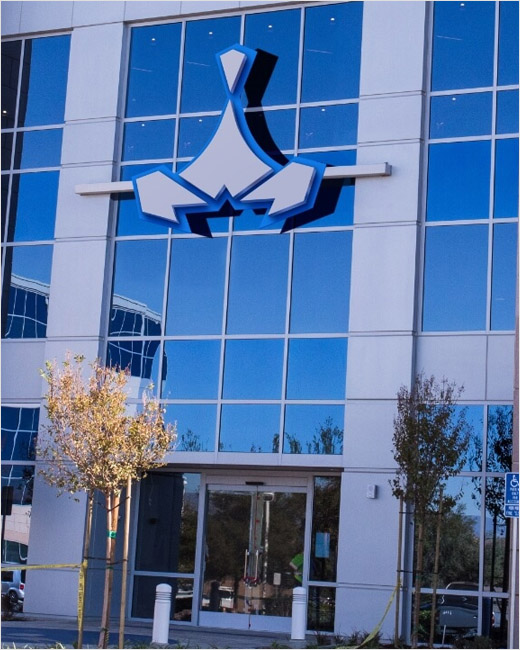
The refreshed logo design is an evolution of the company's previous logo, with a look and feel that is claimed to embody Scorpion's "tireless determination and genuine care for its clients".
The new typeface and colours are further claimed to "reflect the company's approach to their work: energetic, passionate, and innovative".
"It's been over six years since we've updated Scorpion's look and feel in a significant way. The time was right to modernise, streamline and simplify our brand identity," explains Corey Quinn, chief marketing officer, who led the branding evolution.
"Over the years, design tastes and trends change. The new brand identity is not only current and modern but continues to reflect the core ethos of our organisation," adds Quinn. "One thing that remains constant, Scorpion is an ally for businesses. Our relentless drive is to see our clients succeed and reach new levels of success."
"Our vision is to become the most loved, most trusted, and most innovative company in our industry," comments Rustin Kretz, CEO of Scorpion, "and our mission is to build a better way for our clients. The rebrand is not just cosmetic – we've taken this opportunity to evolve and improve our approach in the market as a whole."
Coinciding with the unveiling of the new brand, Scorpion has also launched an updated corporate website.
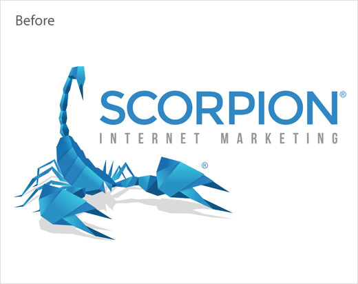
Source: Scorpion


