Staples Reveals New Logo Design
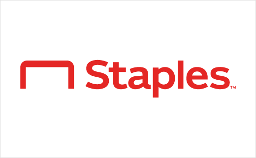
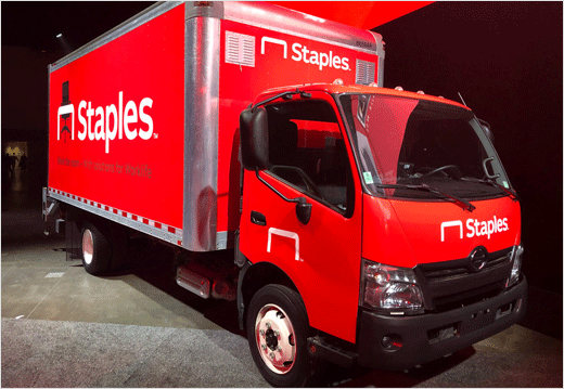
Office supply retailer Staples has revealed an updated logo as part of a major brand refresh.
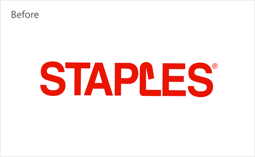
After well over a quarter-century of being known for its slanted "L" logo, the American company is introducing an all-new design that grants the staple a more prominent role, set in what is described as "a friendly and approachable" font.
The revised icon is further claimed to be a more "direct" representation of the Staples’ name.
"Today’s workplace is evolving and so is Staples," comments Marshall Warkentin, chief marketing officer at Staples. "Our new logo is symbolic of the commitment we are making to our customers: they are innovative, forward-thinking problem-solvers, and it’s important for them to know that we are, too."
As part of its new look, Staples has also developed a series of new 'independent' product brands.
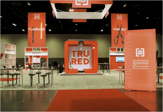
The first sub-brand, dubbed "TRU RED", will roll-out across retail stores starting from next week. It comprises "thoughtfully designed" business essentials such as pens, notebooks, shredders, as well as other organisational-type accessories.


Source: Staples


