TENA Gets New Logo and Packaging by Bulletproof
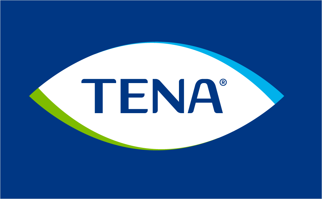
Global agency Bulletproof has created the new identity and packaging design for leading continence care brand, TENA.
The agency was appointed to work on the project back in 2016 by Essity, the Swedish hygiene products group that owns TENA.
The new look forms part of a repositioning exercise that aims to shrug off "the outdated notion that incontinence should be embarrassing, or stop you living the life you want".
Bulletproof comments: "The purpose in the world was clear to TENA; a desire to improve the lives of people with incontinence through better performing products. Yet, its identity and packaging did not capture this sentiment. Our approach was to seek a balance between the emotional along with the more functional information.
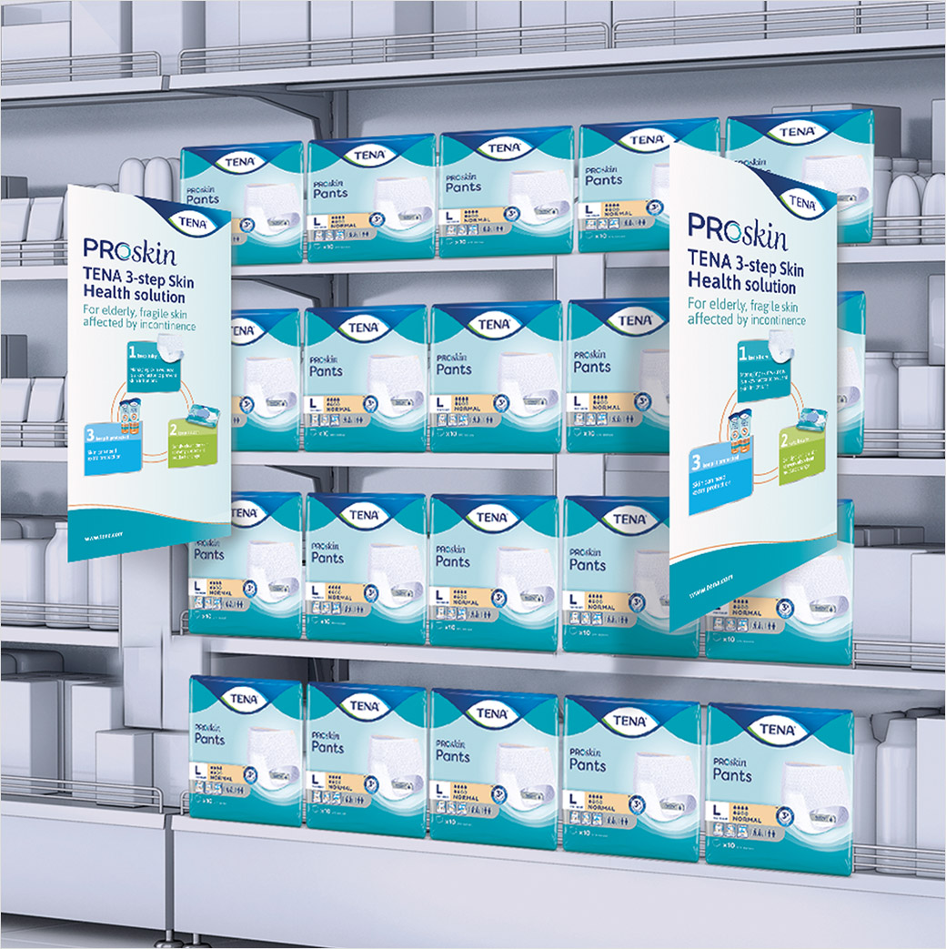
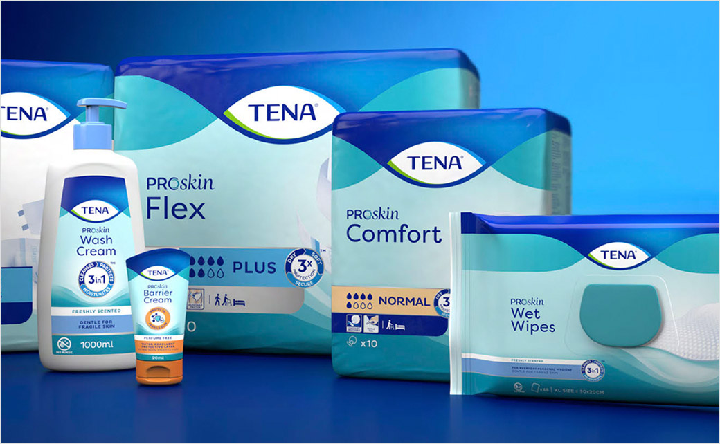
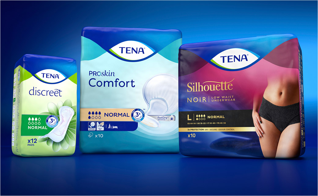
"TENA needed to stretch its appeal to suit customers and consumers alike. Our task was to create a more visually consistent brand identity across its comprehensive product portfolio; drive impact and recognition at shelf; and to build leadership equity.
"At the heart of the new strategy was a simple but powerful idea: TENA could, and should, be about more than just solving a medical problem. For anyone who feels embarrassed by their incontinence, it could also be liberating – empowering, even.
"With all this in mind, we landed on a design concept of ‘Reassuring Performance’ that research identified delivered modern, engaging, clear and enhanced expertise attributes.
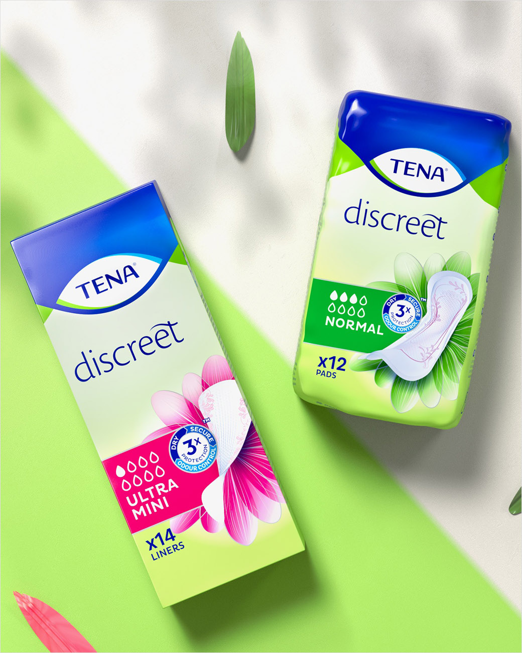
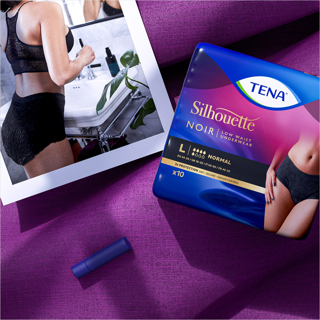
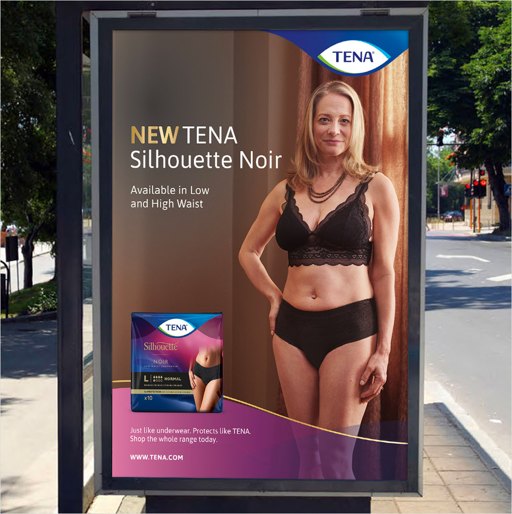
"In a game-changing approach for the sector, we turned the usual 'clinical' approach to the brand’s look on its head. In its place an empowering visual language that de-stigmatises incontinence, and in the case of its TENA Silhouette range, boldly takes its cues from the world of lingerie.
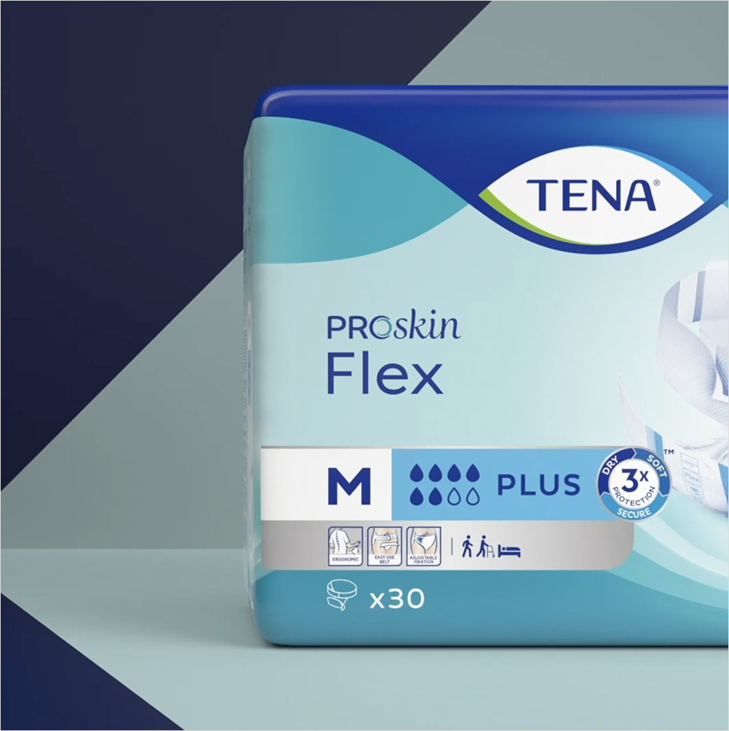
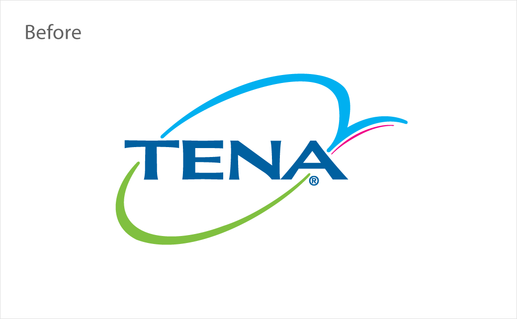
"When it came to the brand identity, we wanted to fully capture the sentiment of liberation via the interlocking, flowing lines of our blue holding shape, through to the eye shape of the brandmark which communicates expertise and reassurance. Placing the branding top and centre surrounded by TENA blue on every single pack helps to create portfolio consistency and instant recognition at shelf.
"With the global master design established across the comprehensive portfolio, we were then able to implement the new design far beyond pack; looking at e-commerce packs, full brand and packaging guidelines, as well as a launch video.”
The new brand identity is being gradually rolled out globally across the portfolio in both retail and B2B channels.
Bulletproof
www.wearebulletproof.com


