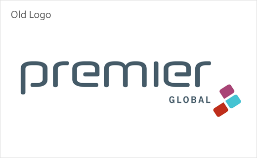
The Clearing Unveils New Logo and Identity for Premier Global
The Clearing has created the new logo, positioning, and identity design for Premier Global, which is said to be one of the UK’s leading education providers of health and fitness professionals.
“We were asked to articulate a clear promise for the Premier Global brand, and redesign the brand experience to help it stand out as a beacon for quality once again,” says the agency. “Despite leading the field in personal training for over 20 years, their brand had been neglected, looked tired and lacked vision. The UK fitness industry has suffered a crisis of quantity over quality, flooding the market with inexperienced and poorly-educated trainers.”
The refreshed look, which is rooted in a new brand promise dubbed “Outperform”, aims to highlight what The Clearing says are Premier Global’s two key strengths; firstly, its partnership with The National Academy of Sports Medicine (NASM), the leading personal training authority in the US; and secondly, the quality of personal training delivered by its tutors, who have now been renamed “Master Coaches”.
“The promise drove the development of the brand identity, including the colour palette choice of black and gold. Black symbolises prestige, while gold signifies a link with the pinnacle of sport achievement – the gold medal, the highest standard possible,” explain the designers.
“We took our inspiration from the world of sport, which is a new approach for personal training education. The new brand identity represents the shift the fitness industry has made towards health, fitness, nutrition and a lifestyle choice,” adds Jon Norton, senior designer at The Clearing.


The Clearing
www.theclearing.co.uk


