The Clearing Creates Look for ‘Gravity’ Health & Fitness Centre
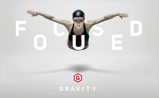
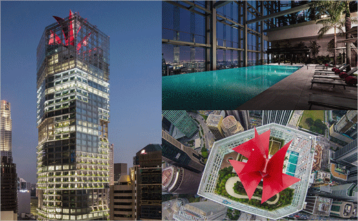
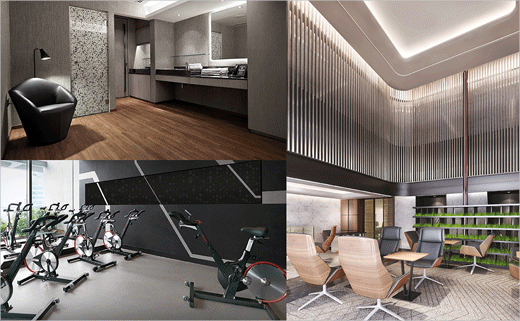
Branding consultancy The Clearing has designed the look for Gravity, which is said to be the world's first 6-star health and fitness centre.
The agency was responsible for creating the brand proposition, name, visual and verbal identity for the private members' club located in Singapore that first opened in August 2015.
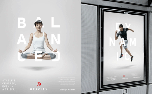
"Our work was founded on the correlation between fitness, wellness and elite executive performance. For us, the brand needed to be positioned to deliver a hyper-personalised experience," says the designers.
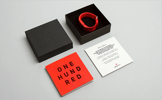
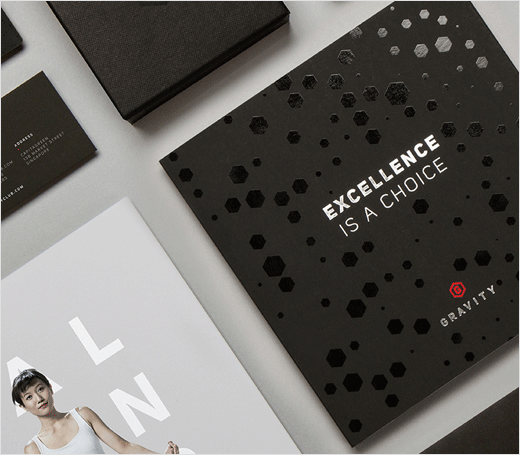
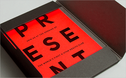
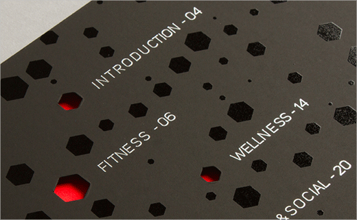
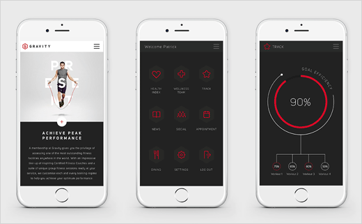
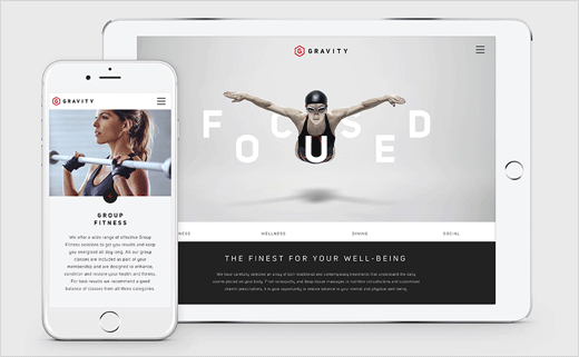
"The brand identity system is deliberately understated and restrained, reflecting the feel of the club. The limited monochrome colour palette plays to luxury cues; flashes of red inject energy and confidence."
The main symbol, meanwhile, uses a hexagon device that is then echoed in a pattern used across the entire brand material.

The Clearing
www.theclearing.co.uk


