Visual Identity for Arch Residential
Arch Residential is a lettings-focused estate agency that operates out of Borough in South East London.
The company approached graphic designer Denis Mallet, of London-based studio DMWORKROOM, to help create a stronger and more memorable visual identity.
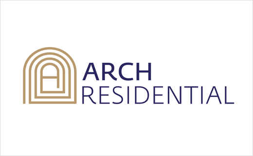
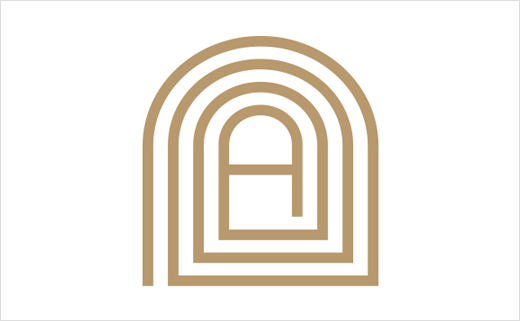
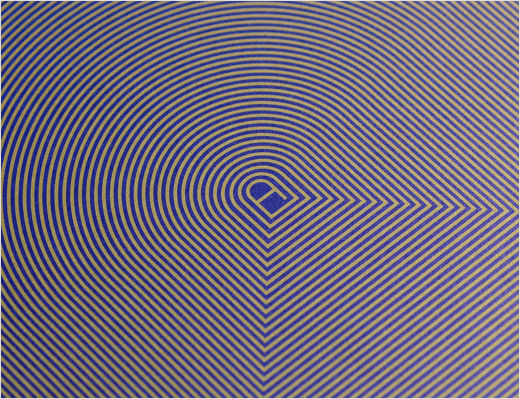
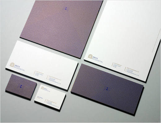
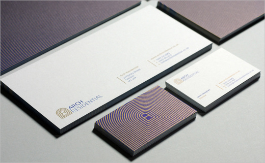
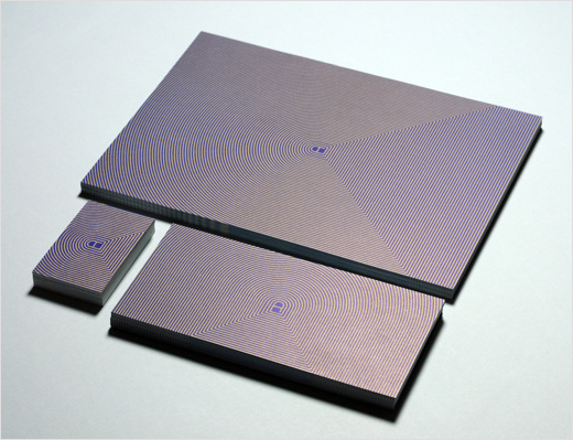
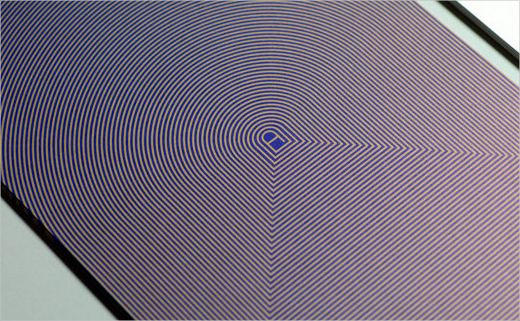
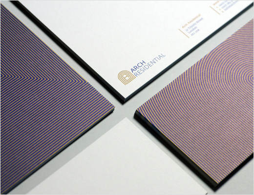
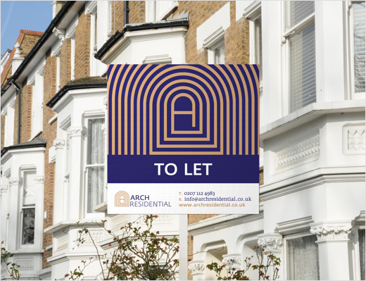
As the main constitutive logo element, Denis created an iconic symbol using the first letter of the business name. The letter A is encircled by a spiral form that is designed to evoke a concept of territorial expansion. In Denis’ view, this visual device also creates greater structural depth and thereby enriches the overall arching construction.
Denis was additionally inspired by labyrinth-style gardens and by certain crescent-shaped London streets that feature such types of communal garden spaces; Egerton Crescent in South Kensington, for example, which was last year declared as the UK’s most expensive street.
Regarding the typography, Denis opted to use Fedra Sans and Fedra Serif A. “It is really important for me to use a serif font to enhance the body text legibility and to keep the sans-serif for the logo, headlines, titles, subtitles and abstract texts,” explains the designer.
“A consistent font family is the best tool to be able to generate harmony as much as distinction and contrast,” adds Denis. Fedra Sans was designed in 2001 and Fedra Serif in 2003 by Peter Biľak.
DMWORKROOM
www.dmworkroom.com www.behance.net/DenisMallet


