‘Well&Truly’ Snacks Brand Given New Look by B&B studio
Baked corn snacks brand Well&Truly has unveiled a new identity, with design by B&B studio.
In a deliberate move away from the brand’s original health-focused positioning, the new look aims to celebrate “taste and satisfaction”.
“As the mainstream and healthy snack sectors begin to converge, B&B was keen to help Well&Truly take advantage of the opportunity to be the better-for-you option within mainstream snacking,” says the agency.
The repositioning therefore sees the introduction of a new tone of voice described as “cheerful” and “upbeat”, which B&B claims gives “increased energy” to the brand.
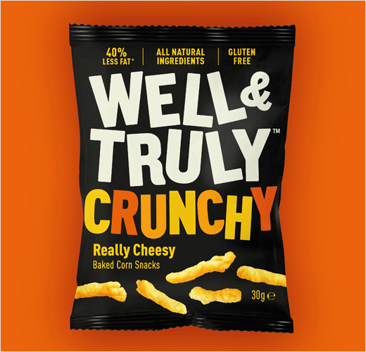
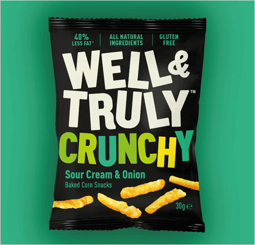
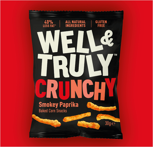
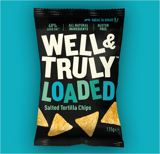
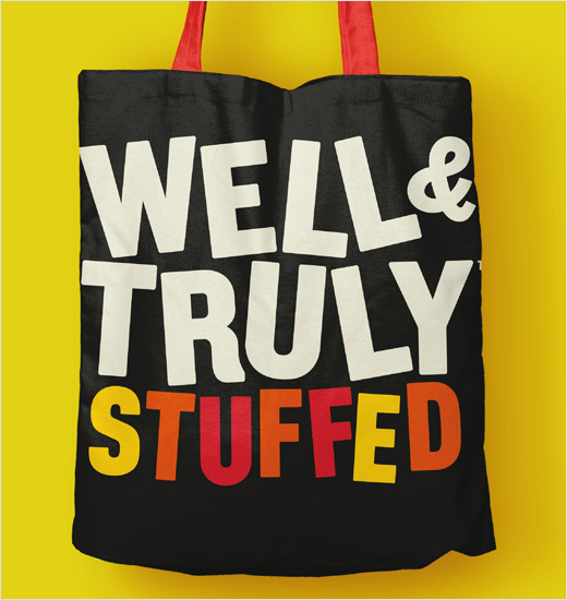
“To achieve maximum shelf standout, B&B turned up the volume on Well&Truly’s visual identity, focusing on the high quality of ingredients and intensity of flavour. A black background on pack – rare within both healthy and mainstream snacking – is brought to life with sans serif type in bright hues and a positive language that focuses on enjoyment,” further explain the designers.
“An underpinning ethos of ‘Positivity not Prohibition’ shines through in the rebrand with a generous, spontaneous spirit that celebrates depth of taste and flavour – not just lower fat content,” adds Shaun Bowen, creative partner at B&B studio.
Well&Truly crunchy sticks are currently available in three flavours – Really Cheesy, Sour Cream & Onion, and Spicy Paprika – with tortilla chips available in Lightly Salted.
B&B studio
www.bandb-studio.co.uk


