WIC Gets New Logo and Identity by Sullivan
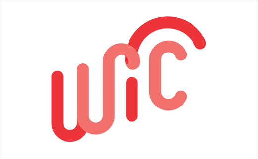
The National WIC Association has unveiled a refreshed visual identity as part of a new ad campaign, designed and strategised by brand engagement firm Sullivan.
WIC is claimed to be the US' most successful and cost-effective public health nutrition program, providing over 8 million mothers and their young children with food, nutrition education and community support.
The relationship began earlier this year, when the National WIC Association approached woman-owned brand engagement firm Sullivan to develop a new visual identity – from logo to campaign site – that would help unite its state-level organisations and raise national awareness of the program available to low-income mothers and children in our country.
In order to develop the new look, the woman-led Sullivan team says it interviewed staff and mothers in the WIC program as well as holding focus groups and surveying stakeholders online.
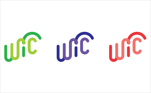
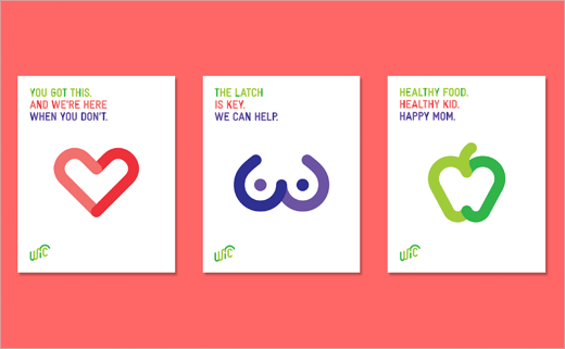
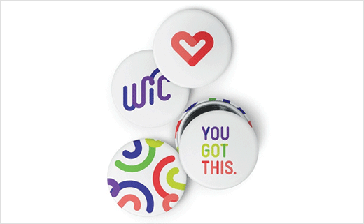
"The logo is the heart of the visual system. Its custom letterforms are active and fluid, signifying WIC's continuous, personalised support at every step of a mom's journey," says Sullivan's creative director, Meg Beckum. "It is complemented by a bright, optimistic colour palette, bold typography, and straightforward iconography."
Sullivan
sullivannyc.com


