& SMITH Creates Logo and Packaging for ‘AYEM’ Breakfast Pot
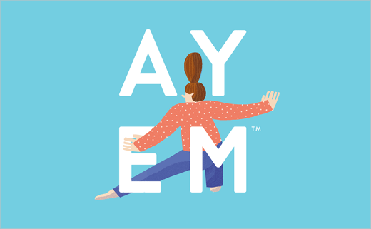
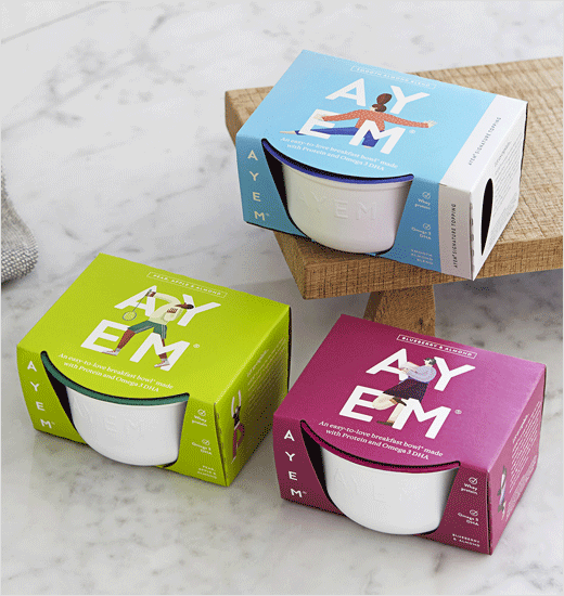
Branding agency & SMITH has named and branded new London-based protein breakfast pot, AYEM.
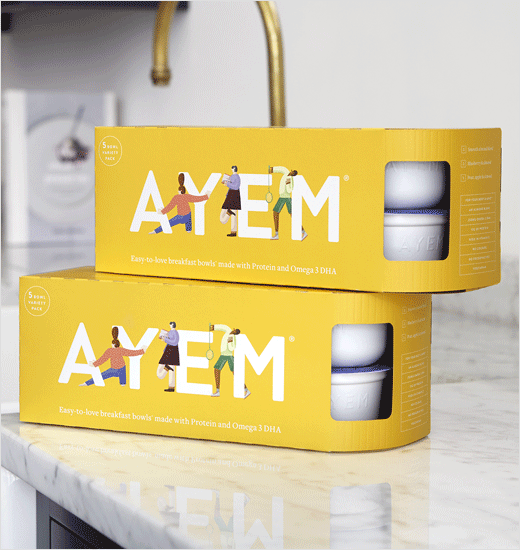
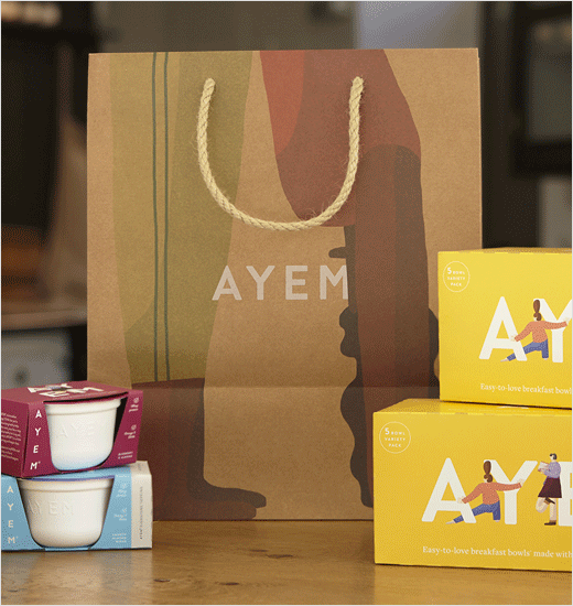
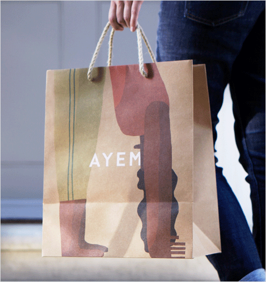
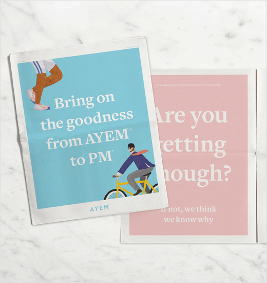
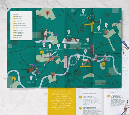
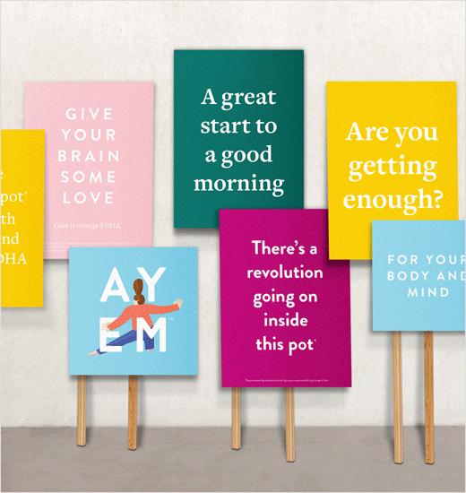
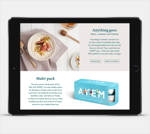
The identity, which encompasses not only packaging and website design but also a pop-up store, aims to position AYEM as a healthy breakfast staple, with a particular focus on its protein and omega 3 content.
“Keen to stay away from a ‘science-y’ look and feel, the identity is straight talking, colourful and playful,” claims the agency.
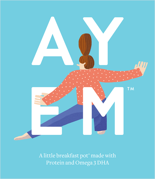
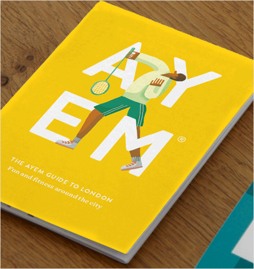
The consultancy also collaborated with illustrator Beth Walrond to create a set of characters that make up the selection of AYEM logos.
“As AYEM can benefit everyone, each character intentionally shows that you don’t have to be ‘my-body’s-a-temple, run-like-the-wind’ level of healthy to do something good for yourself every day,” explain the designers.
“The big thing was to make sure we sold AYEM as ‘food’, rather than a supplement shake or powder style product. It meant that we focused on selling a breakfast pot that happened to be a really good way of getting more protein and omega 3, rather than the other way around. From then on we knew the branding had to fit in with the ‘foody’ crowd and move away from anything to clinical or ‘science-y’,” adds Dan Bernstein, creative partner at & SMITH.
AYEM is currently available online and has also recently launched in Ocado. The brand’s pop-up store is set to follow at Old Street Station in Shoreditch from January 14th – February 2nd next year.

& SMITH
www.andsmithdesign.com


