• rss
  • pinterest
  • twitter
  • facebook
  • inkedin
Logo Designer menu
  • home
  • home
  • about
  • advertise
  • contact
  • submit
  • jobs
  • Advertising
  • Advice
  • Architecture
  • Articles
  • Arts
  • Automotive
  • Books
  • Business & Finance
  • Communication
  • Community
  • Competition
  • Computer & Internet
  • Corporate
  • Design
  • Design Jobs
  • Design Studio
  • Design Tools
  • Education
  • Electronics
  • Entertainment
  • Fashion & Lifestyle
  • Fonts
  • Food
  • Freight & Transport
  • Government
  • Health & Beauty
  • Home & Garden
  • Hotel & Travel
  • Icons
  • Music
  • News & Media
  • Opinion
  • Other
  • Photography
  • Real Estate
  • Religion & Spirituality
  • Science & Technology
  • Social & People
  • Sports
  • TV & Video
  • Web Design
  • pinterest
  • twitter
  • facebook
  • inkedin
search
0

COLLINS Rebrands the San Francisco Symphony

By Editor February 11, 2021

Categories: Music

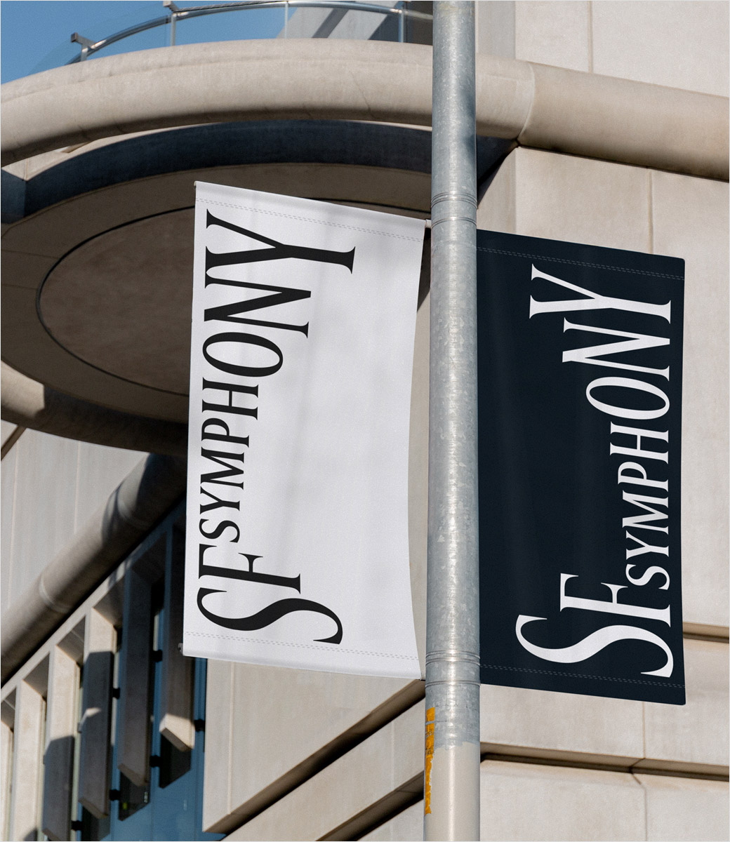
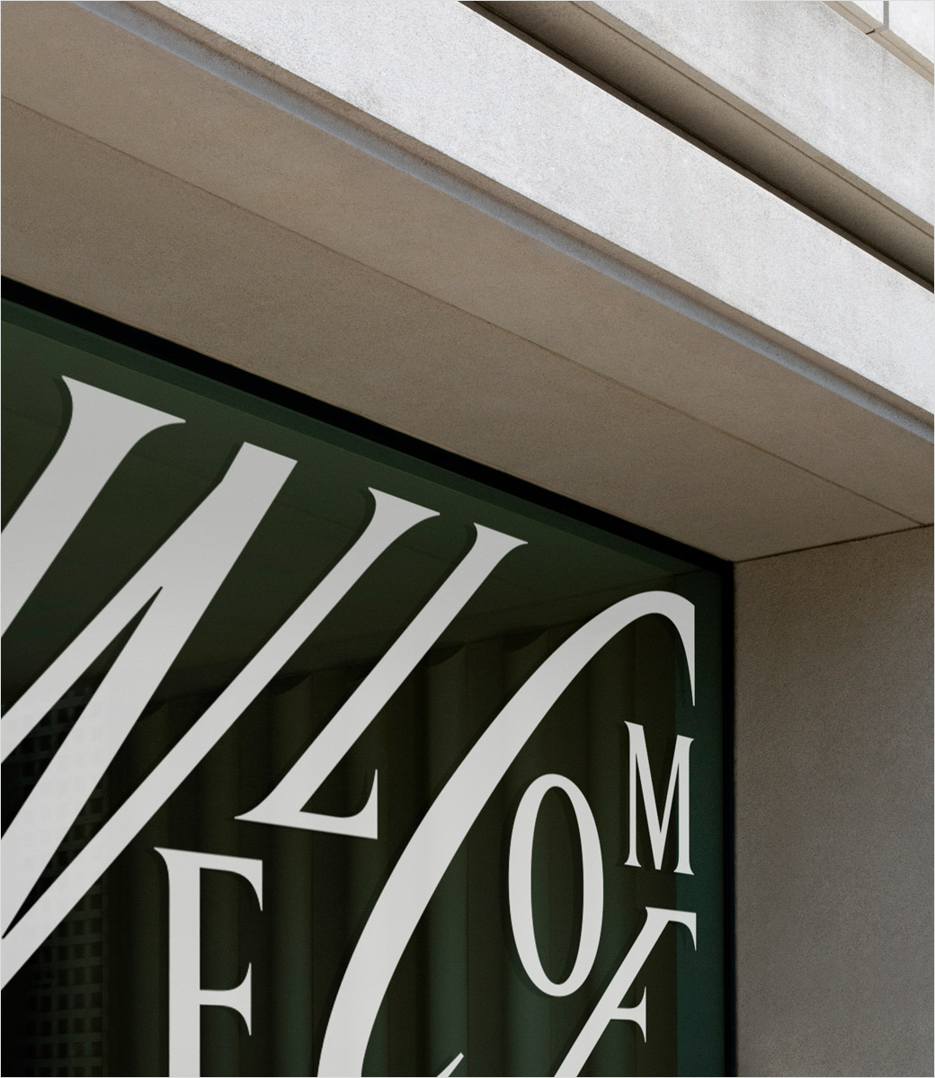
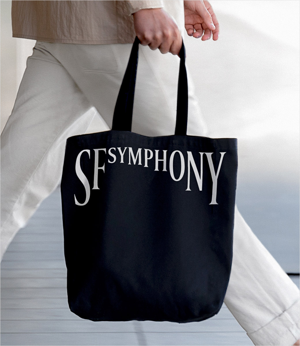
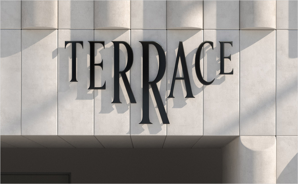
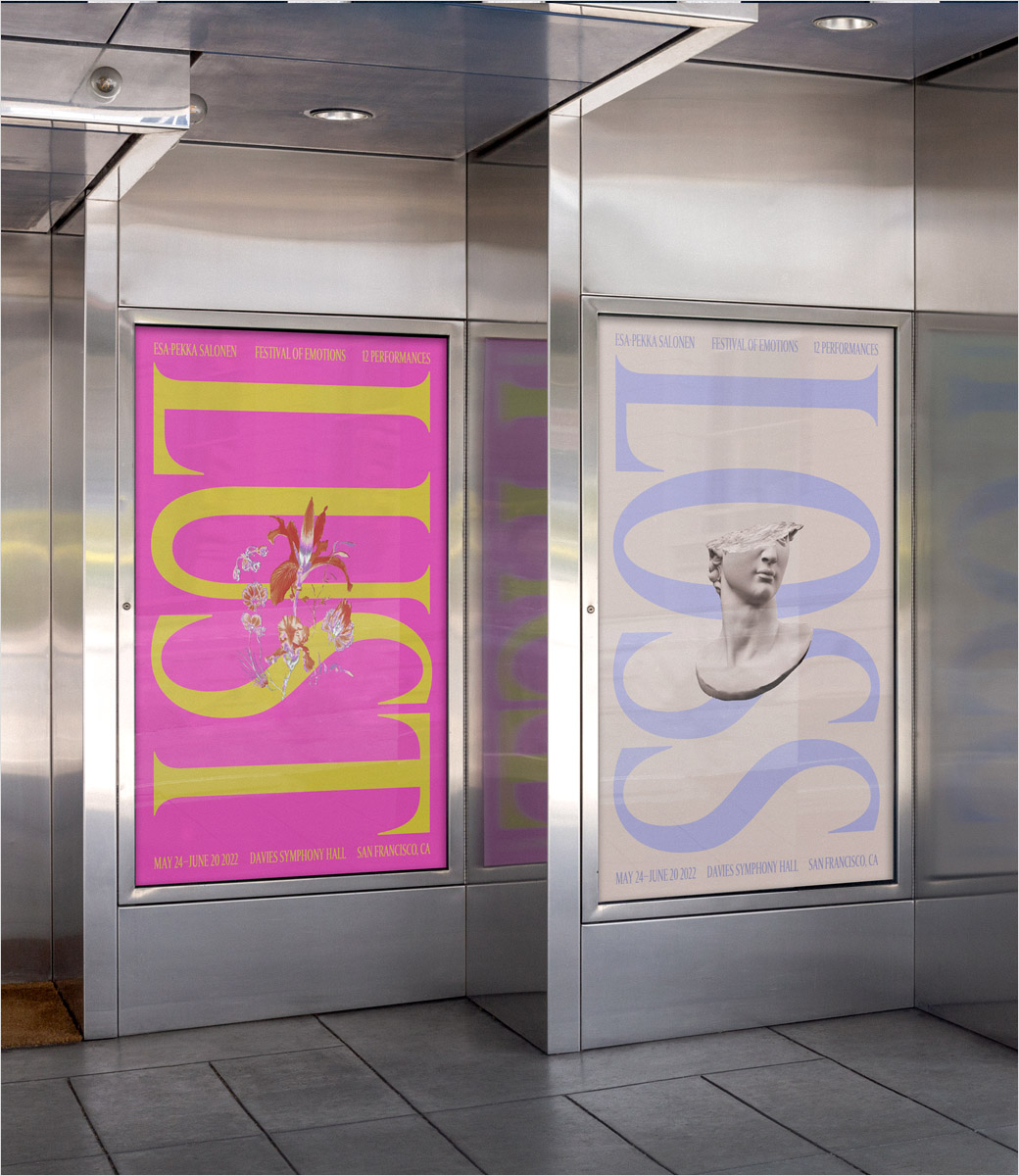
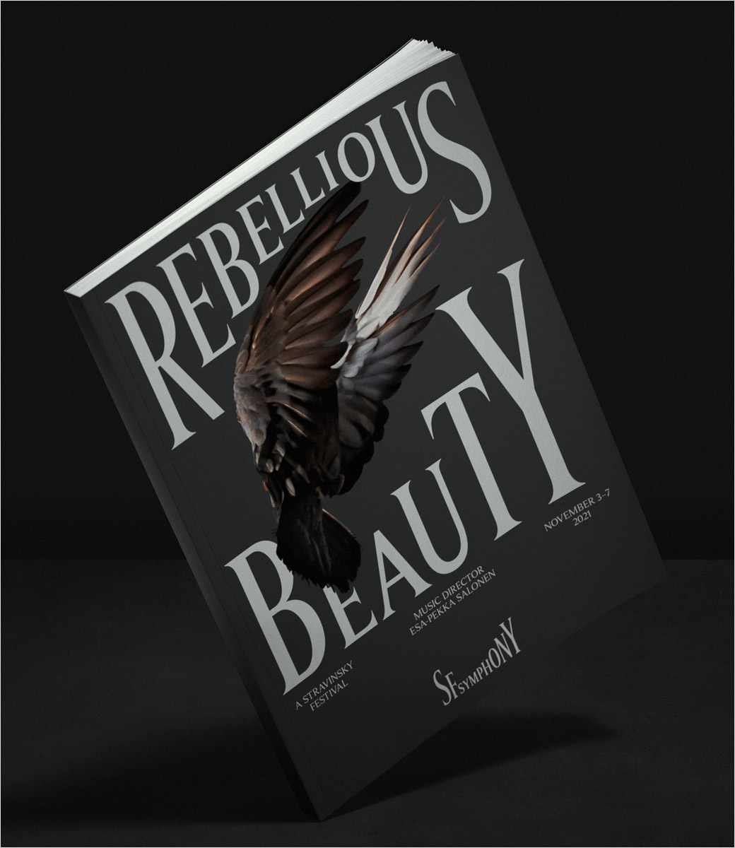
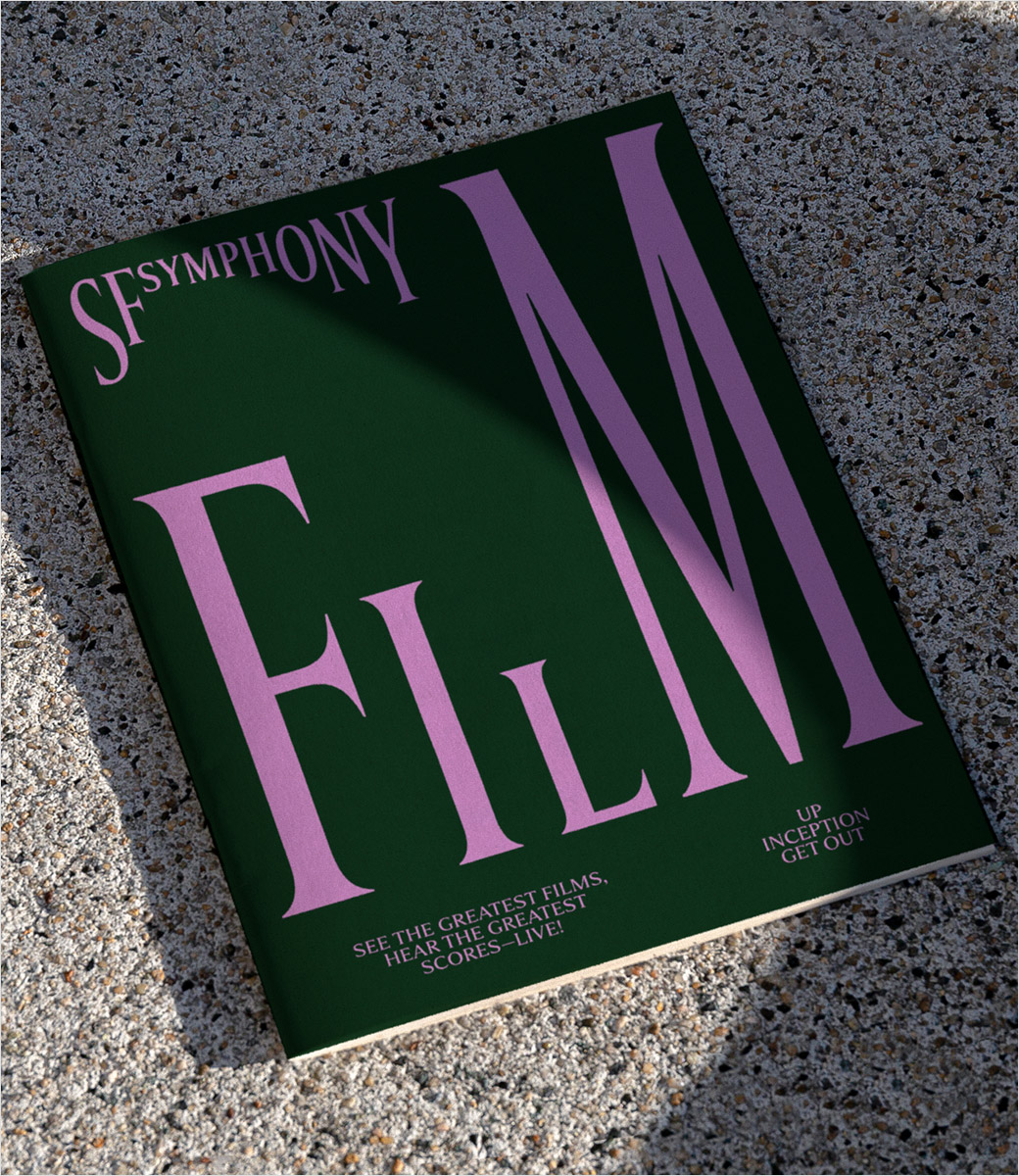
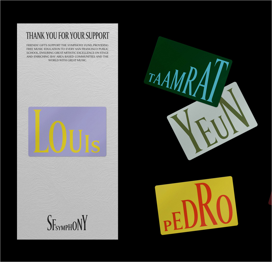
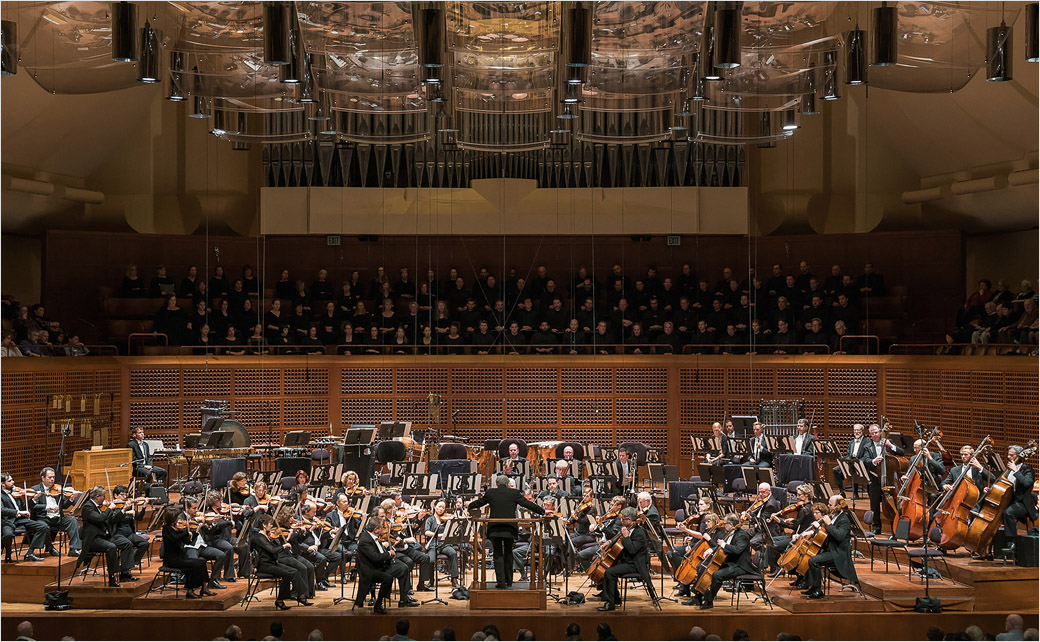
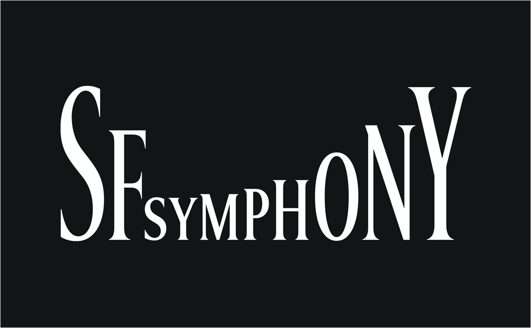
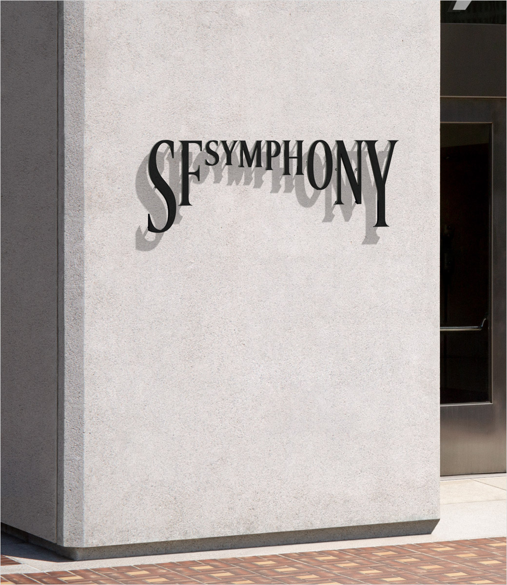
Strategy, design, and communications consultancy COLLINS has created the new logo and identity for the award-winning San Francisco Symphony.

The 108-year orchestra has been reimagined for the future as part of efforts to broaden its reach to more diverse audiences

“Music is one of humanity’s most powerful creations – it meets us at our emotional centre. Like all great art, it both inspires and reflects the times we live in. However, ‘classical’ music also suffers from an ongoing and ruthless PR problem: it is too often perceived as an unchanging, dusty, old-world music for elite audiences only,” says COLLINS.

The agency was therefore asked to help clarify, define, and express a new vision for the Symphony, and help them present classical music as “a crucial, global contemporary art form”.

Beginning by interacting with Symphony’s musicians, audiences, staff, executive leadership, and board members, COLLINS defined a new, shared vision for the organisation, which then became a springboard for creative and design exploration.

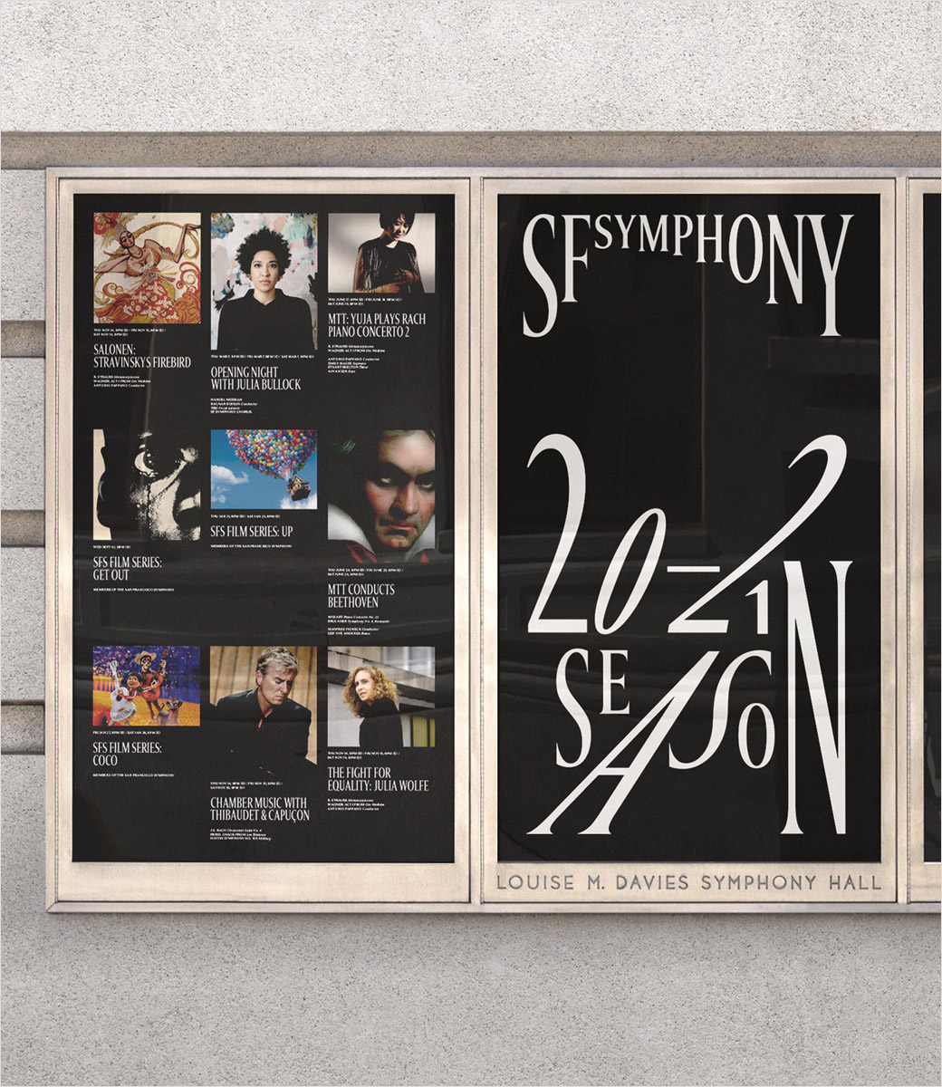
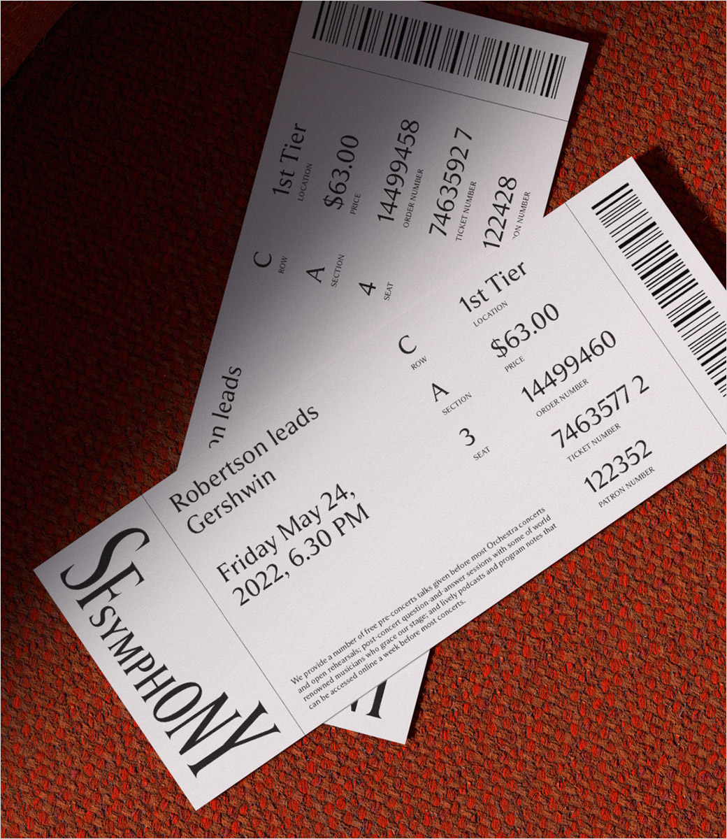
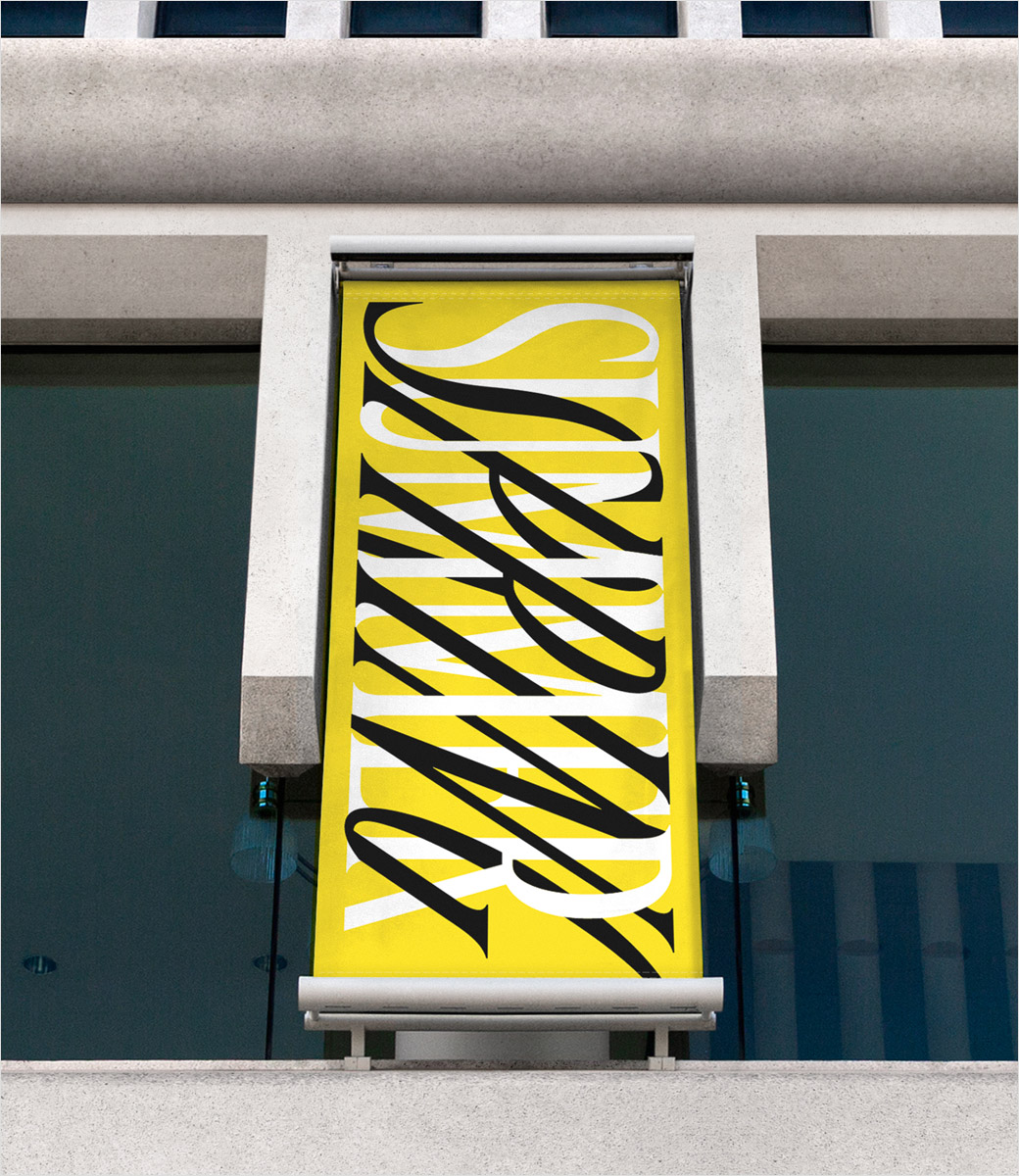
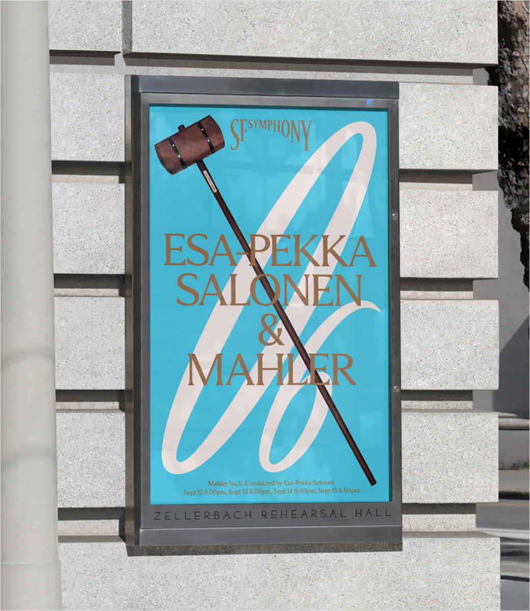
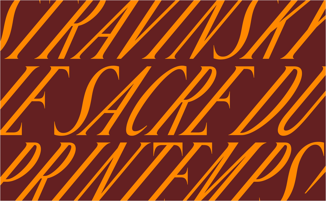
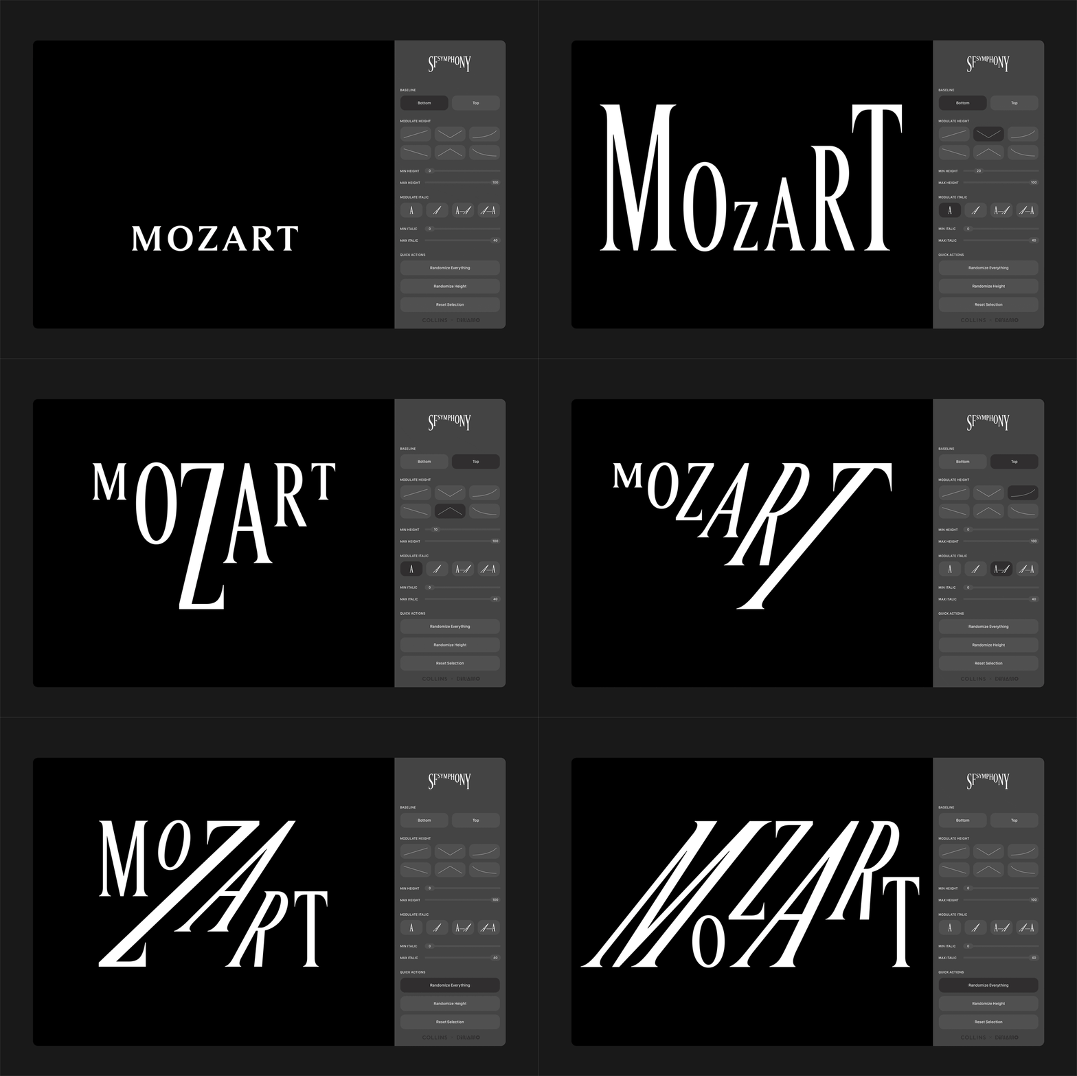
This eventually led to the development of what is described as an “ever-responsive, evolving visual system” that includes an animated logo featuring responsive and variable font technology; the latter enables each typographic character the ability to change form in reaction to sound and music.

Additional details include a refreshed colour palette that is said to have been inspired by the colours and landscape of the Bay Area, as well as a new online platform dubbed “Symphosizer”.

“At its heart, classical music is an interactive experience,” explains COLLINS creative director, Louis Mikolay. “Because there are no lyrics, every listener is open to interpret the music in their own way. The Symphosizer enhances this idea by inviting you to explore a completely personal emotional journey during a performance. The motion of the letterforms symbolises the emotional expressions of the piece itself, uplifting layers and details in the music which may have previously gone unnoticed. This brings a new depth to that personal journey.”

“It’s true that the origins of classical music are hundreds of years old, if not more,” Mikolay continues, “but the general population doesn’t tend to realise that it has been in a constant state of flux since its inception. It has been defining and redefining itself with each generation – even woven into movie scores, video games, and beyond. Classical music has an incredible amount to offer all of us, especially in such a stressful time.”
COLLINS
www.wearecollins.com

Tags: animated logo, Art Deco, Art Nouveau, Bauhaus, font design, identity design, logo design, Louis Mikolay, monochrome, orchestra, poster design, rebranding, San Francisco Symphony, signage design, sound, typography, web design

SEE ALSO:

  • Music Rebrands Powerleague Football
  • Music Provider Spotify Unveils New Look
  • Art Product Brand Reeves Gets New Look by Pearlfisher
  • The Cabinet Rebrands ‘Creative Access’
  • Spin Rebrands University of the Creative Arts
  • Logo Design for Music Society ‘Harmonie Wesepe’

Leave a Reply

Click here to cancel reply.

CATEGORIES

  • Advertising
  • Advice
  • Architecture
  • Articles
  • Arts
  • Automotive
  • Books
  • Business & Finance
  • Communication
  • Community
  • Competition
  • Computer & Internet
  • Corporate
  • Design
  • Design Jobs
  • Design Studio
  • Design Tools
  • Education
  • Electronics
  • Entertainment
  • Fashion & Lifestyle
  • Fonts
  • Food
  • Freight & Transport
  • Government
  • Health & Beauty
  • Home & Garden
  • Hotel & Travel
  • Icons
  • Music
  • News & Media
  • Opinion
  • Other
  • Photography
  • Real Estate
  • Religion & Spirituality
  • Science & Technology
  • Social & People
  • Sports
  • TV & Video
  • Web Design

POPULAR

  • Online Dating Site Match Launches New Look by COLLINS
  • Marinus Pharmaceuticals Reveals New Logo Design
  • Belvoir Farm Unveils New Logo and Packaging by B&B studio
  • Hulsbosch Brands New ‘Woofin’ Good!’ Dog Food Range
  • Conran Design Group Launches Branding for Viatris
  • Sony Music Publishing Returns with New Logo Design
  • COLLINS Rebrands the San Francisco Symphony
  • Hulsbosch Creates Logo and Packaging for ‘Coles Kitchen’
  • Rolls-Royce ‘Spirit of Ecstasy’ Marks 110th Anniversary

TAG CLOUD

3D A animated logo architecture black black and white blue branding car badge circle fruit geometric gold green grey icon design identity identity design illustration interior design logo design logotype luxury M metallic minimalist monochrome monogram naming orange packaging design Pentagram pink poster design purple rebranding red roundel shield stationery design stripes typography web design wordmark yellow

MONTHLY ARCHIVE

tweet meme

Tweets by @logodesigner_co

facebook

  • ABOUT | ADVERTISE | CONTACT
  • SUBMIT YOUR WORK

We simply love logos! Logo-Designer.co is dedicated to corporate and brand identity work. Our primary goal is to showcase identity design from around the world; we want to give designers the opportunity to share and publicise their creative work online.

If you're a designer wanting to submit your work, click on the ‘SUBMIT YOUR WORK' tab above.

For all other enquires, including advertising placements, please complete this form:

*Required Fields

THANKS. YOUR MESSAGE HAS BEEN SENT.
WE'LL RESPOND SHORTLY.

Logo-Designer.co is an online platform open to both professionals and students. We’re interested in your logo’s ‘design story’ – context, history, background, ideation, narrative, symbolism, meaning, semiotics, and other such things. We want to see iterative sketches, including discarded preliminary and prefinal designs, wherever possible. If you’re able to tell us about budget and time constraints, please do so. The more information, the better.

WHAT YOU NEED TO DO:

  • Provide large-sized images showing your design in lots of detail, saved at 150 or 300 dpi in JPEG (preferred) or PNG format
  • Include the ‘design story’ text document, not forgetting to list relevant categories and tags
  • Enclose the above in a single zip/rar file and send to: submissions [at] logo-designer [dot] co
  • You can submit more than one logo design; however, the limit is one submission per month
  • Be patient (it may be a while before we feature or publish your work).

OTHER CONTENT:

As well as logos, we’ll also consider the following for publication:

  • Font design
  • Icon design
  • Articles: opinion/advice (from both logo designers and brand strategy consultants).

RULES:

Please note: Logo-Designer.co will not show work related to any of the following:

  • Alcohol
  • Gambling
  • Tobacco
  • Pornography (or adult related themes).

©2020 Logo-Designer.co. All rights Reserved.
Do not republish/reprint our content without express written permission.
You are free to link to any of our website material.