Miami Marlins Reveal All-New Logo Design
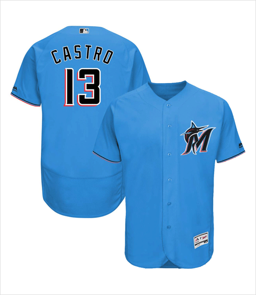
American baseball team the Miami Marlins have unveiled an all-new logo design as well as new uniforms.
The club, which was known as the “Florida Marlins” when it was founded back in the 1990s, currently competes in Major League Baseball (MLB), North America’s oldest professional sports league.
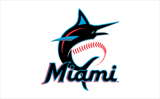
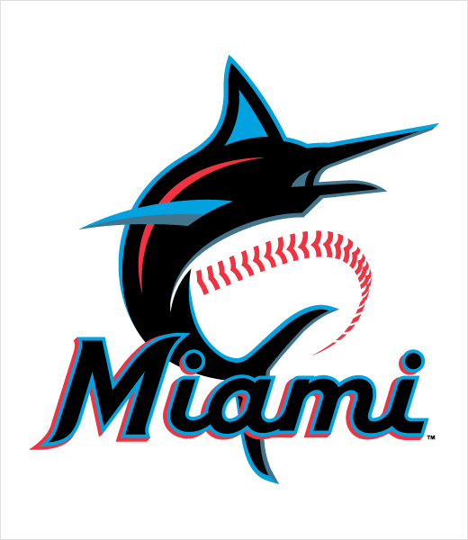
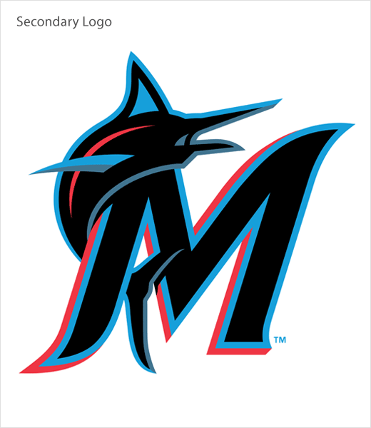
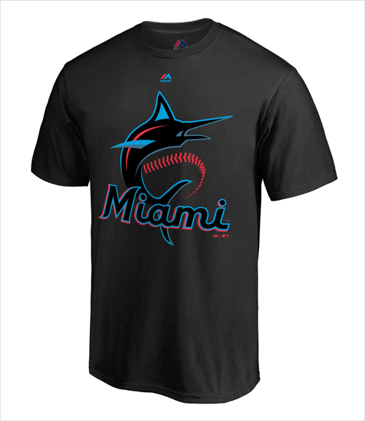
The team’s refreshed primary logo features not only a baseball but also a marlin fish that is drawn to be “much more athletic and powerful” than before, while its upward body position aims to symbolise “strength, speed, and legendary fighting spirit”.
Accompanying the redesigned logo are a set of new colours, namely, “Caliente Red”, “Miami Blue”, “Midnight Black”, and “Slate Grey”.
Both the logo and colours are said to have been inspired by the heritage and culture of the Floridian city of Miami.
“The styling of the modern script ‘M’ and curved tapered serif font is a classic approach influenced by the typography commonly found among the Latin-American culture. The look has as much to do with the infusion of the local Hispanic culture as it does with the history of baseball in Miami as the font style and accent colours are a throwback to the Miami Marlins and the Havana Sugar Kings of the 1950s,” explained a club representative on the official Miami Marlins website. “Our colours can be seen throughout the culture of Miami, on the vibrant streets and metropolitan landscape of South Florida, and are representative of the shades of colours found in the large variety of cultural flags flown throughout the community’s many neighbourhoods.”
The pairing of Miami Blue and Caliente Red are further claimed to deliver “an electric and vibrant look” – representing Miami’s “nightlife”.
Source: Miami Marlins


