Suicide Prevention Charity CALM Given New Look by Output
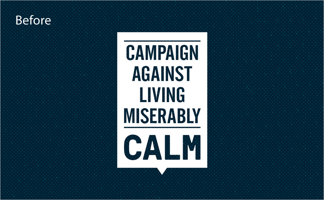
Design agency Output has created the new logo and branding for UK suicide prevention charity, Campaign Against Living Miserably (CALM).
In Britain over 6000 individuals reportedly take their own lives every year, and CALM is hoping to reach more people with its refreshed identity.
“CALM’s challenge to us was unique. The brand has to do so many different things – from support to activism – but it needs to always feel like CALM. We were also conscious that it should feel like a natural evolution. The next iteration of a much-loved brand, rather than something completely new,” explains Output’s creative director, Johanna Drewe.
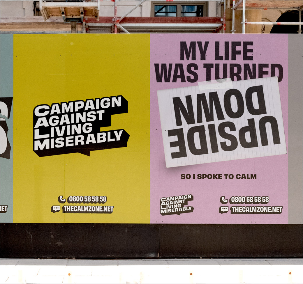
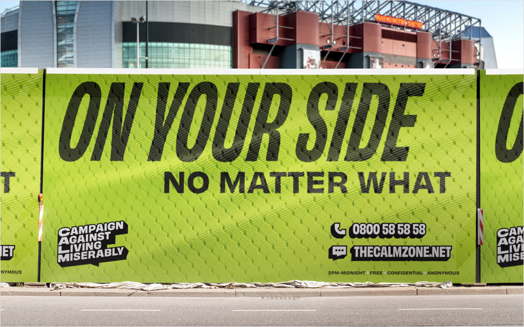
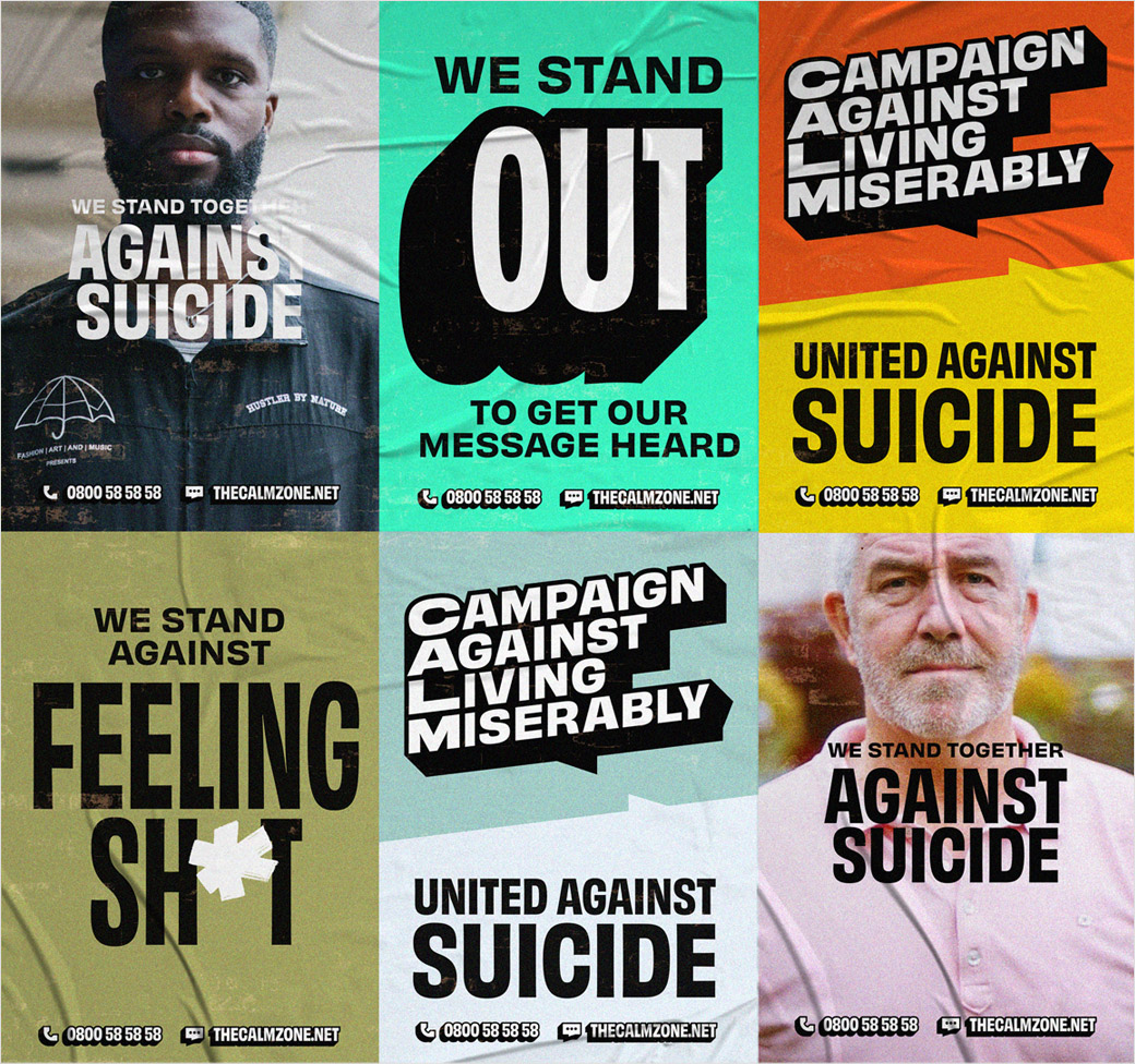
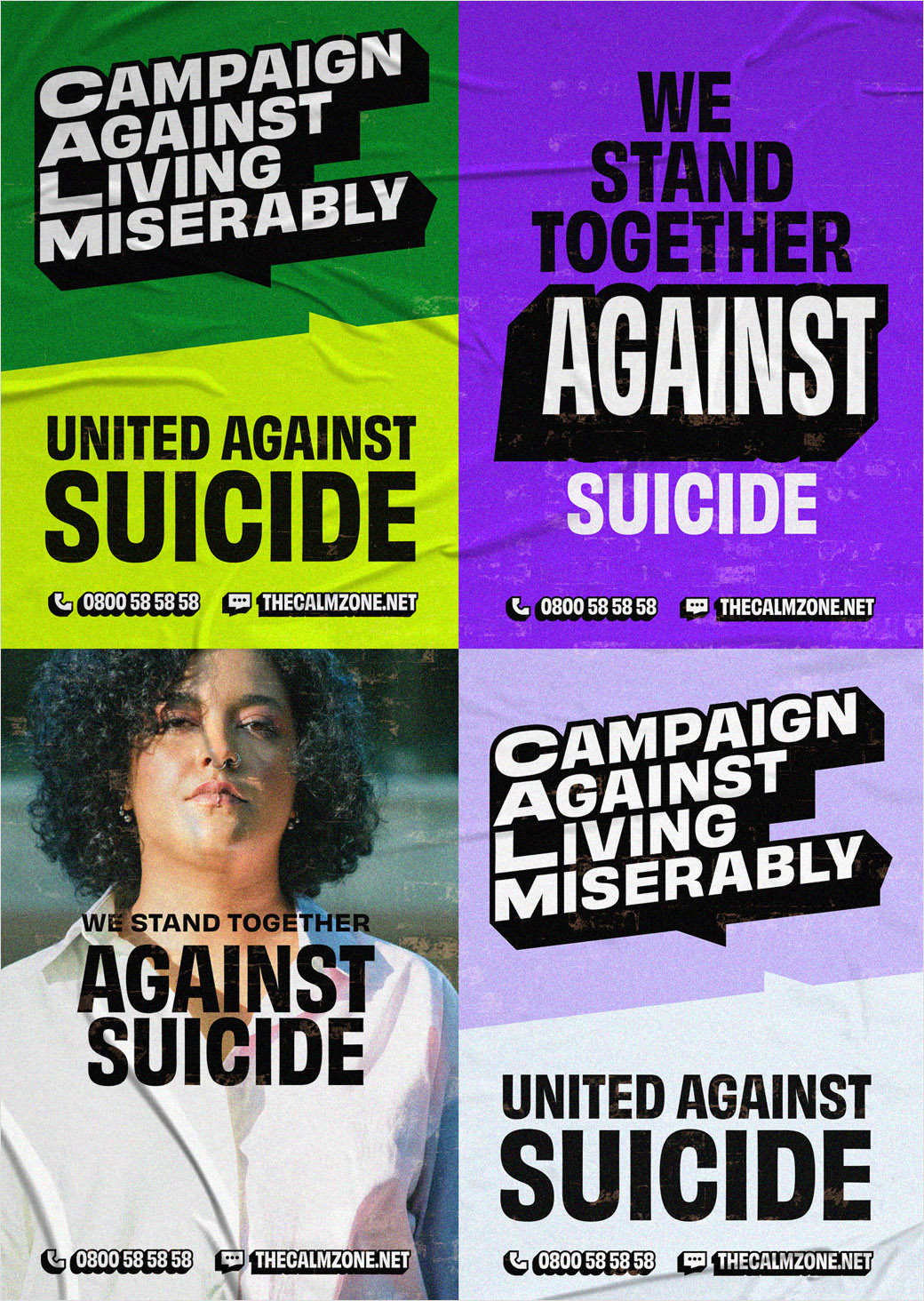
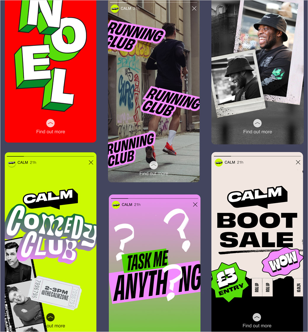
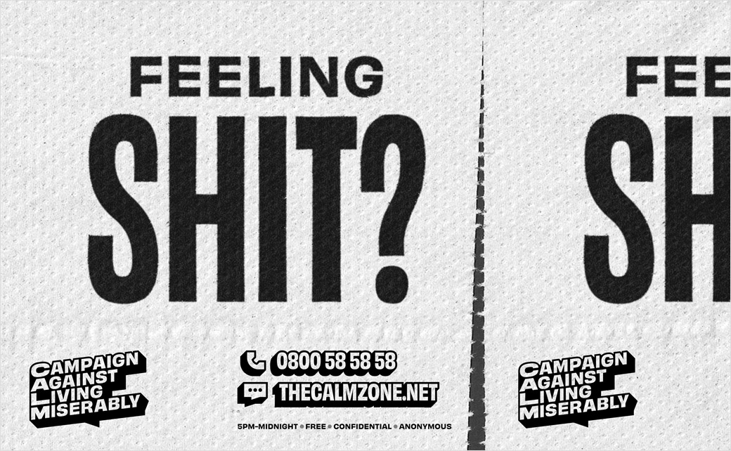
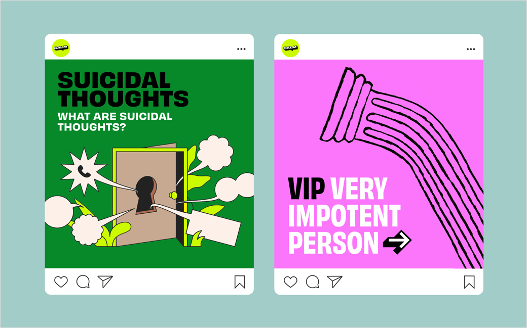
“To do that, we revisited the speech bubble logo, and used the extruded text style to define the graphic language beyond it – the helpline number, website URL and framing devices. You don’t even need to see the logo to know it’s CALM. That structure gives freedom for the brand to flex to lots of different touchpoints – from bringing people together to fight for change, to helping someone in crisis – all in the same brand.”
“Suicide prevention has to be led from the ground up, uniting thousands of people in the campaign to stand with one another and beat down misery. It continuously reminds people that change is in the small things that create huge waves,” adds CALM CEO, Simon Gunning.
“That’s why our new look and feel along with our refreshed messaging leans into the power of our name. That’s why our refreshed logo champions the full name and leads with our ethos but also brings people into the close knit community of ‘CALM’ by placing the abbreviation at the heart of the mark.”
While the visual identity has been developed by Output, Reed Words was tasked with coming up witht the verbal identity, with the two elements working together across CALM’s multiple touchpoints.
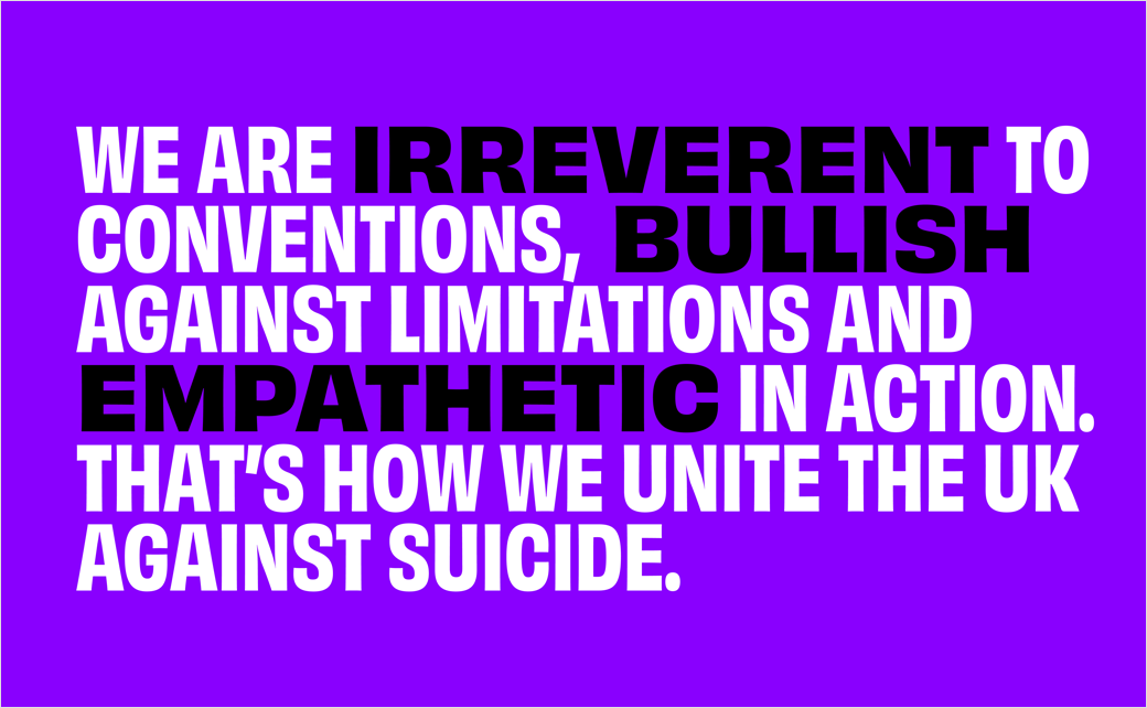
“CALM has the kind of voice that would stand out in any sector – and it’s particularly distinctive alongside other charities and mental health services. We needed to retain that authenticity and show how it can expand to fit the whole organisation, with all the different moments they meet their audiences in,” comments Gemma Wilson, writer at Reed Words.
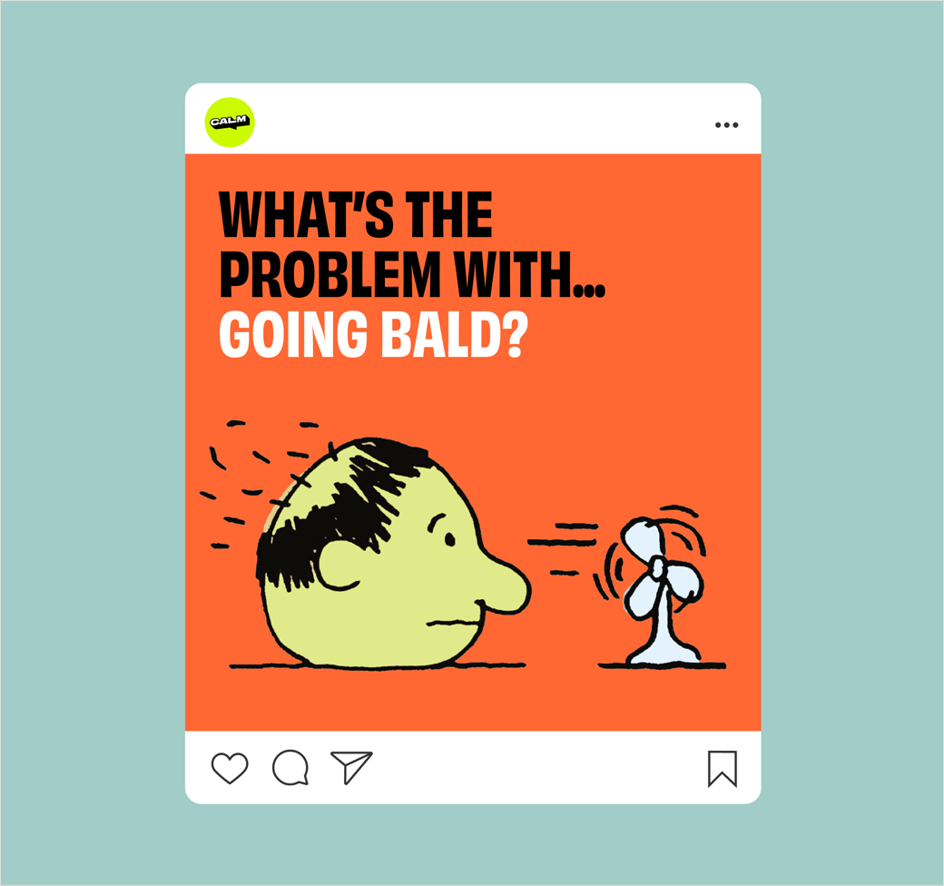
“It’s an unusual challenge, but one with so much potential for strengthening the brand even further. We worked with internal teams to show how their bold, punchy, and much-loved voice can work everywhere – even the toughest topics.”
Output
www.studio-output.com


