Thomas Cook Reveals New ‘Sunny Heart’ Branding
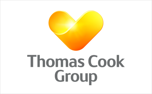
Thomas Cook, one of the world’s major leisure travel groups, has today announced its plans to unify its brands and market activity under one common symbol, the ‘Sunny Heart’.
The Group has many other brands including Neckermann in Europe, Ving in Sweden, Condor in Germany and Airtours in the UK that will all carry the ‘Sunny Heart’. The intention isn’t to rebrand all with the Sunny Heart, but they form part of the Group architecture and will, in most cases, carry the Heart as some part of their logo.
“It’s a major milestone in our high tech, high touch transformation,” said Harriet Green, Group CEO of Thomas Cook Group. “This isn’t just a rollout of a new logo, it’s about a promise. What we’re announcing today is a renewed promise to our customers, our people and suppliers. A promise that we’re putting them at the heart of our transformation it’s the essence of who we are. The unification of our brands under the Sunny Heart is three fold; it will make it easier for our customers to understand the full strength and end-to-end value of the entire Thomas Cook Group coupled with our full innovative offering of our services and products; it will show more clearly what differentiates us and how we provide a total experience along every touch point – from research, to booking, to anticipation, to the holiday itself; and importantly, it will clarify our customer promise– a complete range of inspirational experiences for our customers.”
“The Heart will appear on the web, in brochures, in our aircraft, in our concept hotels, our other hotels and in our stores: in short, everywhere that our customers connect with us,” added Harriet.
“We are building a simplified and strengthened portfolio that incorporates the ‘Sunny Heart’ essence into our brands, this is more than a design refresh, it is leveraging the combined strength of our Group to maximise our presence in the mind of customers,” said Michael Healy, CFO of Thomas Cook Group. “This brand unification is part our new profitable growth strategy announced in March this year. Having already piloted this approach in our North European businesses, we know first-hand that it increases both early bookings and online bookings with the added benefit of heightened brand awareness. The brand unification has been developed internally, and we are rolling it out appropriately for this stage of our transformation in a way that complements the normal, planned refresh of materials including our planned brochure runs, maintenance and store refreshes.”
The out-going Thomas Cook logo design, which was introduced back in 2001, was designed by Futurebrand and featured a blue globe.


Source: Thomas Cook


