Warner Chappell Music Reveals New Logo Design
Warner Chappell Music (WCM) has revealed a new logo design and brand identity as part of a major rebrand.
The changes follow what is being claimed as “the beginning of a new era” for the global music publishing giant, which recently introduced its new leadership duo of Co-Chair & CEO Guy Moot and Co-Chair & COO Carianne Marshall, and moved into new headquarters in downtown Los Angeles’ Arts District.
The new logo, which has been developed in collaboration with Emily Oberman and her design team at Pentagram, combines a regal ‘crown’ monogram with handwritten style typography.
“The design pays homage to a moment of creative inspiration and to the highly individual, personal art of songwriting. It evokes both graffiti and calligraphy, allowing the logo to represent a diversity of songwriters and musical genres,” according to a company spokesperson.
“We love our new logo, which is a tribute to our songwriters and the power, emotion, and timelessness of their craft,” add Moot and Marshall. “We’re also modernising our name by dropping the slash from Warner/Chappell, which is symbolic of our becoming a more global, connected company. And we’ve put ‘Music’ in the logo. It’s always been part of our name, but we wanted to be clear that it’s our reason for being.”
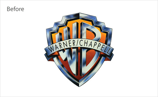
With a history dating back to the founding of Chappell & Co. in London over 200 years ago, the company’s origins are deeply rooted in music publishing. This is the first rebrand since Warner/Chappell was formed when Warner Bros. Music acquired Chappell in 1987, and the Warner Bros. logo was adopted for the launch of the newly combined company.


Source: Warner Chappell Music


