Wall’s Launches New ‘Social-First’ Identity with Design by Sunhouse
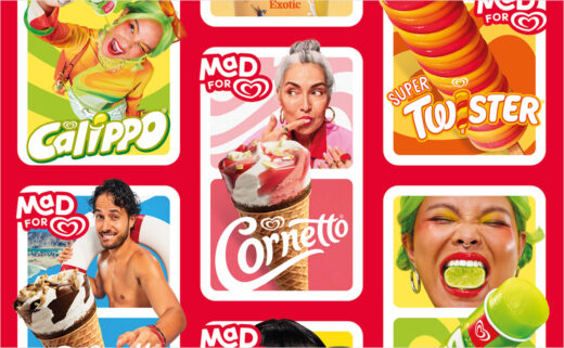
Brand design agency Sunhouse has developed a new identity for the ice cream brand Wall's.
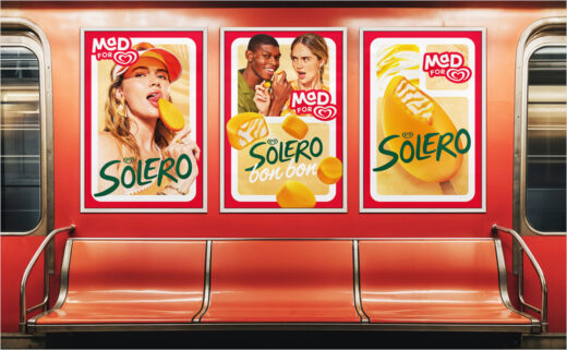
The red and white heart logo of Wall's is already among the most recognisable marks in the ice cream industry, serving as a masterbrand for over 40 sub-brands, including Twister, Calippo, and Solero.
Now, the century-old ice cream brand has collaborated with Sunhouse to develop a 'social-first' identity design that is set to form the basis of a global campaign.
"Wall’s had defined a distinctive brand campaign idea with ‘Mad For’, but it needed to be underpinned with a strategic spine and clear connection back to the Heartbrand," says Matt Van Ness, brand strategy creative director at Sunhouse.
Adding: "The Heart already symbolises passion. ‘Mad For’ magnifies this desire, reflecting consumer insights around the irrational love people have for ice cream. It becomes a behavioural expression of the brand. It’s not about being crazy, it’s about being passionate. Not just a flash in the feed, but something with lasting devotion and meaning."
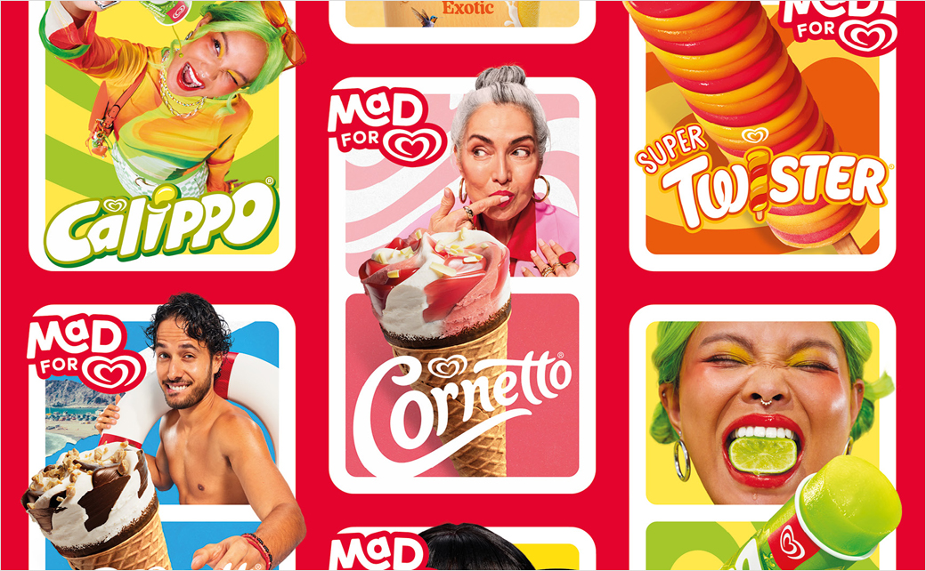
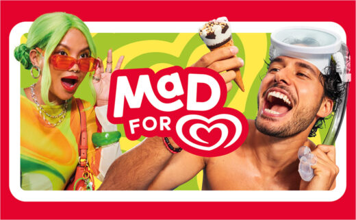
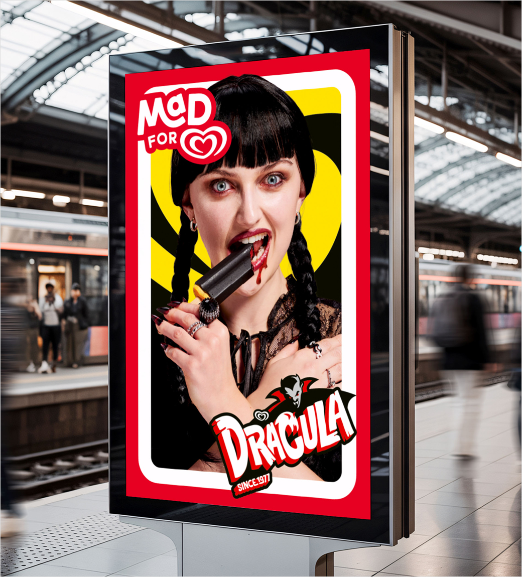
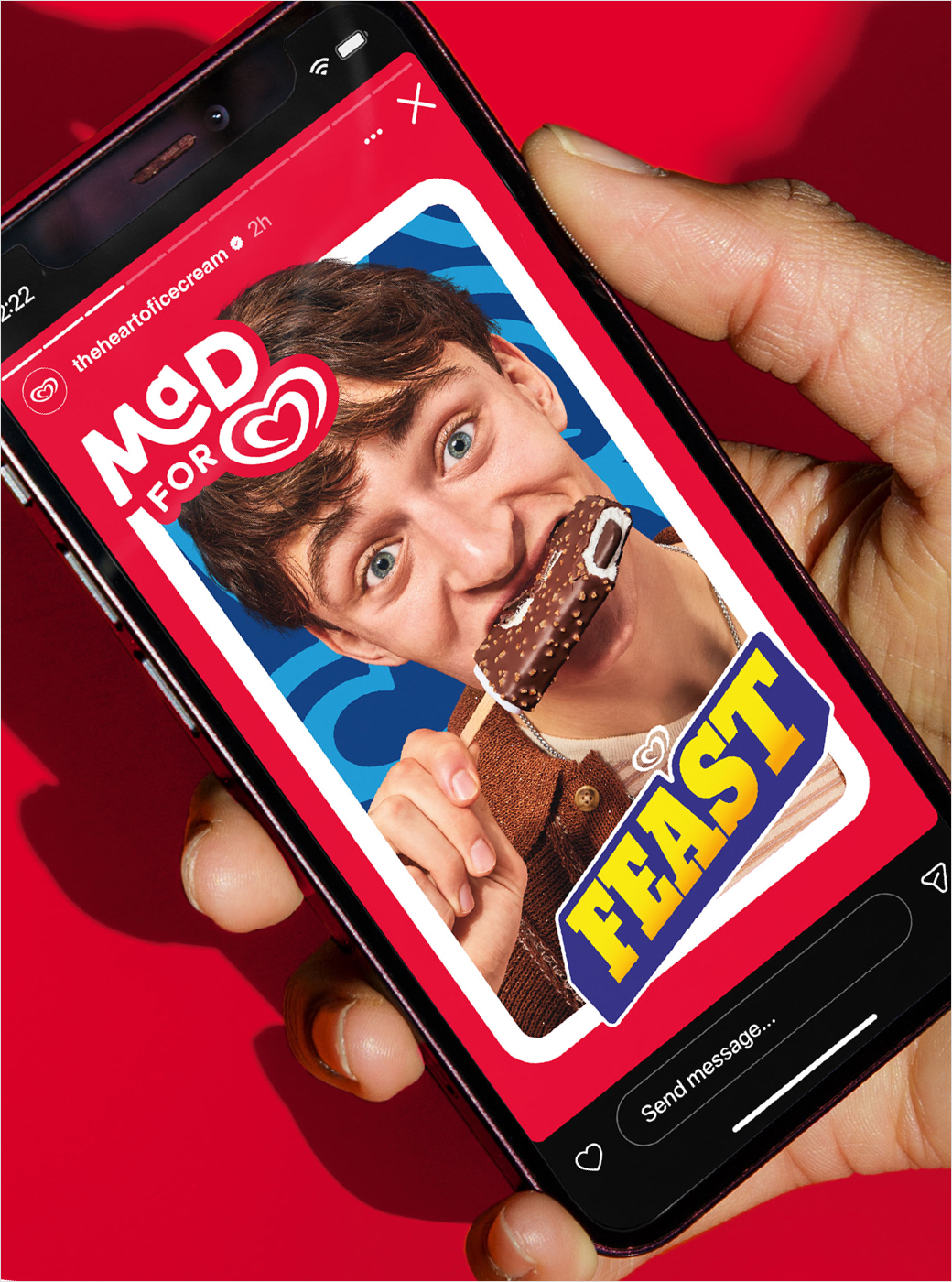
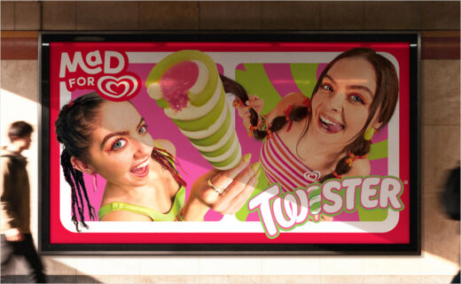
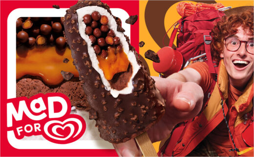
Central to the design is a "Mad For" lock-up, which includes a modular panel system that highlights individual ice cream products along with different people consuming them.
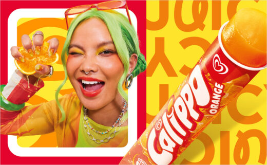
A new custom typeface is further claimed to add "irrational characteristics and personality through subtle script details and confident letterforms".
Chris Griffiths, creative director at Sunhouse, explains: "The panels create consistency, but within them, there’s room for the irrepressible character of each sub-brand to have its moment.
"Ice cream drips. It melts. People break through and reach beyond the frame, because ‘Mad’ love like this doesn’t sit politely inside a box."
The agency also managed the global shoot, establishing the creative vision, directing the art, and collaborating with photographer Frankie Turner to bring the campaign to life.
Sunhouse
www.sunhouse-creative.com