Sunhouse Updates Logo and Packaging Design for Skincare Brand St. Ives
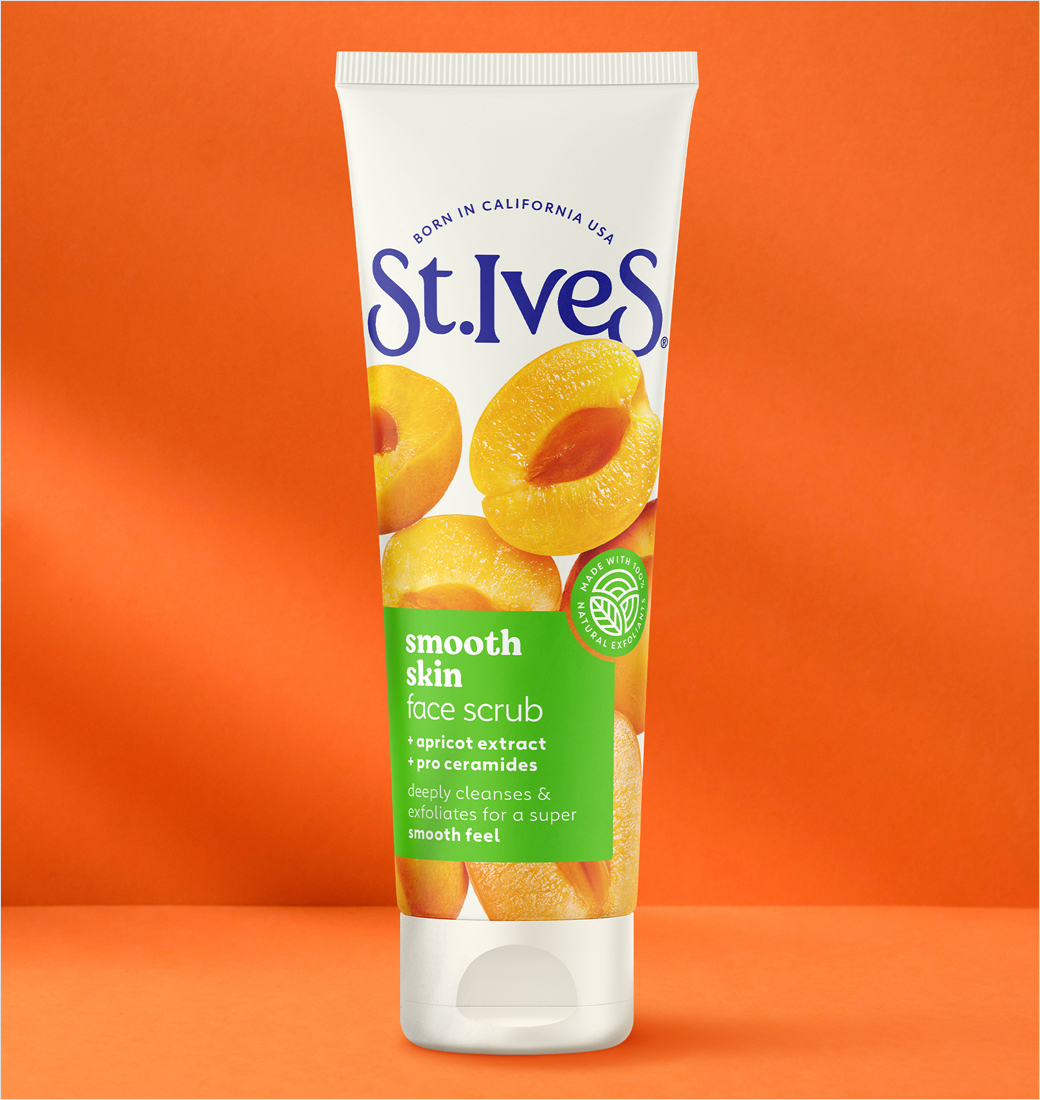
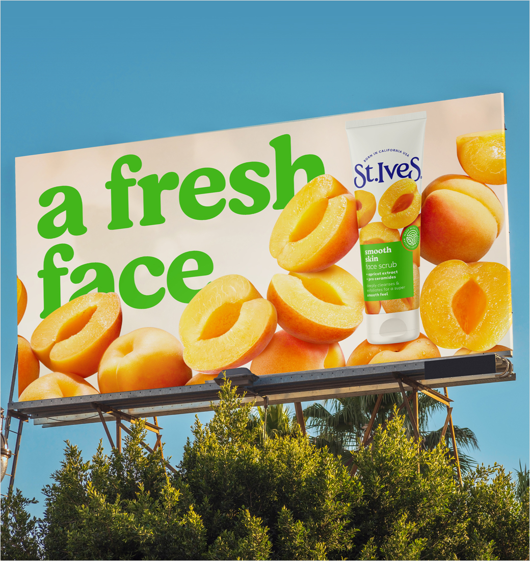
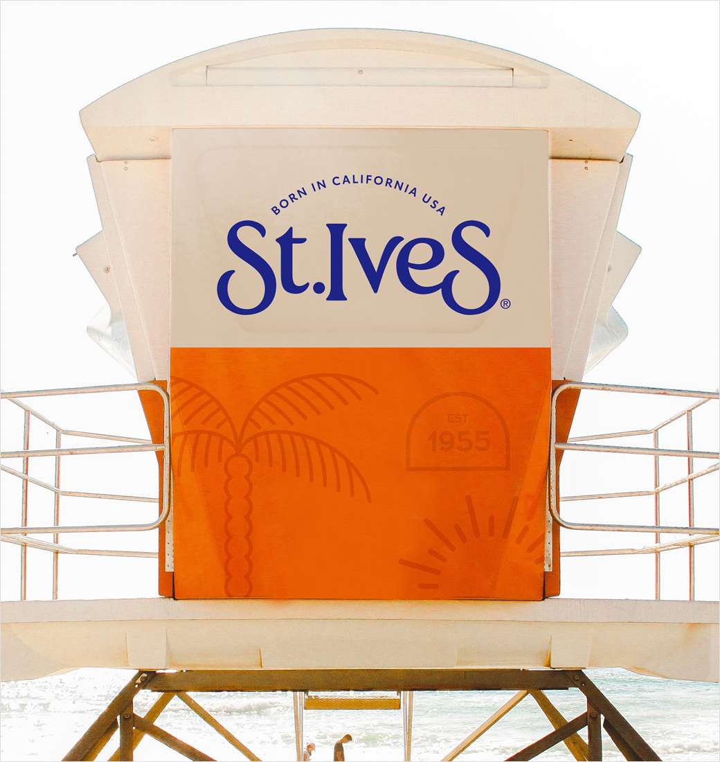
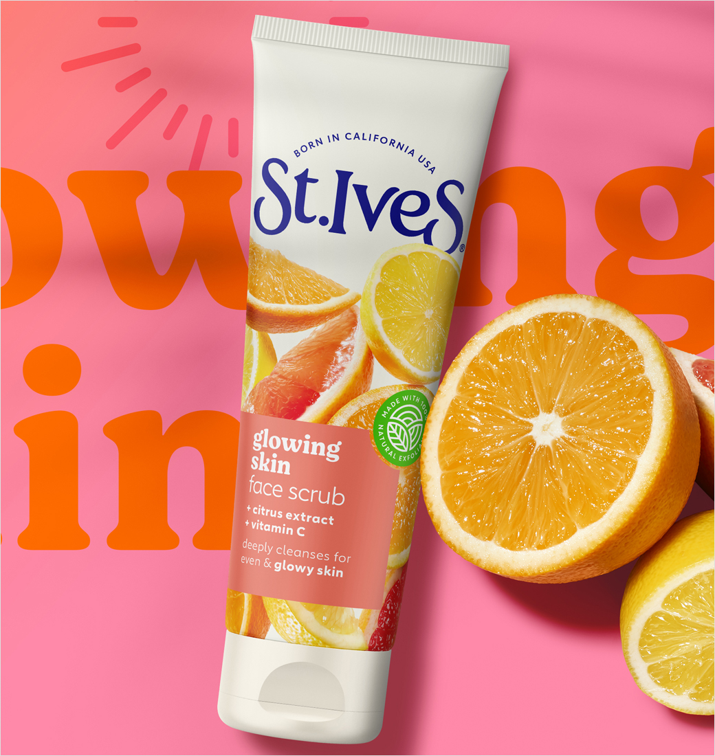
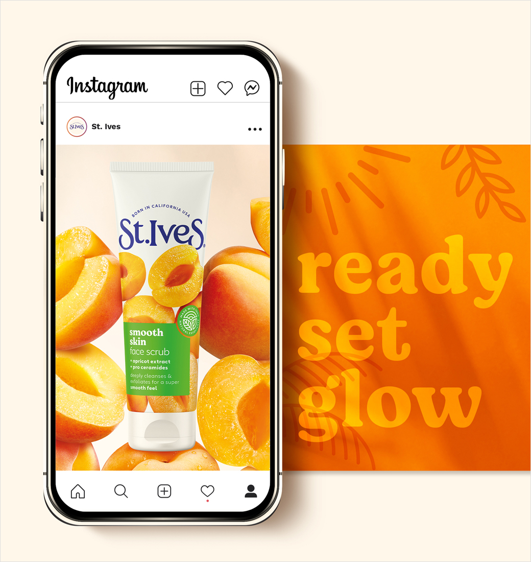
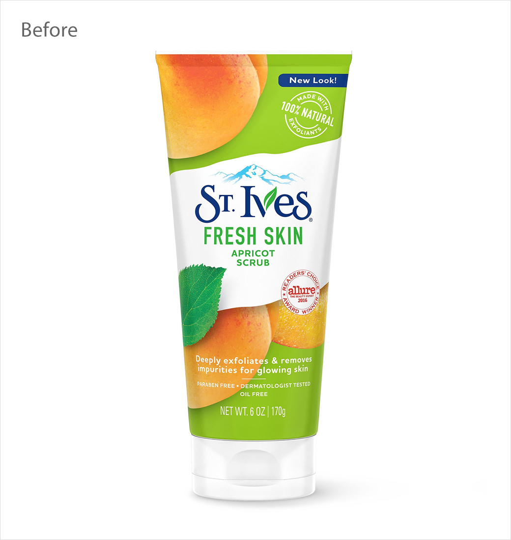
Design agency Sunhouse has crafted the new look for skincare brand St. Ives, updating both its logo and packaging.
The St. Ives story is said to have started a century ago when the Iverson family – having settled in California and been inspired by local ingredients – created their first product, namely, St. Ives Apricot Scrub.
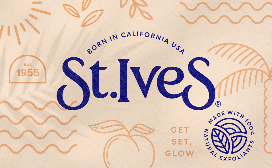
According to Sunhouse’s design team, the new identity aims to reconnect the brand with its Californian roots.
“Our work was essentially about bringing clarity to St. Ives’ story by crafting assets to recapture and elevate its California heritage,” comments Chris Griffiths, creative director at Sunhouse.
Adding: “From the ‘Made in California’ sunrise arch above the wordmark to the warmth illuminating the deliciously abundant natural ingredients, every element in the new brand world reflects that origin story in all its glowing glory.”
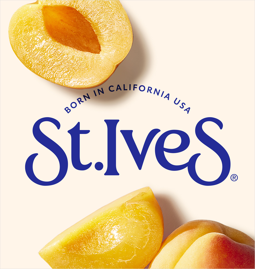
The wordmark itself has been updated in order “to convey a bit more character” say the designers.
“Typography with a nostalgic California vibe has been introduced, appealing to both the legacy audience and Gen Z, while a palette of soft, yet vibrant colours evokes a warm Californian feeling and supports navigation through the portfolio,” they further explain.
Additional design details include new photography – by beauty photographer Dennis Peterson – that is claimed to hero the ‘yumminess’ of the ingredients sourced from the Golden State.
“Inspired by our past, we’re connecting with the next generation, empowering them to embrace life’s adventures with the freedom that comes from great skin,” reckons Magali Giupponi, a representative from Unilever, the company that owns St. Ives.

Sunhouse
www.sunhouse-creative.com


