Branch Creates New Logo and Identity for Cambridge Open
Branch has designed the new logo and identity for Cambridge Open, a service run by Cambridge University Press that makes peer-reviewed research findings in the form of books and journals freely available for anyone to access and view.
The work follows on from two previous identities the agency has created for the academic publisher, namely, Cambridge Core and Cambridge Elements.
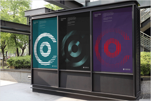
“Our solution for the Cambridge Open logo is centred around a playful interpretation of Open Access,” explain the designers. “We took the standard Copyright symbol and inverted it, putting the C and O into the correct order. More importantly, by doing this we created a visual metaphor for Open Access publishing, i.e. content that is free to use, recite and re-publish.”
The logo is accompanied by a graphical style featuring a series of ‘disseminating’ illustrations, while the colour palette is adopted from the University of Cambridge’s guidelines.
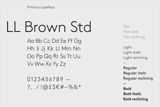
The designers also chose LL Brown for the lead typeface, which they say works “harmoniously” with the typography of the wider Cambridge University Press identity and sub-identities.


Branch
www.thelondonbranch.com


