Identity Design for Brazil’s 4th Design Biennial
The general theme of the 4th national design biennial in Brazil was “Brazilian Diversity”.
In order to represent this, the visual identity takes its starting point for inspiration from the multiple diversities characterising Brazil, exemplified by its natural resources, its plurality as well as the many different industrial and handcrafted products.
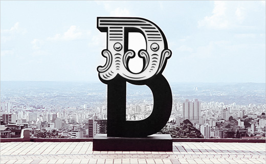
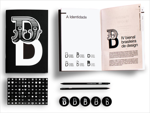
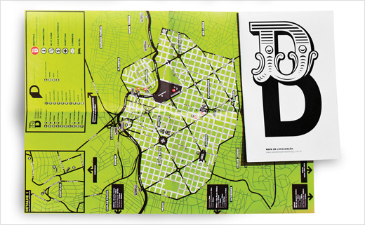
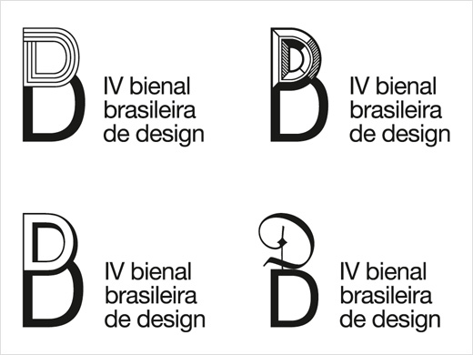
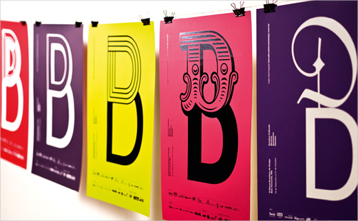
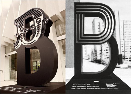
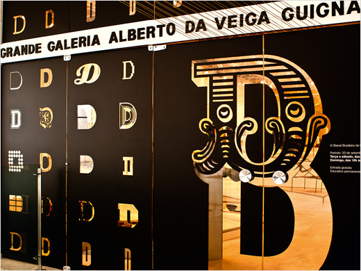
A variable identity for all media products, including brochures, maps, posters and badges, was created in which two letters “D” standing for Design and Diversity are featured in different types, alternating to form a “B” representing Biennial.
The variations with ornamental, classic and playful letters reflect the various topics featured in the showcases, including jewellery, mobility, handmade crafts and furniture, further emphasising the Biennial’s main theme of “Brazilian cultural diversity”.
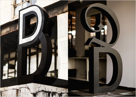
To promote the event around the city of Belo Horizonte in the Brazilian state of Minas Gerais, urban signage equipment called “B totems” were set up. In addition to functioning as signage, they pointed out a path that revealed Biennial exhibition sites.
Created by Brazilian studio Greco Design, the project has been selected as a “Red Dot: Grand Prix” winner in this year's Communication Design category.
Greco Design
www.grecodesign.com.br


