Hydro Silk Gets New Logo and Packaging Design by JDO
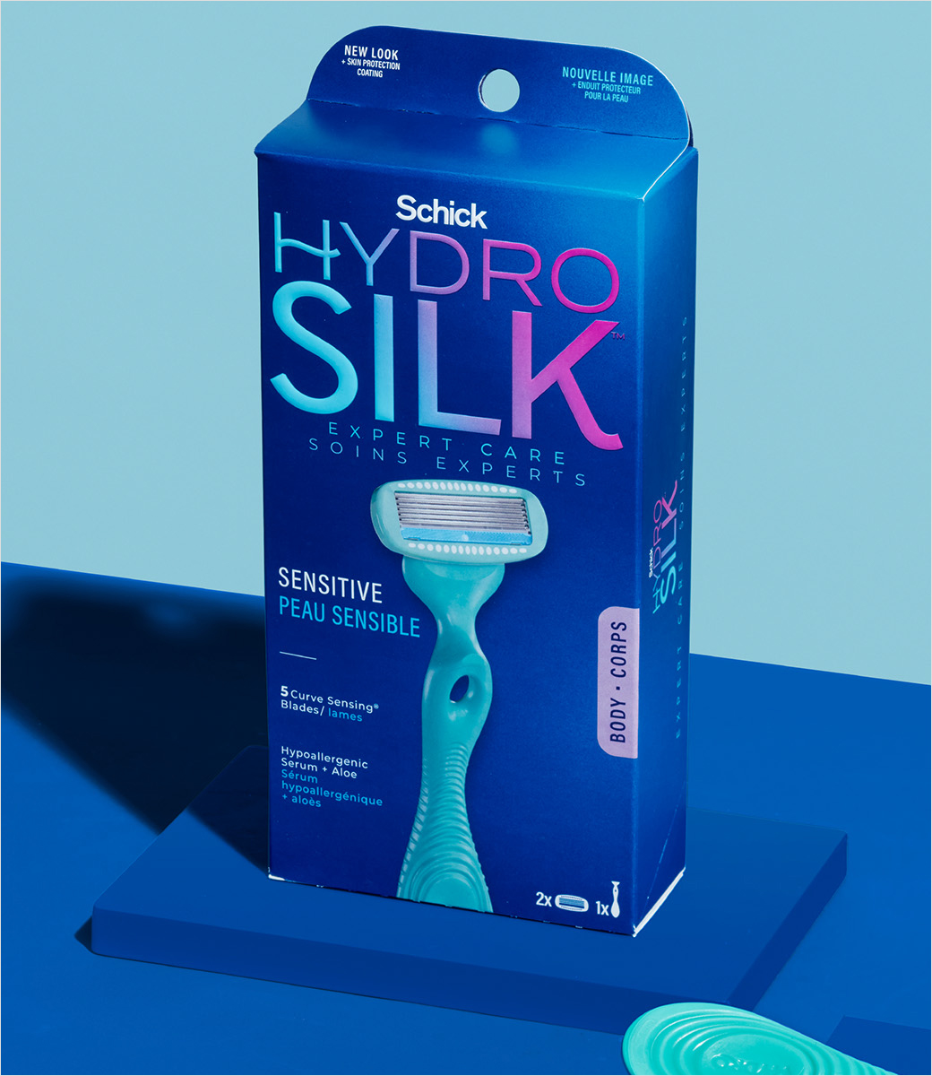
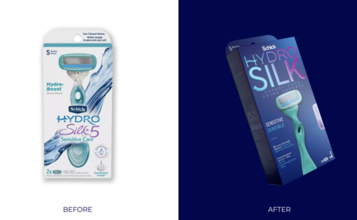
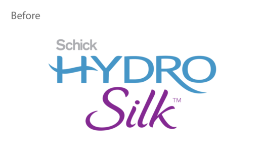
Global branding agency JDO has refreshed the logo and packaging design for women’s razor range, Hydro Silk.
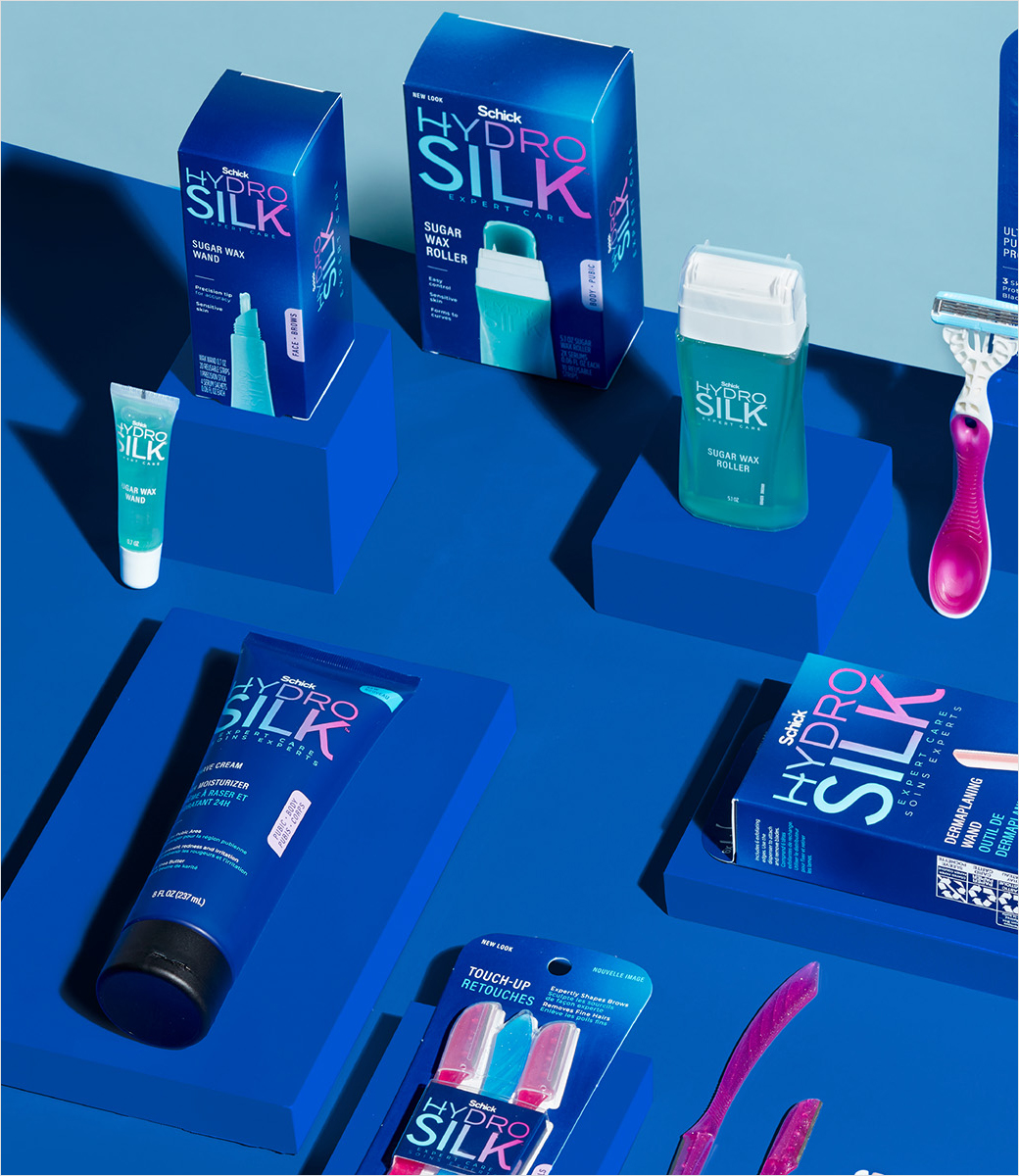
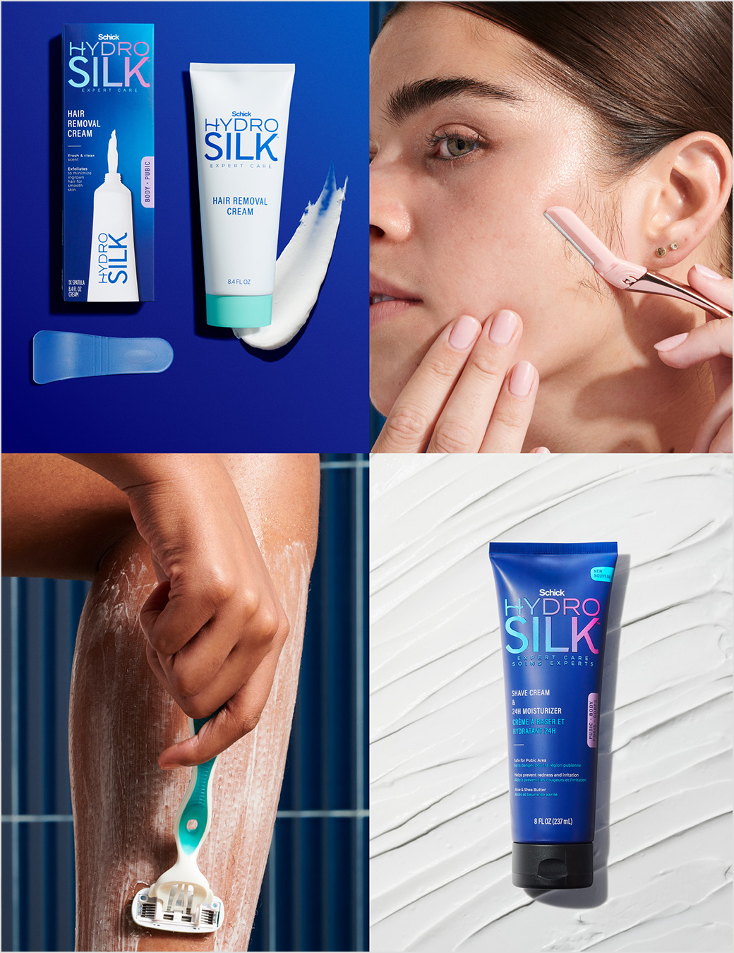
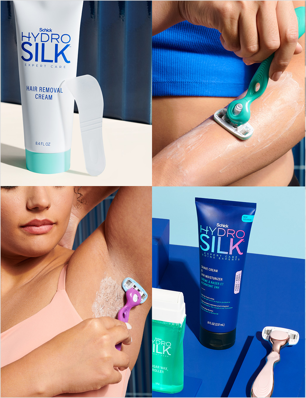
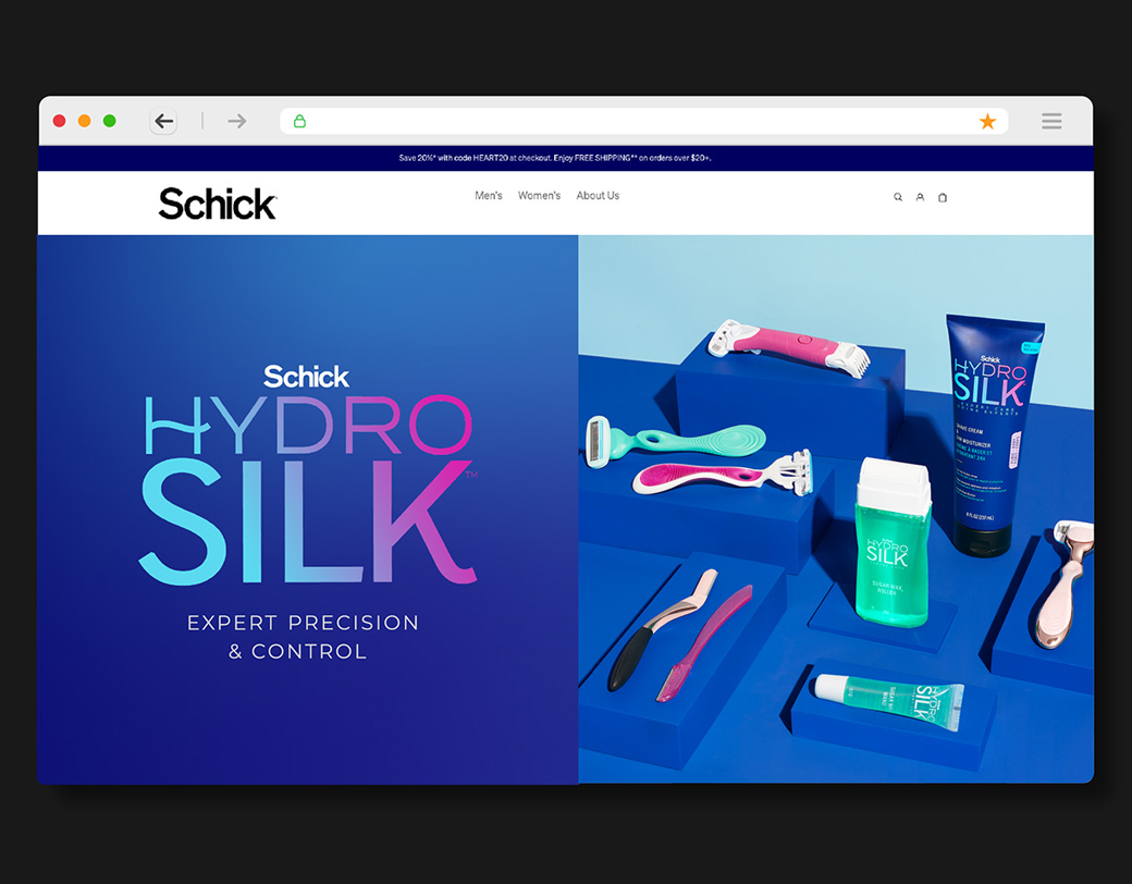
The modernised look aims to unite the product portfolio with a clear and streamlined design.
“The redesigned brand identity distinguishes Hydro Silk as a trusted expert in a crowded market that has become increasingly fragmented and confusing for shoppers,” says the consultancy.
“Our goal was to create the belief that consumers no longer need to settle for average hair removal results,” further explains Isabelle Aleksander, senior strategist at JDO.
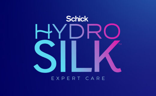
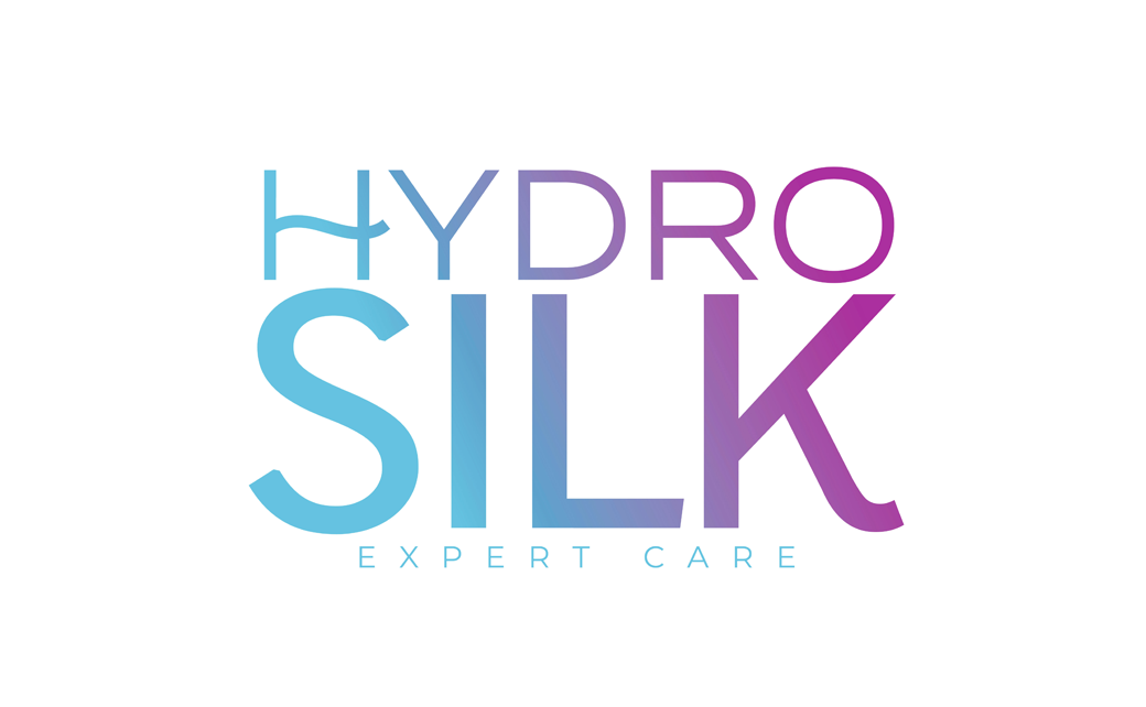
Adding: “‘Expert Care’ now serves as a brand qualifier and is placed under the logo across all touchpoints, promising precision and performance whilst putting the consumer in control of their hair removal experience, from head to toe.”
The new logo is said to help propel the brand forward “with confidence, clarity, and credibility”.
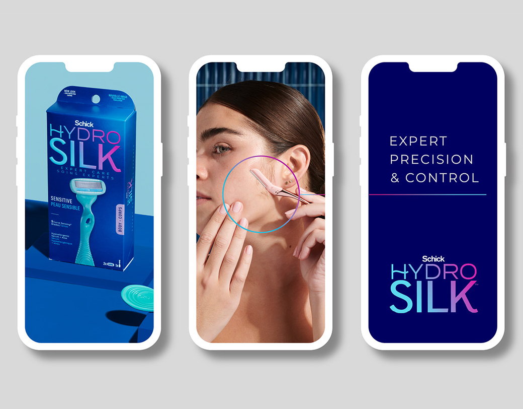
“With a captivating gradient, the new mark possesses a modern vibrancy that is both distinctive and eye-catching, especially on packaging, where it commands attention, ensuring a compelling presence on the shelf,” claims the design team.
The master brand colour, meanwhile, has been updated to a dark blue and also features a gradient that the designers say helps give Hydro Silk “a premium, professional look”.
Additional design details include a new typeface that has been created to underscore the brand’s “superior expertise”.
“By highlighting the product’s exceptional performance and maintaining a bold, uncluttered aesthetic, the new identity and packaging underscore Hydro Silk’s commitment to championing the thoughtful routines and choices that help individuals be at their best without ever compromising their high standards,” comments Ben Oates, creative director and founder at JDO.
