Lamborghini Unveils New Logo and Corporate Identity
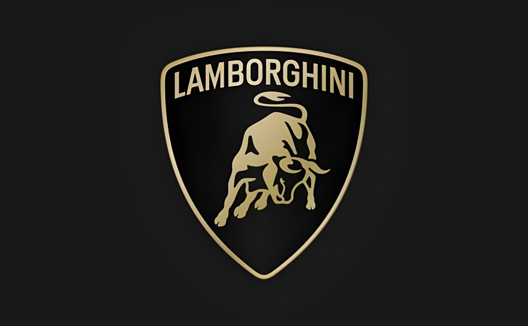
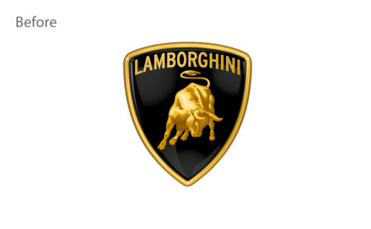
Lamborghini has refreshed its famous logo design after more than two decades.
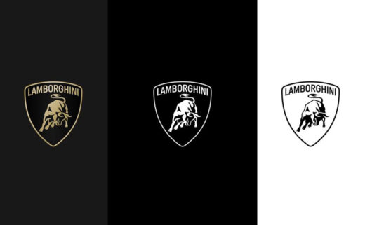
The new logo gets a broader Lamborghini typeface than its predecessor while the lines of the bull in the centre have also been simplified – and for the first time, the latter will feature individually on the company’s multiple touchpoints, separated from the classic shield “to lend it even greater prominence”.
In terms of colour, black and white will serve as the primary hues, while yellow, along with the introduction of toned-down gold, are to be used as accent colours.
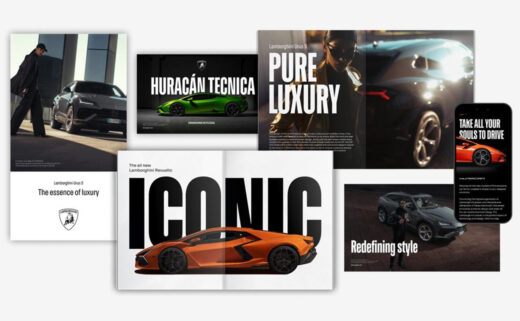
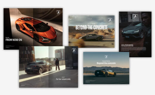
Additional details include a bespoke Lamborghini typeface that is designed to echo the lines and angularity of the brand’s cars, and a new set of icons – developed in collaboration with the firm’s internal design studio, namely, Lamborghini Centro Stile – that for the first time will be deployed uniformly across all digital touchpoints.
“The restyling is driven by a new strategy that involves adapting the brand’s visual expression to better reflect the ‘brave’, ‘unexpected’ and ‘authentic’ values of its mission, namely ‘Driving Humans Beyond’, a concept that translates into the intention to always go beyond the limits, standards and conventions,” says the Italian marque about the new identity design.
The renewed logo has been confirmed for application on all of the brand’s future cars.

Source: Lamborghini


