Maltese Soft Drink Kinnie Gets New Logo and Packaging by bluemarlin

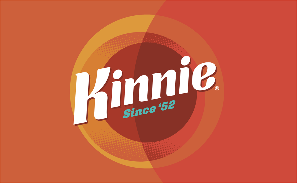
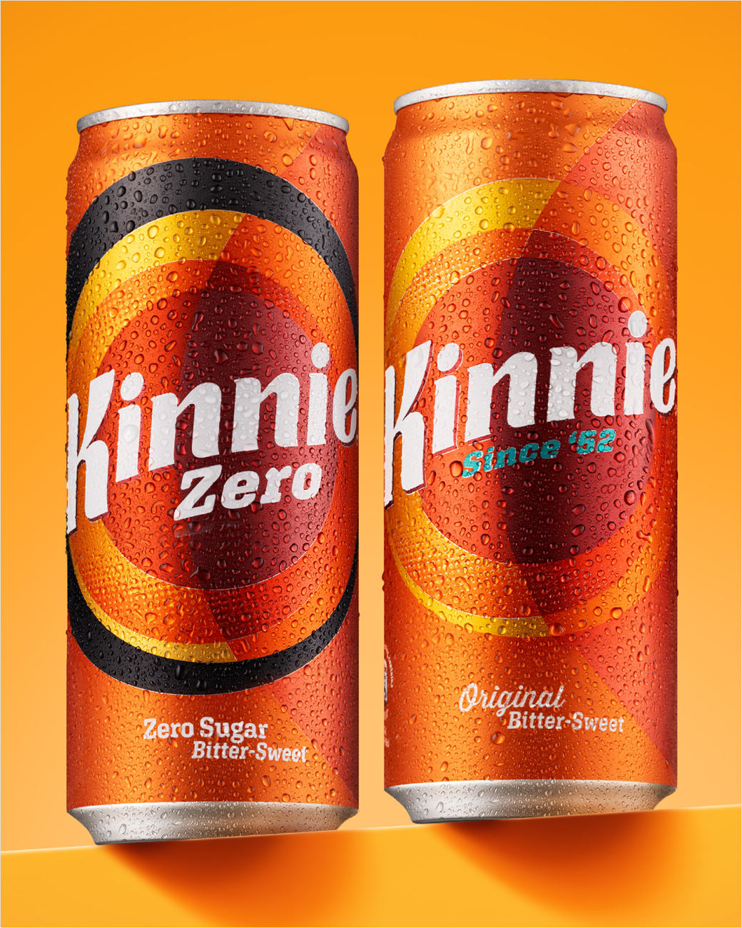
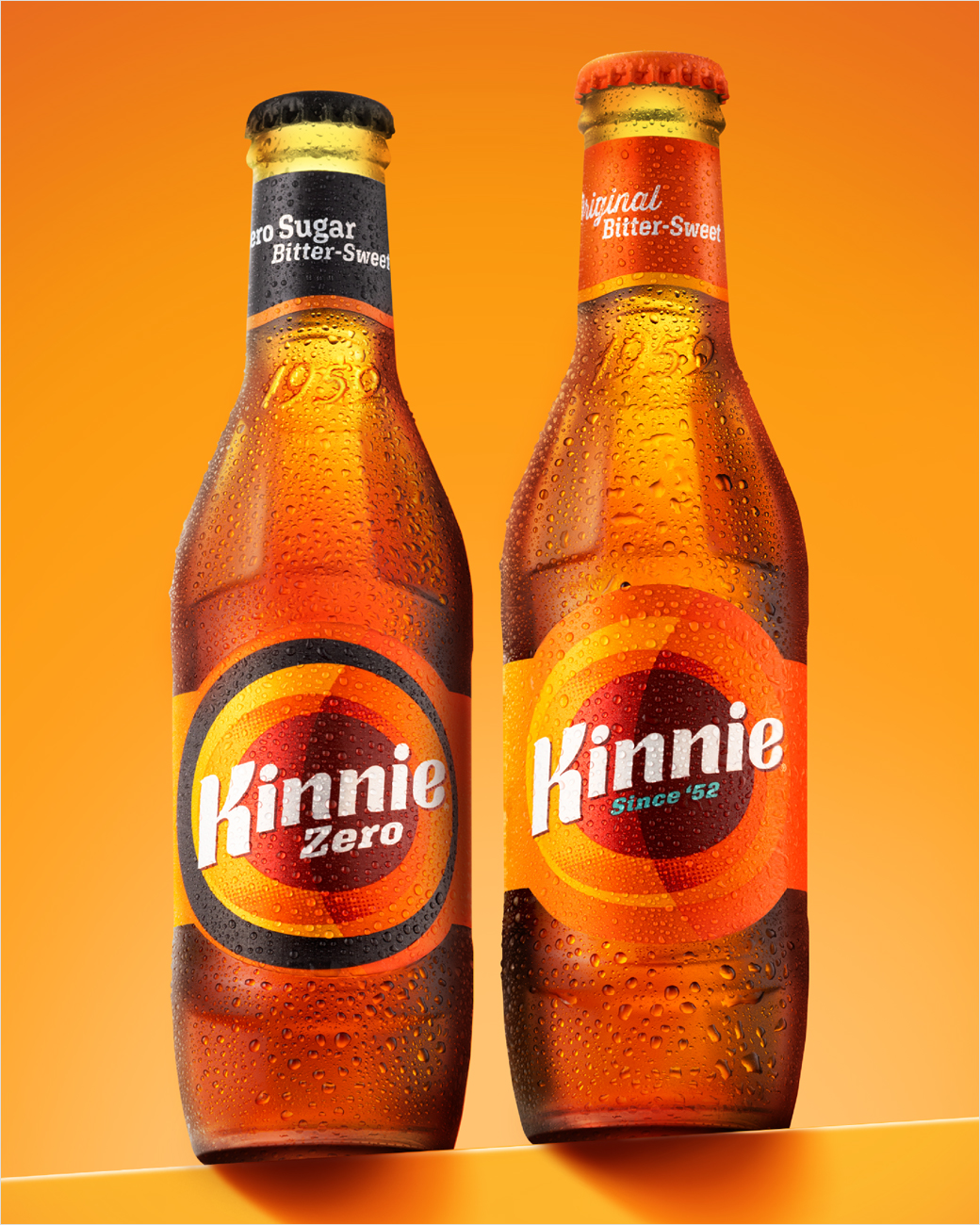
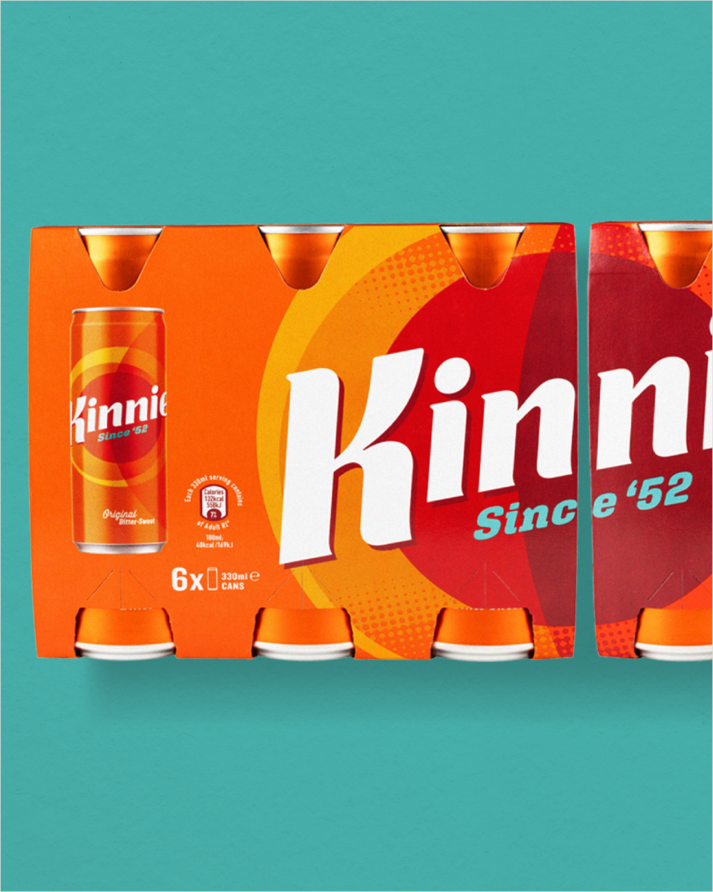
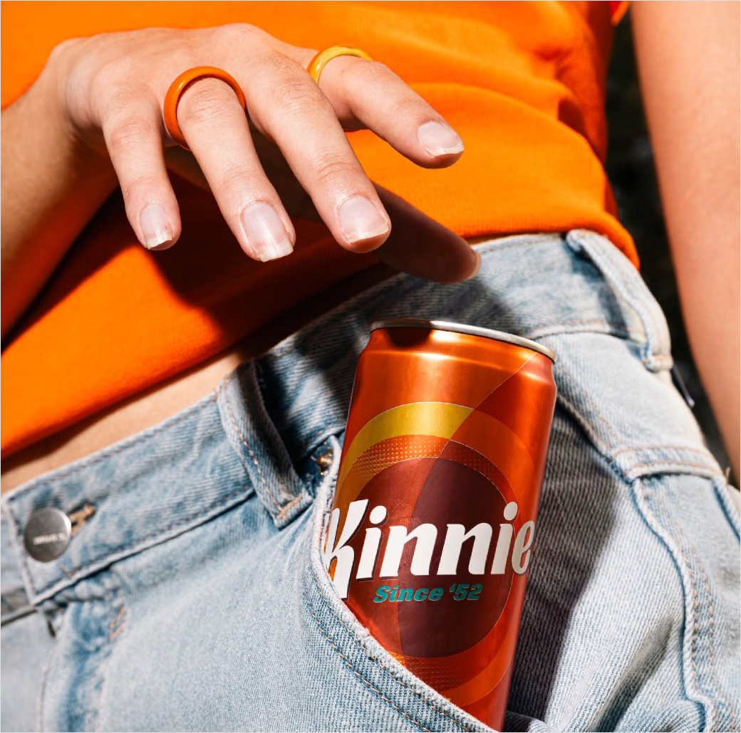
Malta's original 'bittersweet' soft drink Kinnie has been rebranded with a new identity, positioning, and packaging design by bluemarlin.
The new look, which includes a redesigned logo, comes as the 70-year-old beverage company seeks to grow in new markets, including internationally, while also enhancing its local presence.
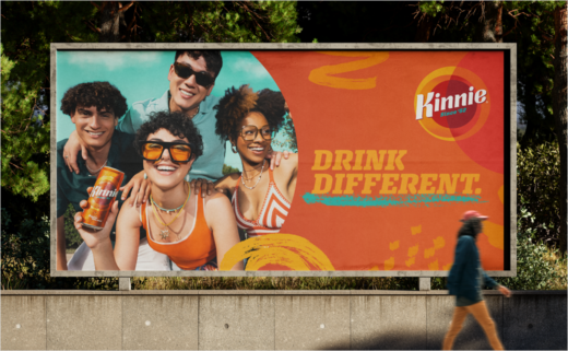
"The original alternative to colas, lemonades, and orangeades, the new brand identity and campaign invite consumers to ‘Drink Different'," says the design team at bluemarlin.
"We knew Kinnie had potential to travel and broaden its fan base by engaging new audiences with its distinct flavour profile, versatility, and personality. But we needed to progress the brand fundamentals – built on distinctiveness, complexity and the unexpected – with more ambition and imagination,” further comments Andrew Eyles, co-founder of bluemarlin.
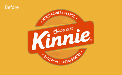
"The original Kinnie logo and brand held a certain nostalgic charm and warmth, but it needed a more progressive edge for new markets," expound the designers.
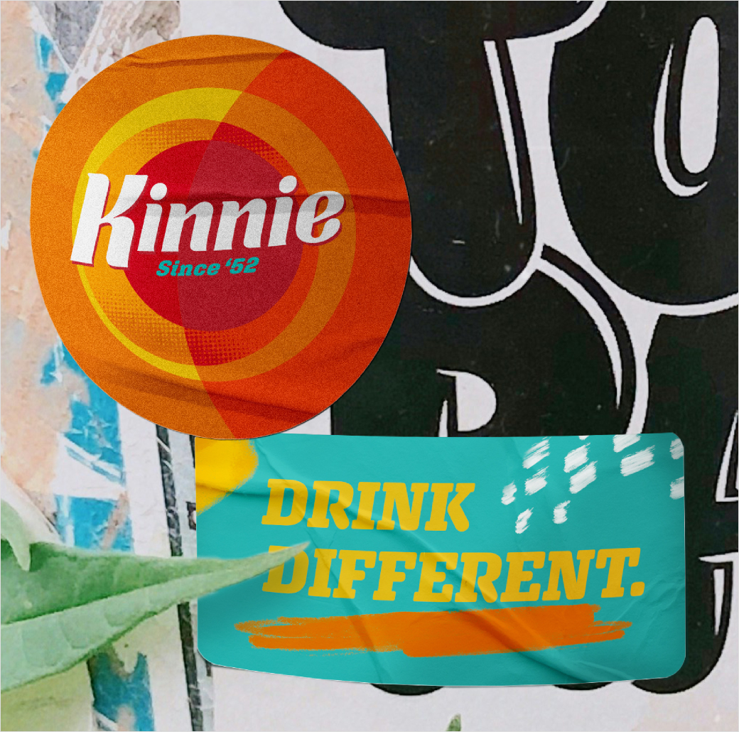
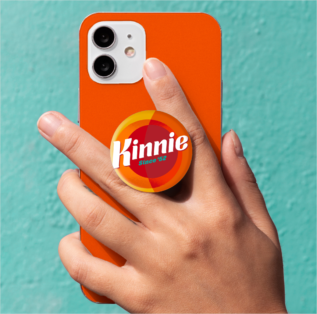
The updated wordmark is inspired by the original design from 1952, particularly the ‘K’ and the underline, which the designers say adds "energy and lift".
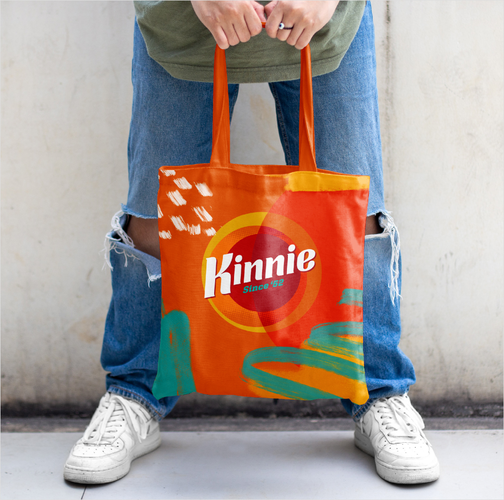
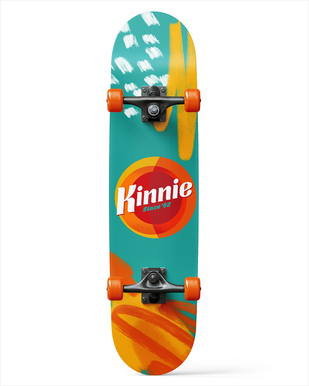
"A new, larger circle casts a shadow over the logo, evoking sunny days. A deeper palette of oranges, rusts, burgundies and teals better captures the bittersweet character of the liquid. Bold slab-serif fonts are balanced with ‘Kinnie Kreativity’ graffiti elements to add a layer of disruption and energy," explain the designers.
Other design elements include painterly textures and brushstrokes spread throughout the brand's visual identity.
bluemarlin
www.bluemarlinbd.com


