Bluemarlin Redesigns ‘Sumol’ Soft Drink
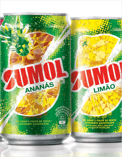
International brand design agency bluemarlin has created a new visual identity for Portugal and Angola’s famous soft drink brand, Sumol.
With a history that dates back to the 1950s, Sumol is a well-known brand in its home country, Portugal. This new visual identity forms part of Sumol’s ambition to reach a wider audience, especially with a younger generation of consumers.
bluemarlin says Sumol wanted to infuse the brand with new “energy and excitement”, focusing on the communication of “natural fruit refreshment”.
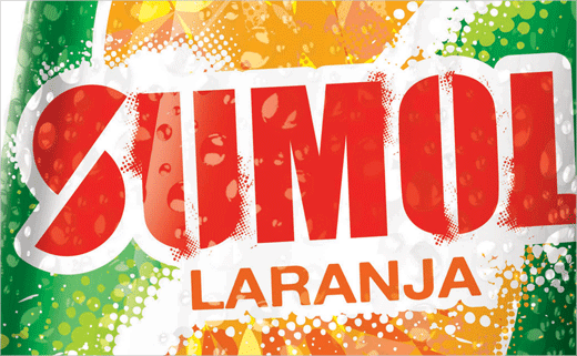
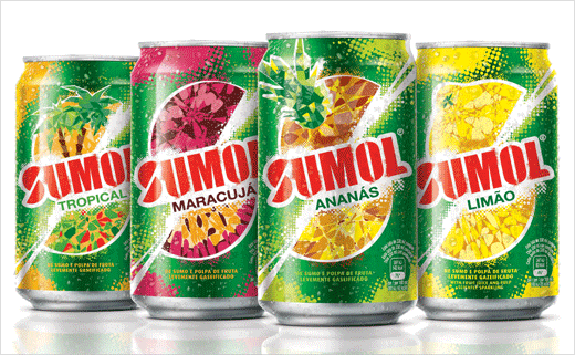
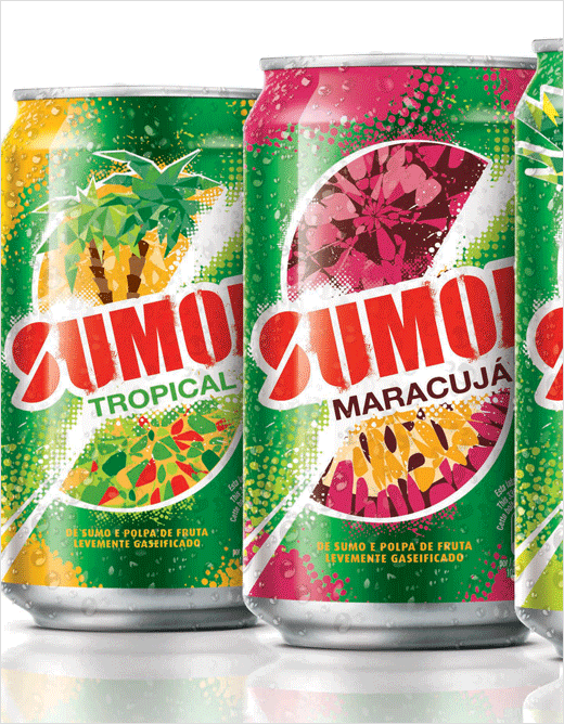
The design focuses around a letter “S” which is created by an explosive slice of fruit. “This injects excitement while conveying the experience of drinking the product. The kaleidoscope illustrations of fruit highlight the product’s unique attribute of containing real fruit pieces,” explain the designers.
The logo has also been updated with edgier typography that is said to have been inspired by “street art”, which is claimed to be popular in Lisbon. The new design has been rolled out in both standard and sleek cans across the core range of fruit variants.
“The new identity takes the brand to the next level, ready to embrace its future. Driven by the idea, Light up Life, the new look conveys optimism, embracing the moment, and being ready for anything,” says executive creative director of bluemarlin, Ian Catling.
bluemarlin
www.bluemarlinbd.com


