NSPCC Launches New Identity
The NSPCC has launched a new brand to represent a change in the charity’s strategic direction and to encourage public support.
The brand has been developed by the NSPCC’s internal creative team, which won the work in a competitive pitch against external agencies.
The NSPCC’s previous brand identity – Full Stop – was developed to raise awareness of child abuse. “Full Stop was hugely successful for us. It put child abuse firmly on the agenda and raised over £250m,” says Mark Tobin, creative director at the NSPCC. “But that was developed more than a decade ago, and the landscape has changed. We’ve raised awareness of child abuse, but our research shows that people are less clear about the work we’re doing to prevent it. We need to address that to drive up support.”
“The previous brand was heavily reliant on black and white photography; a limited colour palette, and a strapline that focused on cruelty. Our new brand allows us to move the conversation on, and talk about the solutions we offer rather than just the problem.”
The rebrand also follows a strategic shift at the NSPCC, that aims to place a greater emphasis on preventing abuse before it starts.
“The NSPCC supports families struggling with mental health and drug addictions, runs antenatal programmes, and helps mums and children recover from domestic abuse. But many people have no idea that this is the kind of work we carry out. And the people who the NSPCC wanted to help were reluctant to use services from what they perceived to be the ‘cruelty charity’. This is what the new brand addresses,” says Mark.
In response to these insights, the creative team developed a new platform based on childhood.
“The research was telling us that people wanted to know what the NSPCC is for, rather than what it’s against,” says Sue Hornsby, art director at the NSPCC. “So all of our design choices bring the idea of childhood to the fore.”
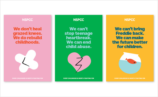
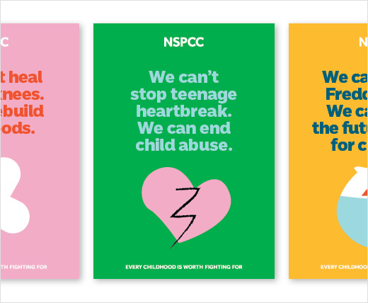
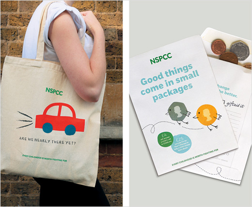
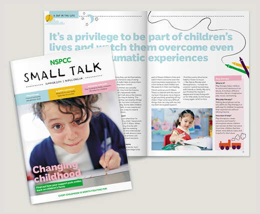
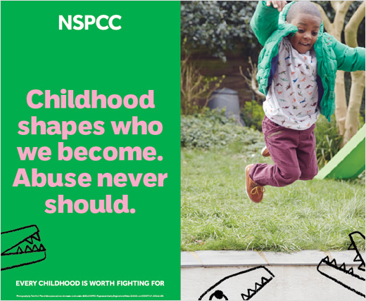
The bright colour palette is a notable move away from the charity’s traditional black, white and green. And the team has developed a ‘crayon’ illustration style to bring the child’s imagination to life, which they say helps give the brand a more ‘playful’ feel.
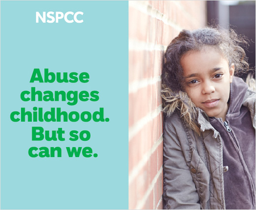
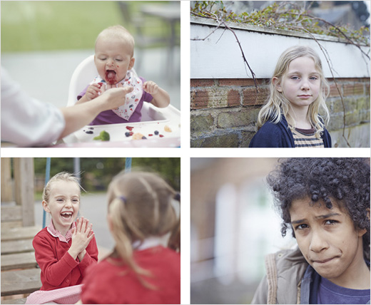
Sue says: “We worked with photographer Tom Hull to produce imagery that offers a glimpse into childhood. It shows real, everyday children, to demonstrate who the NSPCC is fighting to protect. Even when we portray children who’ve been abused, we follow this principle. Abuse doesn’t just happen to a certain ‘type’ of child – it could happen to any child, from any background. Our brand needs to convey that in order to make our cause feel more relevant ”
The charity has a new strapline – Every childhood is worth fighting for – and has developed a new tone of voice.
“The new brand will help us counter declining levels of support. And more importantly, it will help the NSPCC become a more approachable charity -meaning children and families will be more willing to come to us for help,” says Mark.
The brand is undergoing a phased roll out, as part of this the NSPCC has been working with digital agency Amaze to develop a new website which launched this week.
NSPCC
www.nspcc.org.uk


