Only Studio Rebrands the University of Suffolk
Design agency Only Studio has rebranded the University of Suffolk. The academic organisation, which is one of the newest universities in the UK, was formerly known as the University Campus Suffolk.
Only says the brand had to reference ‘change’ as a theme central to the institution’s core proposition — that of a new university “for a changing world”.
A forward facing angle is therefore used throughout the identity to reflect “progressive change”, and to further create a reference to the University’s location in the South East of England within the logo itself.
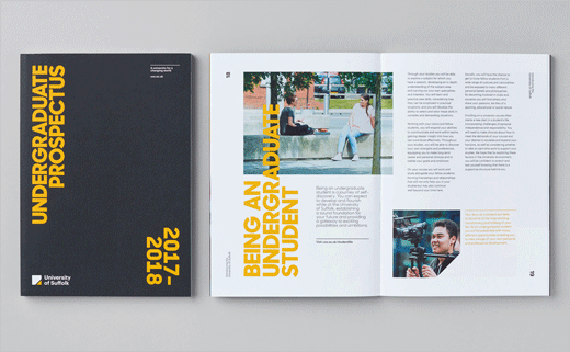
While the old identity was set in Helvetica, the new one utilises Commercial Types Graphik. The new typography is paired with a yellow, grey and white colour palette. Yellow is also a colour closely associated with the county of Suffolk.
Following the rebrand, Only were also commissioned to design a suite of university prospectuses, wayfinding for the new Atrium building and recruitment campaigns for Clearing 2016 and 2017.


Only Studio
www.onlystudio.co.uk


