Studio Blackburn Rebrands the Canal & River Trust
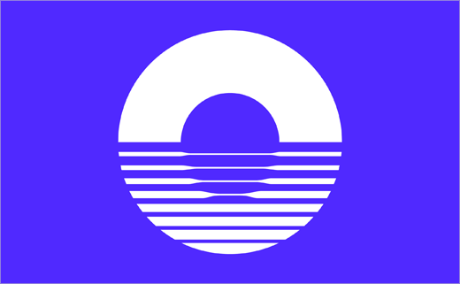
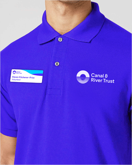
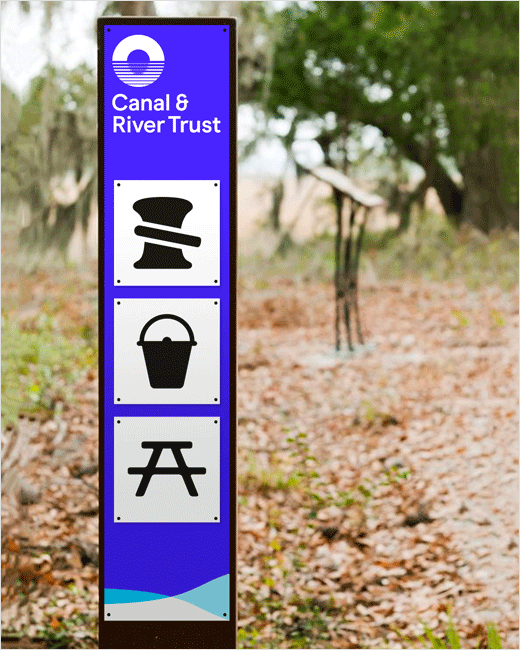
Creative agency Studio Blackburn, part of the newly-formed Hello Finch network, has designed a new brand identity and logo for the Canal & River Trust, a charitable organisation dedicated to looking after waterways across England and Wales.
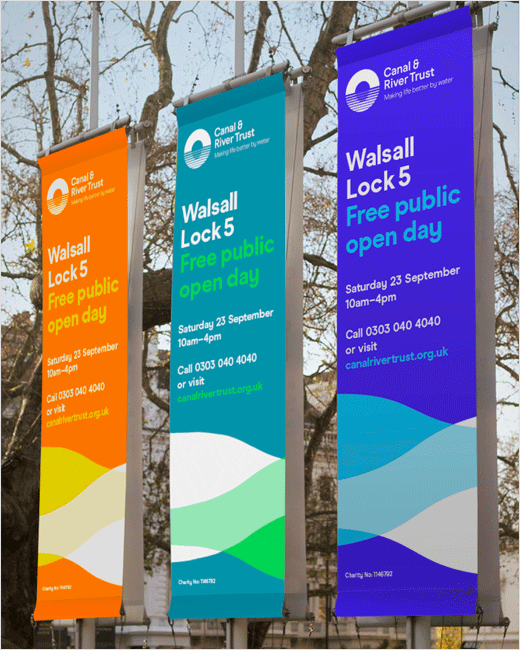
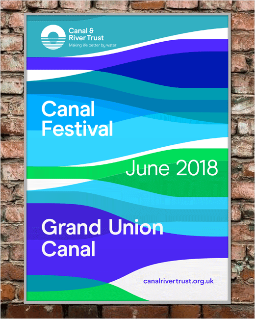
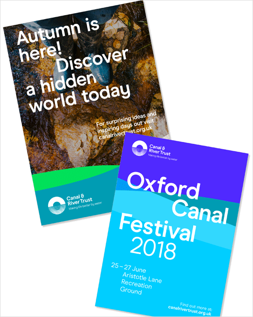
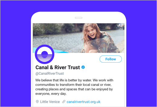
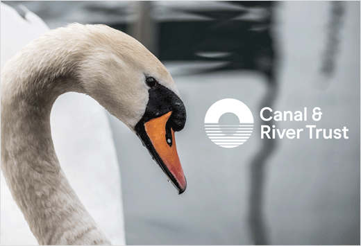
Centred around a new brand positioning of ‘Making life better by water', the chief element of the refreshed identity is an all-new marque dubbed "The Reflection Symbol".
Referencing ripples of water as well as the numerous bridges found across the UK’s inland waterways, the logo is further combined with colours that the designers say represent nature and water.
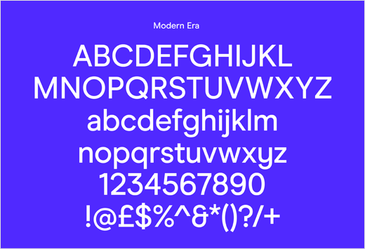
Other key features of the brand system include a sans serif typeface called "Modern Era".
"This was a perfect brief, delivered by a bold and ambitious client driven by the purpose that life is enhanced when near water," says head of Studio Blackburn, Paul Blackburn. "The result is a visually striking, optimistic, colourful and instantly recognisable brand system that will appeal to a broader demographic and boost interest and awareness in the Trust and its valuable work."
"We were looking for an identity that captured how being by water makes us feel and which reflects our ambition to become the ‘waterways and wellbeing’ charity. As a team, Studio Blackburn were able to translate the spirit of what we’d envisaged for the Trust into what we think is a strong, unusual and differentiating identity," adds Canal & River Trust marketing boss, Nicky Wakeford.



Studio Blackburn
www.studioblackburn.com


